The effectiveness of colors in grabbing attention is no longer a mystery, yet the challenge of utilizing them effectively, especially in the midst of visual clutter, remains. How can you ensure that amidst the deluge of information, your ad doesn't go unnoticed by the average person? Additionally, we'll delve into the crucial aspect of aligning color meanings with the specifics of your business or product.
Color possesses various properties, impacting an individual's psycho-emotional state, mood, emotions, and behavior. Despite the belief in the subjectivity of color reactions, experts dedicated to the psychology of color argue that its potential is often underestimated by humanity.
To validate the significant influence of well-chosen colors, marketers have conducted compelling studies with impressive results:
Nearly 90% of people acknowledge that the color of a product affects their initial impression of it.
93% of buyers prioritize the visual appearance of a product.
80% of buyers assert that brand recognition hinges on color.
These survey findings highlight that color serves as a primary source of information for consumers. A noteworthy 78% of consumers remember a brand based on its color, surpassing the 43% who recall the brand name. Moreover, consumers tend to attribute specific characteristics to a brand based on its color, forming assumptions about the company. Therefore, selecting the right shade becomes crucial as it serves as an additional source of information about your company.
Color psychology delves into its impact on the human mind and behavior. Concurrently, marketers meticulously scrutinize how different tones influence the buyer's subconscious perception of a brand. While some of the scientific community still debates the ability of color to sway human actions, research indicates that a well-selected shade can guide the buyer's gaze and prompt specific actions. Adopting a practical approach, let's explore real examples of color utilization in marketing:
Restaurants:
Fast-food giants like McDonald's, In-N-Out, and Burger King share a commonality in their logos being red or yellow. While color is secondary to factors like food quality and service, vibrant logos in juicy colors have played a significant role in associating with delicious food in the subconscious minds of visitors.

Trends:
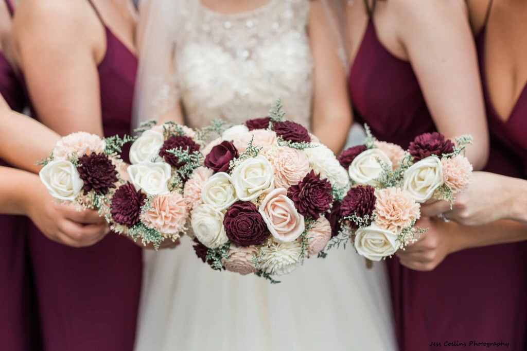
Colors dictate trends, as exemplified by the Pantone Institute's annual declaration of the Color of the Year. For instance, in 2015, brides aspired to orchestrate their weddings in the captivating hue of Marsala. By 2019, coral had emerged as the most popular color. The influence of shades in driving the sale of goods and services, you can see by opening any fashion magazine.
Branding:
Colors help buyers establish associative links with brands. Thus, everyone remembered that Adidas is black and white, Coca-cola is red, and H&M is a white-red combination.

The value, assigned to the choice of color, confirms its effectiveness in inducing the buyer to respond to the product in a certain way.
To make color work, you need to familiarize yourself with color theory. The good news is that you don't have to study it the way artists and designers do. Marketers should know at least the basics.
Colors are typically categorized into three groups: warm, cold, and neutral:
Warm colors: This group includes red, yellow, orange, and various shades of pink. These colors are generally associated with emotions such as joy and optimism.
Cold colors: Green, blue, purple, and their derivatives fall into the cold color group. These colors are often credited with soothing properties.
Neutral colors: Brown, white, black, and gray are considered neutral colors. While they frequently complement warm or cold colors in pairings, they are also self-sufficient and carry their own significance.
When working with colors, you will definitely come across specific terms. We have collected the most important ones for you.
For beginners wondering how to combine colors effectively, the color wheel tool is a helpful resource.

With the help of a wheel, you can build color harmonies. Such as:
Monochromatic, combining different tones and shades of one color.
Analogous, which involves the use of colors that are next to each other on the color wheel.
Contrasting where combined colors, which are located opposite each other.
Triadic, where two sets of contrasting pairs are used.
It goes without saying that these are far from all possible harmonies, but this should be enough for a basic understanding.
Before we start discussing the symbolism of colors in marketing, it is worth noting that the same colors can have opposite meanings in different cultures. In this article, the meaning of colors is described from the point of view of Western European and North American cultures. If your target audience is in Asia, it's worth checking color value, focusing on the local context.
Positive emotions: trust, loyalty, logic, security, calmness.
Negative emotions: coldness, emotionlessness, unfriendliness.
The color blue has a calming effect and also evokes a sense of security and reliability. It's no coincidence that companies that operate with a large amount of personal data of their customers and users favor blue logos. For example, Facebook, LinkedIn and Skype. Even established brands like Ford, Intel, Boeing, and Walmart utilize blue. And this is far from a complete list.
*example of a Business template by BannerBoo
Positive emotions: strength, passion, excitement, energy, fearlessness.
Negative emotions: aggressiveness, hostility, dislike, anger, danger and pain.
Red creates a sense of urgency, as seen in the well-known red price tags in supermarkets that prompt us to grab the product quickly. Additionally, red is linked to movement, reflecting physiological aspects like heart rate and blood pressure.
Moreover, red is believed to stimulate appetite, explaining why major fast-food chains like McDonald's and KFC incorporate this color into their logos.
*example of a Gaming template by BannerBoo
Positive emotions: wealth, mysticism, imagination, wisdom, sophistication, spirituality.
Negative emotions: aggressiveness, hostility, dislike, anger, pain.
Purple has long been associated with royalty, so it can often be seen in the logos of those brands that are considered premium.
Purple seems extravagant and a bit excessive, perhaps this is the reason why confectionary companies such as Cadbury, Milka or Millennium have chosen it as their color.
*example of a Misc template by BannerBoo
Positive emotions: friendliness, cheerfulness, confidence, vitality, courage, warmth, innovativeness, energy.
Negative emotions: disappointment, ignorance, immaturity, laziness.
This color creates a feeling of warmth and comfort. As an example, we can cite The Home Depot - a company that sells goods for home construction and decoration. Their orange logo in many American families evokes memories of making a new house to be home.
*example of a Misc template by BannerBoo
Positive emotions: passion, creativity, ingenuity.
Negative emotions: impulsiveness, extravagance, audacity, rebelliousness.
Usually, this color is used to emphasize the connection with femininity and youth, but it is also often associated with hope and comfort.
Many well-known brands use pink in their branding, namely: Mattel, Victoria's Secret, Pink and Cosmopolitan magazines. Pink also became a color of breast cancer awareness.
*example of a Restaurants template by BannerBoo
Positive emotions: strength, reliability, safety.
Negative emotions: loneliness, isolation, sadness.
Since color evokes associations with reliability, logistics companies such as UPS use it in their branding.
*example of a Real Estate template by BannerBoo
Positive emotions: warmth, optimism, happiness, creativity, intelligence.
Negative emotions: fear, caution, anxiety, disappointment, cowardice, irrationality.
Represents youth and looks great paired with contrasting colors. Companies such as Nikon, Lay's, DHL, and BIC have chosen yellow logos for themselves
*example of a Pets template by BannerBoo
Positive emotions: hope, health, development, nature, prosperity, balance, harmony.
Negative emotions: boredom, envy, fixation on material things.
A pleasing color associated with life and nature, green is easy on the eyes. Evokes strong associations with wealth and power (eg military industry, banking, economy).
Often used by brands that produce products that improve well-being and promote a serious attitude to protecting the environment, such as Whole Foods, Nature's Bounty and Animal Planet.
*example of a Cosmetics template by BannerBoo
Positive emotions: innocence, purity, simplicity.
Negative emotions: emptiness, excessive simplicity, aloofness, coldness.
White color is a symbol of modernity. Many successful brands, such as Zara, Tesla, Sony, and Apple, have chosen white as the color of their logos because they appreciate its elegant aesthetic.
*example of a Jewelry template by BannerBoo
Positive emotions: power, security, elegance, strength.
Negative emotions: coldness, mourning, oppression, depression.
Powerful and contrasting color, which is used to sell elegant and high-end products.
The New York Times, Nike, Nespresso and L'Oréal use black as their signature color, to emphasize your authority, power or luxury.
*example of a Fashion template by BannerBoo
Positive emotions: success, wisdom, compassion, charisma, optimism.
Negative emotions: egocentrism, demandingness, meanness.
In many cultures, gold is considered the color of wealth and associated with royalty and religion.
High-end companies such as Rolex, Versace and Porsche use gold in their logos and products.
*example of a Travel template by BannerBoo
Our ability to perceive and attribute meaning to color is often influenced by the language we use. Cultural factors play a significant role in color associations. For instance, in Western countries, white is linked with joy and purity, while in many Asian countries, it is associated with death. Conduct thorough research to ensure that your brand colors do not carry negative connotations in the regions where your target audience resides.
Now that you have a foundational understanding of color theory, it's time to select a palette for your brand. Research published in the Journal of Consumer Research indicates that individuals tend to favor brands that align with their lifestyle. Brands often become integral to the buyer's personality. This underscores the significance of color as a tool that empowers marketers to communicate the primary message and purpose of the brand.
How to define your brand color?
To find the perfect shade, you need to answer the following questions.
Features of your brand: What makes your brand special? What characteristics do you give it? Would you like your audience to see it as reliable, innovative, or perhaps creative?
Your target audience: Who are your customers? Which gender and age group does the largest percentage of customers belong to? Which color could resonate with their emotional state?
Industry: which color choices are most popular among businesses in your field?
Your logo color: What color is your logo? Do not forget that the logo and brand colors should match each other.
After you answer all these questions, you can start experimenting with color combinations.
When discussing website design, it's important to note that color impacts the overall user experience and usability. Color also affects the conversion rate. The right color scheme creates a sense of trust and reliability, leading to increased conversions, while the wrong color scheme has the opposite effect. For instance, employing a soothing blue color scheme can instill a sense of trust on a website, whereas a red palette may evoke feelings of anxiety. Beyond the page's overall color, designers must ensure that call-to-action (CTA) buttons and web forms are not only visible but also user-friendly.
Color harmony is important in user interface design because it is responsible for:
ease of use: color helps create a simple and intuitive interface to navigate.
accessibility: color harmony allows you to achieve the necessary contrast to make the site easy to use.
To make it as comfortable as possible for website visitors to work with it, follow the color balance according to the 6:3:1 formula. According to which, the dominant color should occupy 60% of the space, minor 30%, and the accent color is only 10%. This user-friendly approach protects the user's eyes from sensory overload. The second rule, known as the '3 Main Colors,' emphasizes limiting your palette to just three colors. This helps avoid visual clutter and prevents the user's gaze from getting lost in a chaotic design. Imagine a website with a rainbow of clashing colors - it would be overwhelming and difficult to focus on any specific element.
It is impossible to imagine social media marketing without constantly looking for new opportunities to be noticed. This time, we'll look at how color can help us get noticed by our potential audience. First, you need to decide 2 things:
on which platforms you plan to promote;
how to integrate your brand colors into your smm-strategy.
We suggest considering the first point using the example of Facebook and Instagram. Although these two platforms are part of the same media empire, they require radically different approaches. The last research proves that using bright, cheerful and energetic colors increases your chances of getting likes on Facebook. Here we advise you to use warm colors, but try not overdo it. Also, we don't recommend making a banner in blue color because there is a big risk that it will not be visible due to the blue color of the interface. If you can't do without a blue shade, then match it with a warm color.
Your Instagram posts will look better if the images are of the same tone and saturation. Use the color wheel, to check if your new post matches the previous one.
We also advise you to conduct A/B testing. It allows you to compare 2 or more ad options and confirm or deny hypotheses. In this way, you can create effective and efficient social media ads.
Email marketing is experiencing a renaissance. You probably also noticed how the mailing list has evolved. To make your marketing efforts even more effective, take advantage of the additional opportunities that color gives you.
Highlight key points with contrasting colors
Highlighting with color important messages and words, you help the reader quickly determine what is being said, what is being offered to him and why this offer is beneficial for him.
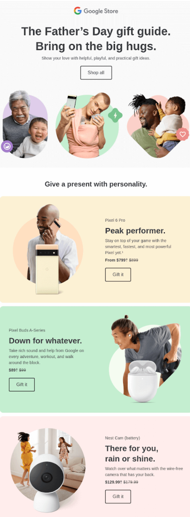
*Image source: Unlayer
Use colored backgrounds
A plain letter, with black text on a white background, may look too simple. Using backgrounds, especially in those colors, which resemble your brand color, you not only make the letter more interesting to look at, but also increase brand recognition.

*Image source: Reallygoodemails
Remember that the colors you choose for your email are also part of your marketing campaign, so it makes sense to stick to a consistent visual style.
The process of creating a whole color palette for marketing companies needs a comprehensive approach. We have collected some valuable tips that should help you choose the perfect option.
Make sure the colors you choose match the goals of the campaign and the brand overall.
Aiming for consistency in visual elements across products, campaigns, marketing materials, and social media isn't just about aesthetics. It's about unifying your brand voice to enhance recognition. In simpler terms, you want to make it easy for your customers to get to know you.Create harmonious color combinations
To ensure that visual materials are appealing, don't overlook harmony. In practice, this implies not combining more than three primary colors. An excess of colors often leads to the brand voice getting lost, making it challenging for your target audience to understand what your company represents. Once you've chosen the main colors, you can then select secondary colors.Adapt color palettes for different marketing channels.
After testing, when you already know how your potential audience reacts to the chosen color palette, you have the opportunity to make the necessary adjustments.Remember, your main challenge is to choose a color palette that works equally well in different contexts, conveys your brand message and matches the values of your target audience.
Having covered the fundamentals of color theory, let's delve into impactful real-world examples of how leading marketing companies leverage color to achieve brand recognition, engage audiences, and drive results.
Pink is the embodiment of creativity, youth, comfort and femininity. It is quite logical that such giants as Lush and Mattel have implemented this bright collaboration. Since the female audience associates pink with a carefree and joyful childhood, it is ideal for advertising cosmetics.
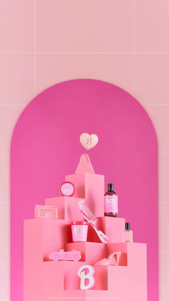
*Image source: Wearelush
Orange literally gushes with the energy of cheerfulness and optimism. It is not for nothing that the shoe brand Crocs, which promotes a convenient and comfortable lifestyle, uses orange not only in advertising, but also in the design of Crocs.

*Image source: y!entertainment
Purple usually associated with luxury, royalty, wisdom and supernatural powers. This color works well in email marketing because it is associated with quality products and sophistication. Also, purple can be used if you offer an exclusive product or service. Here's how Headspace did it.

*Image source: email.uplers
Red is the color of action. First, it creates the feeling that you urgently need to perform a certain action. Secondly, it causes appetite. Oreo's Instagram ad is a great example of using color effectively.
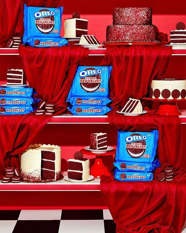
*Image source: Oreo
Yellow is the color of the sun, happiness and joy. It is successfully used by brands for which it is especially important to evoke a feeling of delight. Take Lego, for instance, where the iconic bright yellow bricks instantly evoke childhood fun and playful creativity.

*Image source: iterable.com
The traditional interpretation of the color white in Western culture is purity, which is why care cosmetic brands often incorporate it into their designs.

*Image source: photigy
Black exudes mystery, elegance, and luxury, making it the signature style of many fashion brands, including Dolce & Gabbana.

*Image source: lesfacons.com
However, it is worth noting that black is no less successfully used in the advertising of everyday things. You can find many options in the BannerBoo template library.
*example of a Halloween template by BannerBoo
Green symbolizes wealth, health and nature. The founders of Starbucks liked this interpretation so much that from the very foundation until now, green is an integral part of the brand's visual identity.
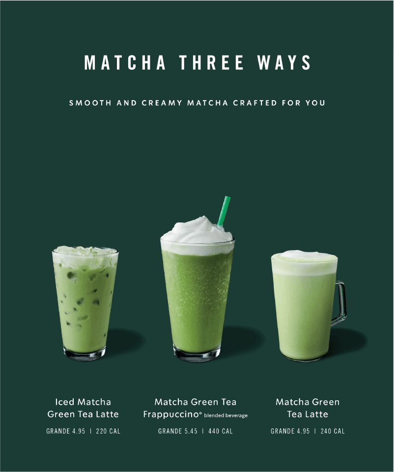
*Image source: Starbucks
Blue helps to calm down and find inner balance. Therefore, applications that offer to learn to meditate, overcome life crises and relax use blue in advertising.

*Image source: effortlessly.io
Shades of brown evoke images of the earth and nature, instilling a sense of security. Brands that emphasize their commitment to responsible resource management often embrace earthy tones. A notable example is the UGG brand.

*Image source: UGG
As you can see, the colors really work. The important thing to remember is that this is only a small piece of the puzzle in your marketing strategy.
Color plays a crucial role in shaping how people perceive your marketing campaigns. It influences the overall brand impression, evokes specific emotions, and triggers associative connections in the viewer. Importantly, color can impact conversion rates, either enhancing or hindering them. By leveraging the insights from color psychology, you can fortify trust and foster affinity for your brand. It's advisable to consider the preferences of your target audience, tailoring the color scheme to resonate with their age and gender group. Moreover, strategic use of colors enables you to emphasize body text, highlight key messages, and draw attention to call-to-action buttons, ultimately enhancing audience engagement.
In Western culture, this color is considered purple.
Color is a powerful communication tool. It can be used to influence mood.
There is an opinion that colors really have energy and each color has its own energy.
To use symbolism, you need to know the specifics of different cultures and distinguish which words or images represent certain concepts, objects or people.
The shade indicates how much black was added to the base color.
Yes, colors can be symbols in painting, literature and cinematography.
Colors are important because they are also a communication tool and a source of information.