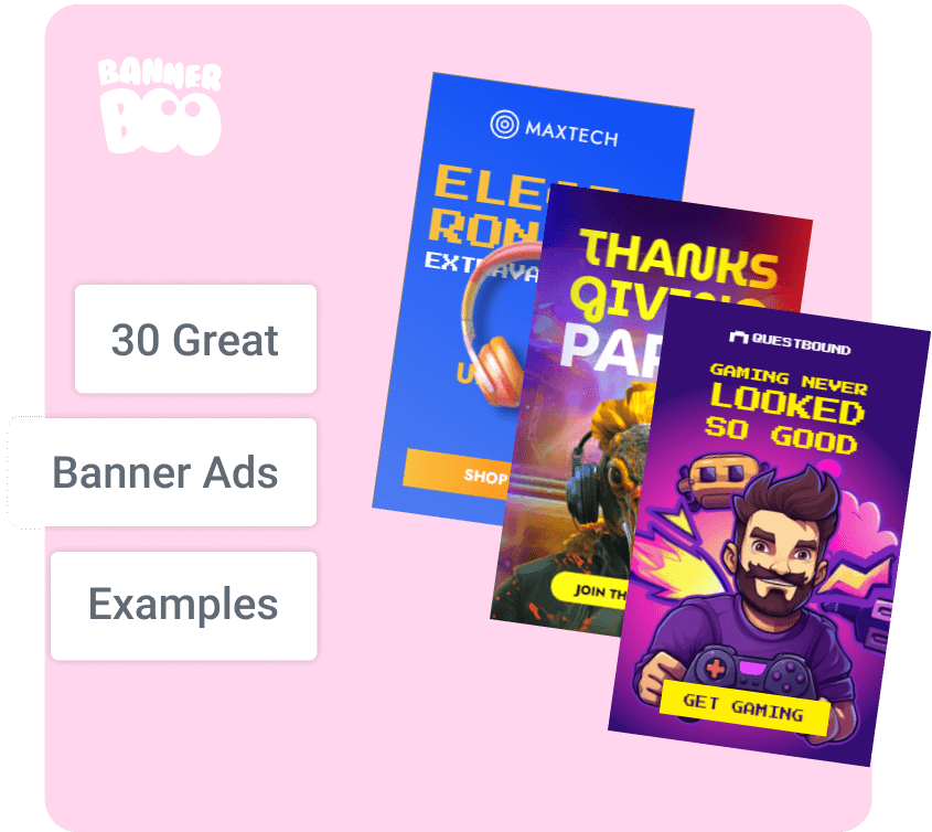
Banner advertising has proven itself to be effective a long time ago as a marketing tool for promoting various businesses. The results are remarkable, considering the colossal budgets involved in creating banners, securing strategic placements, and capturing the attention of potential buyers. What binds together brands that excel in leveraging the potential of display advertising? Years of experience creating banners that work! We have found 30 examples of banner ads that will help you reveal all the secrets of effectiveness and improve your advertising activity.
Banner ad has been so popular for many years due to its capabilities, functionality and flexibility. In the first place is the variety of forms and formats. No advertising tool offers such a diverse range of ad sizes to ensure optimal performance for every brand or company. The downside could be viewed as the necessity to create multiple versions of a banner for the same ad campaign, but the effort is undoubtedly worthwhile when compared to the genuinely impressive results of customer interaction!
Banner ads are displayed in a large network with more than two million sites, and the total traffic covers 90% of Internet users. This is a great chance to advertise on the right resources, including video and mobile apps.
To make each of your campaigns a masterpiece of online advertising, we have collected 30 effective ideas of banners, which are built according to all the rules and perfectly show the value proposition. Analyze these approaches and add them to your advertising strategy to drive even more targeted traffic of potential buyers to your own site or resource.
Some things truly never go out of style, which is why marketers have been using these techniques for decades and always win. Idea of brand: the tactic of parallel comparison. It is a simple, direct and clear way to communicate the value of your product or service. It takes a second to understand: uncomfortable purses are a thing of the past, and sleek models are the future.
If you have a cool example for comparison, use it. It is simple and straightforward for the audience.

* resource https://ridgewallet.eu
Similarly, Apple is always on the side of light and simple design. Highlighting the competitive advantages and strengths of the product is promptly communicated on banners. "Apply in minutes" is an example of an ideal CTA (both simplicity of action and speed of getting results).
Moreover:
black and white contrast attracts more attention;
conciseness of the text and graphics add zest to the banner;
direct comparison focuses on a key query of the audience.
A good and vivid example of the development of recognition brand.

* resource www.apple.com
People do not always approve a decision about a purchase solely based on price, often a consumer chooses a particular product or service because it is consistent with his personal values. On this banner, Amazon supports small businesses and is driving this trend.
Promoting the products sold by small businesses on Amazon is a strategic move to reach a wider audience. It's always a good idea to run an ad that has a solution to a customer request.

* resource www.amazon.com
The design of The New Yorker banner ad is simple, original and clear. The discount is highlighted separately and has an accent role. Potential customers understand that "Limited-time offer", so you need to act quickly. But the text "Cancel anytime" lowers the acceptance barrier of decision about the purchase. This is a vivid example of an effective and concise banner to promote special offers and deal with objections.

* resource www.newyorker.com
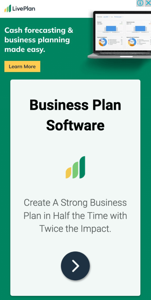
The whole promotional banner of LivePlan is a copy of the platform's dashboard. The ad text convinces you to take action: "Create A Strong Business Plan in Half Time with Twice the Impact". If potential customers are interested, they can click on the ad to learn more about the offer and product. A great example of creating a visual match between the ad and the result that customers can get.
* resource www.liveplan.com
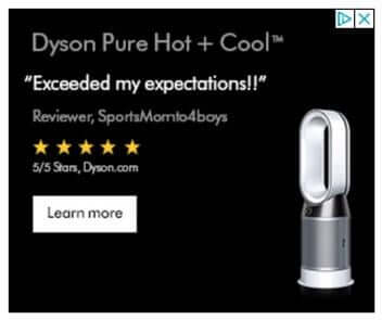
If you have reviews, try adding them to your banner ad. There is no need to say "We're the best on the market" when a testimonial from a real customer can do it much more eloquently. Merge the impact of feedback with the influence of visual imagery by showcasing the product in action. Voila! Your ideal banner is complete!
* resource www.dyson.com
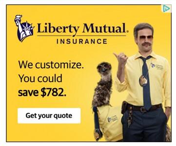
The insurance company highlights genuine savings and cost-effectiveness. When someone sees $782 in an ad, their thoughts immediately go to all the things they could do with that money: pay rent, pay off a car, pay off debt, etc. If your emphasis is fantastic financial benefit — feel free to use this opportunity to the fullest.
* resource libertymutual
This banner ad example is strategy oriented on remarketing, that is, when customers already know about the service and what it offers, but have not yet used it. It's an effective banner for reminding and maintaining constant contact with the audience that hasn't made a purchase decision yet. It is simple and concise, does not irritate, and therefore serves as an excellent navigation component in the marketing strategy.

* resource www.goto.com
The product solves everything! This ad showcases an innovative laptop that bends in the opposite direction from what everyone expects. Therefore, the emphasis is on the image. The CTA is in the form of buttons. The classic combination of product and call to action does banner effective and full so that the client has a desire to follow the link and learn more details.

* resource www.microsoft.com
In this case, the key is the audience that this ad is targeting. Trading is not easy, that's why brand Equiti communicates accurately with those who understand what is going on. No buttons or prompts because visual matching works. If your product is very specific, just show the element that will make it understandable to the right segments of potential customers.

* resource www.equiti.com
Disney+ advertising presents potential customers with an exclusive opportunity to view a specific series — a spin-off of the famous Star Wars franchise — that won't be available on any other platform. This offer is extended to those who decide to start using the free trial version of the service. The key elements of the banner lie in familiar graphics, style, and visual elements, contributing to its overall effectiveness.

* resource www.preview.disneyplus.com
Banner of brand Jira promises to show completely different rules of project management. The image shows how the service helps to optimize the ticket sales process — problem areas are marked with green ticks. If someone is familiar with the product, it can inspire them to sign up or learn more by simply clicking on the banner. The banner is created to promote a separate service, so it makes sense to use such formats to work with the existing audience: additional sales or expansion of cooperation.

* resource https://www.atlassian.com/software/jira
Samsung’s advertising banner has a minimalist design, featuring an image of a Samsung Galaxy tablet and a compelling headline, “Create. Work. Anywhere". It shows both the stylus and the keyboard, so viewers know multiple ways to use the tablet. The product is shown from the advantageous side, and this is just the kind of story when nothing else is needed!

* resource www.samsung.com
Starbucks advertises its breakfast menu through banner ads. The ad features the headline "Find your breakfast at Starbucks", which explains the variety and diversity of the menu to explore. The button “LEARN MORE” is clickable, and the flags further emphasize the importance of personalizing the company's offerings.

* resource www.starbucks.com
Advertising banner Pluralsight showcases a "Buy One Month, Get One Free" offer. There is little text, but each sentence has a logical, complete thought. Banner created as if they were two different ads, but united by a single concept. By the way, this is an interesting move: create two diverse designs, but make each of them logically complete and test which style and text resonates more with the audience.

* resource www.pluralsight.com
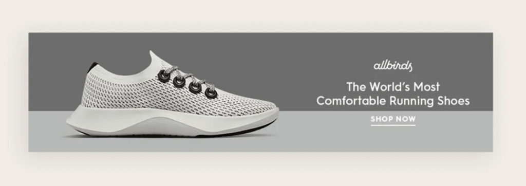
The Allbirds banner showcases the unique value proposition of "The World's Most Comfortable Running Shoe". The “SHOP NOW” call to action is clear, and the overall aesthetic matches the style brand. This is a simple and clear example that you don't need to create a complex design or veiled text to make the right impression.
* resource www.allbirds.com
The LinkedIn banner ad effectively communicates the resource-intensive nature of the hiring process for employers. To convey the importance of LinkedIn in this process, a testimonial from a real customer is included. Anyone who finds their need in this text can click to get additional information. With:
a clear indication of the result you will get by clicking on the ad;
using a quality image and branded blue button.

* resource www.linkedin.com
This example is a must-have in this collection.
The unusual nature of the characters and the text makes you want to click on the banner, to learn more about the company. Dreamworks just makes you click because it is impossible to pass by such a bright design.
Features:
strange images are easily remembered;
causes extreme curiosity;
This ad clearly aims to increase awareness of the brand, and does its job very well.

* resource www.dreamworks.com
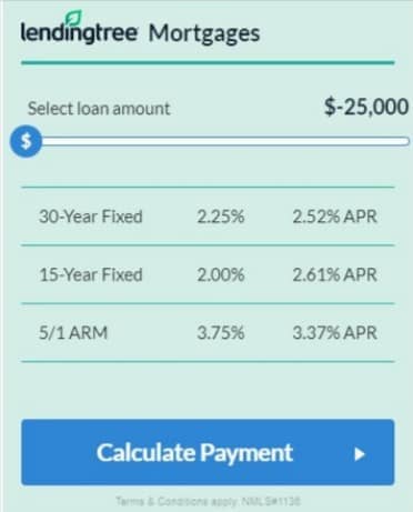
The brand created an interactive ad that captivates the audience by presenting precisely the information they are interested in. Details of financial transactions, numbers and percentages are what can draw attention to the banner. What else is interesting:
the large size of the banner, which is made to look like an eye-catching financial calculator;
the ad offers answers to specific questions.
If you offer a certain service, it is a perfect idea to show the interface so that potential customers can already get to know them.
* resource www.lendingtree.com
The beauty industry is full of examples of incredible designs. For example, IT Cosmetics draws attention with a huge product image, name, text and price. Each part of this ad contributes to getting the most clicks:
large and high-quality photo of the product, thoughtful text that attracts attention;
thoughtful elements that motivate you to click and learn more.
Once again, we make sure that a good product should be the star of banner, to attract even more audience to your site or resource.

* resource www.itcosmetics.com
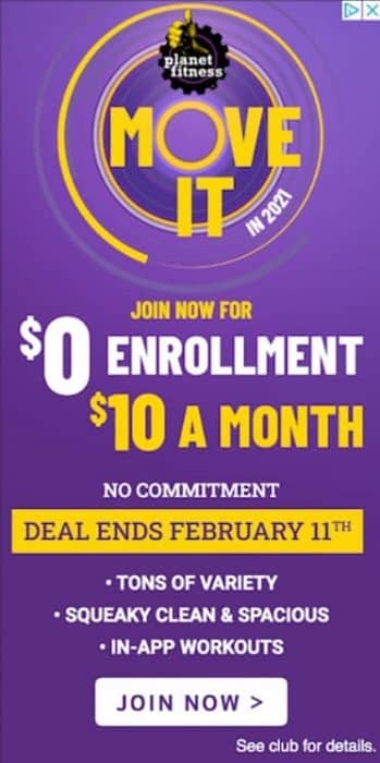
This is a traditional limited-time offer. Planet Fitness gives potential customers every reason to click on the ad for more information. It's an exceptional offer (especially if it resonates with the target audience's needs), ensuring increased clicks and boosted sales.
Banner is made with firm colors, which are difficult to ignore. Plus, there are clear and detailed reasons to act now (and they're profitable, which is also important). A deadline is an added incentive to click right now.
* resource www.planetfitness.com
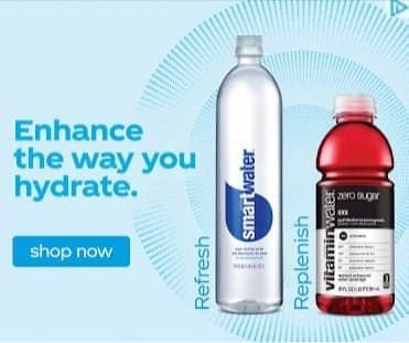
Smartwater doesn't waste a single word in this ad. The banner is well-designed with vibrant colors, showcasing the product through images, and featuring carefully thought-out text. The overall combination captures attention and serves as a strong motivator for making a purchase.
Positive sides of the advertisement:
great use of product photos and bright colors;
combination of image and the text motivates the purchase of the product;
heavy emphasis on the “shop now” call-to-action button.
* resource www.instagram.com/smartwater
Do not watch this banner ad unless you are on your lunch break. Here everything is simple and clear: a large animated GIF with bright colors attracts attention. And the big photo immediately shows the highlight: a smart kitchen thermometer that will help create culinary masterpieces. The text is laconic and well-thought-out, and the banner style is made in corporate style colors. Brand Yummly knows how to get attention!

* resource www.yummly.com
A bright and contrasting example of a banner from MailChimp. Its distinctive feature lies in its incredible design, which is founded on a harmonious combination of colors and their strategic accents. The basis is the service's signature yellow color, and the use of pink is intended to create emotional triggers. And even if you don't click on this banner, you will definitely remember this company.

* resource https://mailchimp.com
Here we see the combination: banner from Nanopay, which advertises its liquidity management services on the Cloud Innovation homepage on Forbes. Again, targeting is a key factor in why this banner shows high efficiency. Nanopay is marketed to an audience of high-level professionals. The ad itself is simple, with a clear, laconic text and a simple CTA. If the targeting is correct, banner doesn't have to be complicated.

* resource www.forbes.com
Tableau understands that most companies use Excel to visualize their data. These banners advertise a service that will help create more valuable and useful information or visualize data. The design is bright, almost all the space is occupied by text that corresponds to the key message of the brand.

* resource www.tableau.com
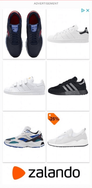
Here, Zalando advertises a banner with examples of comfortable shoes. What is special? Instead of advertising a single pair of shoes, the brand features six different pairs of different formats and styles. This approach broadens the appeal to a wider spectrum of Zalando's target audience, as everyone can select the option that suits them best. The brand also incentivizes the purchase with a 25% discount coupon on one of the examples.
* resource https://zalando.com
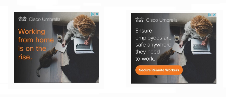
This is an animated banner ad from Cisco Umbrella advertises its cloud-based security services for remote workers. The story begins with an urgent problem for business development — the increasing need for effective remote work. Then a second frame appears, promising to protect employee data around the world. Image on a banner with a blanket and a cat, promotes a sense of security and peace.
* resource https://umbrella.cisco.com
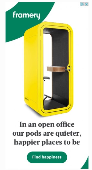
This creative banner ad promotes Framery office stands with a light creative touch. It puts the product front and center in a unique color, to attract attention (because everyone is used to white stands). The text indirectly points to the problems of open offices and suggests Framery Pods as a decision. "Find happiness" is a good example of creative CTA.
* resource www.frameryacoustics.com
This banner is an advertisement for the Huawei P40 Pro mobile phone with 5G. It highlights the main advantage and demonstrates it in action: a 50x, incredible camera and a unique screen. Advertising drives action with a special offer of £30 OFF and over £235 worth of gifts. It also promotes brand recognition, showing the phone's profile from different angles.

* resource www.huawei.com
What makes a banner ad effective?
visual appeal: is the ad noticeable among competitors and content of the site?
clarity and brevity: is the valuable offer clear?
creativity: does the ad stand out among all the typical ads on the Internet?
clickability: does it encourage you to click and learn more?
Tips for creating banner ads from BannerBoo:
728×90 – horizontal banner at the top of the page;
300×600 – half a page;
300×250 – middle triangle;
336×280 is a large rectangle.
Choose carefully. The best place, of course, is at the top of the page near the main content. That way, there will be more chances that visitors will see it because all attention is always focused on the first screen.
All ads must be properly balanced. This allows you to increase the effectiveness of banner advertising and guarantee brand recognition. A banner must have three components:
company logo (make sure it is visually noticeable and fits on mobile displays);
key offer (discount, special prices or benefits, premium quality, long-term warranty, etc.);
call to action (CTA) — text or button, which should explain what the brand expects from the audience.
Usually, the user sees the banner within a few seconds, so there is no need to create overly complex effects. Everything should be as simple as possible and at the same time interesting.
This can increase your click-through rate. Buttons should be bright and noticeable, but fit into the general idea and design.
First, the main paragraph and the heading should have different font sizes.
Secondly, the text of the banner should not exceed four lines, the less, the better.
Make sure that the elements are combined with each other and look harmonious.
Do not use italics, very thin options, or a font size smaller than 10 pt. Small text can only be for the transmission of copyright information or information that must be posted according to the rules of networks.
This will provide a sense of urgency and motivate to make a decision about the purchase as soon as possible.
For example, graphics and photos should reinforce the text if they are not related to your product or service – they should not be on the layout.
By the way, about image. It's okay if you can't afford professional photo shoots. As an option, you can easily use stock photos, the main thing is the quality and relevance of your banner topic.
Here are some ideas for using your own photos:
Inspiration is the key to creating effective banner ad campaigns. And if there are no ideas? Easily and quickly utilize banner ad templates by simply updating the essential information, yielding a polished outcome.
The BannerBoo banner ad maker will help with this.
Step 1. Log in to the service and choose the option «Create banner».
Step 2. Select the preferred banner format that you'll be working with (you can also set a personal size in pixels).
* if you have not yet chosen a style, we recommend you first take a look at the category Templates, to find an idea to implement.
Step 3. Choose the first option«Add image or video».
You can upload your own files or use quality stock backgrounds for your banners, just browse the collection and choose the right one.
Step 4. Add the logo and set the parameters for its placement.
Step 5. Write the desired text and specify its characteristics: font, color, formatting options and design style.
Step 6. Choose the CTA button and stylize it in the visual concept of the banner (set the color, shape, saturation and position).
Step 7. Download and incorporate any graphic elements in the preferred format to enhance the banner's style, modernity, and completeness.
Step 8. Set the animation parameters and make the banner so that it attracts attention from the first seconds of interaction.
Reviewing the completed banner ad design is convenient and straightforward. You can make any necessary adjustments after testing the ad or at a later time.
It remains only to download ready banners in the required format (via button "Save") in one archive and start an effective display advertising campaign!
Developing a brand indeed poses its challenges. While exploring various digital marketing strategies, it's crucial not to overlook the effectiveness of tried-and-true options like banner advertisements. To maximize the impact of your banners, infuse them with creativity and tailor them to meet the specific needs of your audience.
Using various banners will help:
lower clicks cost (because customers will respond better to advertising, and algorithms will consider that the information is relevant);
overcome banner blindness and fatigue from the monotony of ads;
be on trend and boldly experiment with various formats and monitor the reaction of target groups.
Consistently crafting a stylish design is key. This not only fosters positive connections with your brand but also encourages the audience to take advantage of special offers.
We wish you high conversion rates!