
The internet is abuzz with discussions about banners. Have they run their course? Is anyone really clicking on them? Could they be losing their appeal? Or has a game-changing alternative to banners emerged?
Sure thing! While banners might not be getting as many clicks these days, that doesn't mean the end of this popular ad format. Even if you can't measure the effectiveness of advertising, you can't really deny they still sway folks when it comes to picking products or services.
Sure thing! While banners might not be getting as many clicks these days, that doesn't mean they're down for the count. Even if it's tough to put a number on how effective ads are, you can't really deny they still sway folks when it comes to picking products or services.
Today, we're diving into 15 design tricks to craft banners you'll proudly show off. We're taking inspiration from the 2015 Webby Awards' champions as our examples.
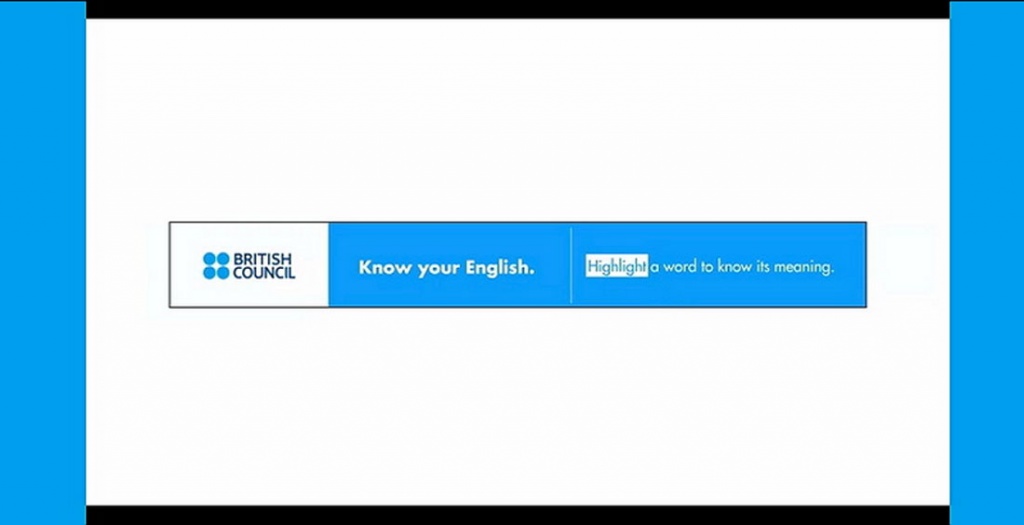
Banner ads aren't a one-size-fits-all deal. You've got to tailor them to fit the specs demanded by the platform you're advertising on, and most sites roll with standard dimensions. This holds true for emails as well.
On Google Adwords, one of the largest servers of banner advertising on the Internet, you can learn about the most popular dimensions.
Below are the sizes you should choose first:
Each banner should contain three elements: branding (logo), message and incentive to click. The problem is that you don't have much room for it.
Craft a straightforward element sequence. Keep the message concise – ideally, two to ten words. Clearly state what you're offering and why it's irresistible. Incorporate a readable, moderately sized logo or another identifier. Finally, present the enticing click trigger. Perhaps a current sale? A coupon code? Or a mail subscription?
Each of these components should be placed compositionally according to the basic principles of design by size, space, weight and color to guide the user from element to element.
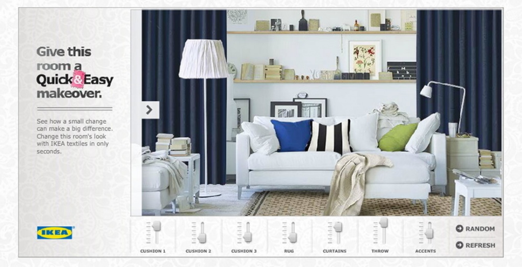
Advertising banners should not be an endless carousel of messages. And although you can use techniques like animated gifs to show several messages in one banner, it's not always the best solution.
Start with a concept that works like a static image. And only after that, feel free to spice things up with some cool animations or extra bells and whistles. Moving elements shouldn't be the only thing people see. Your message should be the most important thing on the screen.
Where do you plan to place the banners after you make the creative? If you're relying on platforms like Google, your placement control might be limited. But if you're aiming for specific sites, apps, or email newsletters, brace to dive into these platforms' specs and styles before crafting your banners.
Opt for colors that starkly contrast the site's design and backdrop. This distinction will ensure your banner pops. Employ crisp colors and easily legible fonts. Even if your banner's theme aligns with the site's product line, opt for striking visuals that truly stand out – it's the key to eliciting the utmost response.
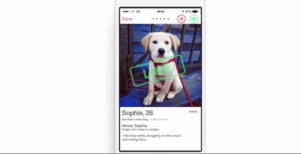
What is the most important task of the banner? That's right — it should be clicked. Use a call to action (Call to Action) in every banner you make. Tell the user what to do next.
The users can subscribe to the mailing list, go to the site, get a discount, etc. But you have to convince them to do it. In such cases, a direct instruction works perfectly — because people don't want to think a lot.
Now it's obviously, but still, just in case, don't let anyone persuade you to create flash banners. You are wasting time, effort and money.
Use HTML5 instead. If you need to convert some of your old creatives and breathe new life into them, Google has a small lesson that will help you do this.
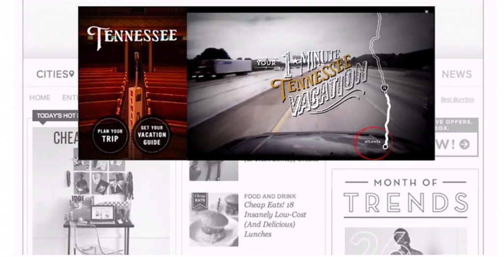
At times, absorbing information can be a challenge – a situation we've all encountered. Here, straightforward directions come to the rescue. While many users are aware, they can click on a banner, the addition of a button often nudges them to take action. (Indeed, the entire banner zone is clickable, but the button serves as a potent visual prompt).
Therefore, incorporate buttons. Elaborate designs aren't necessary; straightforward phrases like "buy now" or "learn more" wield significant influence, transforming banner views into clicks and eventual conversions.
The smaller the area you are working with, the greater the importance of font selection. Banner ads are mostly very limited in size and compete hard with other site elements. So use clear fonts that are easy to read.
As a rule of thumb, two fonts are usually enough.
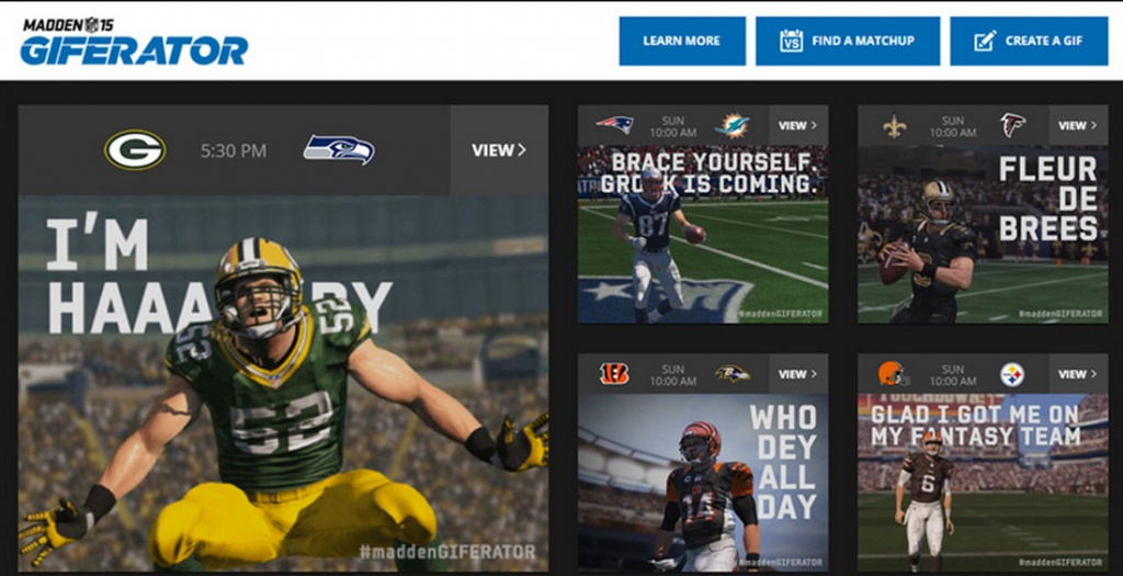
One of the biggest trends in banner advertising is simple animation. For example, a funny character running through a banner, or a cute girl nodding or winking at you from the screen.
What you definitely shouldn't do is the bright yellow or orange flashing screens from the banners of the past. We're talking about little tricks that spark interest and make users take a second look at the banner. A simple animation can be like a little wink that grabs attention effortlessly.
This is an important point. No one will place your ad if the files are too heavy or the banner is in the wrong format. Optimize the size as much as possible. The final size of the files should not exceed 150 KB, depending on the area of the advertising banner.
After that, make sure that the banner is made in the correct format, standard for Internet advertising. Common banner formats are PNG and JPG for static banners, GIF for animated ones. The SVG format is also gaining momentum and is increasingly being adopted by various advertising networks. Forget about SWF (Adobe Flash) — almost everyone has abandoned it now, and even browsers have stopped supporting it. Instead, HTML5 banners, which are created with the help of such programs as Google Web Designer, Adobe Animation, or online banner maker BannerBoo, have become widespread.
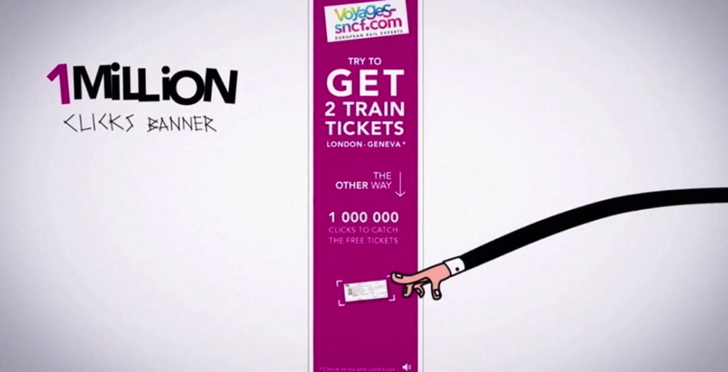
Certainly, you might argue that this isn't exactly within your purview, yet copywriting stands as a pivotal element when crafting a banner. Despite the limited text space, crafting a compelling message that drives sales demands a substantial investment of your creative effort.
You're not going to cram 100 words into a banner, are you? A viable option is to work with a copywriter that will help you choose the right message. Choose expressions that are used by users' queries, or come up with messages that are intriguing to get their attention.
Banner ads serve as an extension of your advertising campaign and should harmonize seamlessly. Despite differences in shapes and sizes, the overarching visual aesthetic should remain consistent.
So when creating banners, think of them as a part of your marketing strategy.
To uphold a consistent style, employ uniform colors, fonts, and images across all materials. When dealing with a compact banner format, consider concealing the logo or creatively cropping photos that are typically full-sized on other media. This is a natural part of the process. In essence, it's crucial to lay a strong foundation to ensure a harmonious outcome.
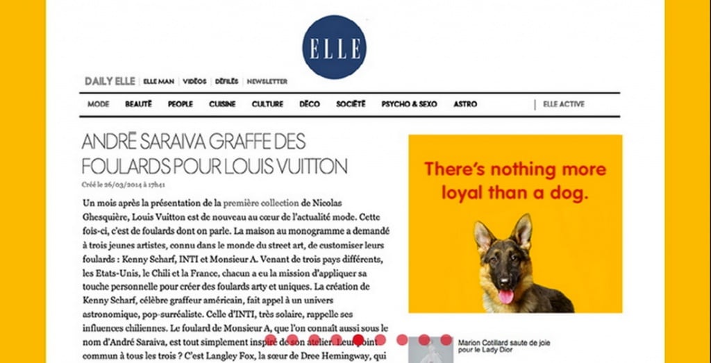
Images within banners are compact, and at times, even exceptionally diminutive. It's essential to select the most impactful and detailed image to achieve the desired impact and effectively engage the user.
If you use photos of people, focus on the face. If you're selling clothing, show one entire item instead of a wardrobe. Lean towards simple compositions — a picture and text next to it. Not a picture in the text, and not a text in the picture. The user only has a few seconds to see your message. A strong, meaningful image and strong marketing text next to it is your win strategy.
Nothing surpasses the effectiveness of a meticulously crafted advertisement. When a user clicks on a banner showcasing a t-shirt they wish to purchase, the link should seamlessly guide them to the product. This thoughtful approach earns appreciation from users.
Yes, you may need to put in a little more effort to get things working as they should. Landing pages created specifically for an advertising campaign are just that option. Adhere to the general style in banners and landing pages so that the visitor does not get confused after clicking on your page. Study the analytics and watch the conversion to understand if everything is working well.
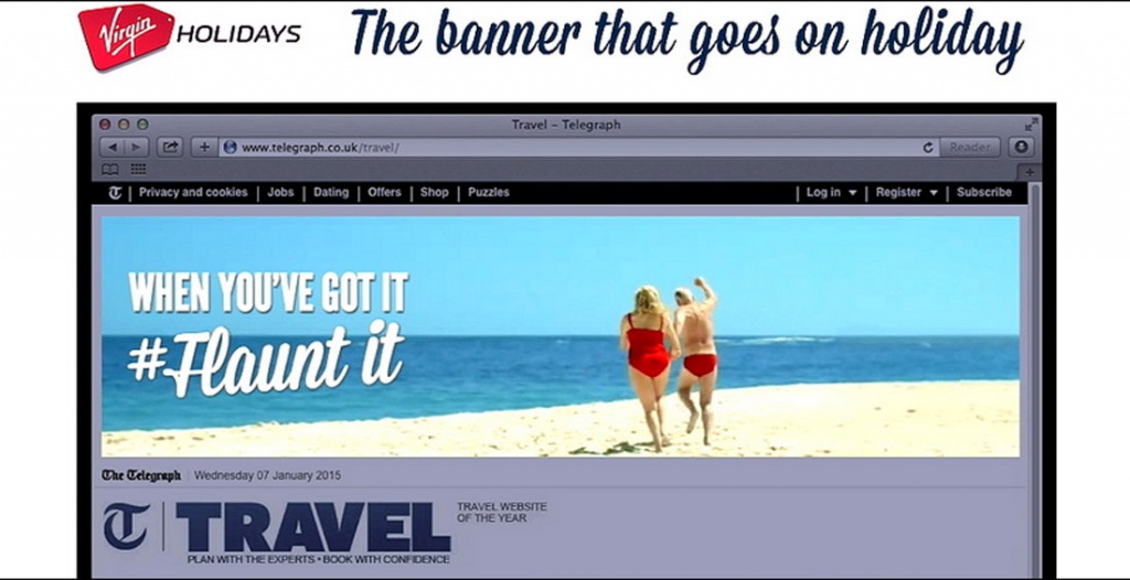
This is absolutely true. If you load the user with a lot of text, animations, colors, facts, you risk losing the main message. Be simpler. In the case of banners, just one will be enough.
So, banners are not dead yet. (And it's not a fact that it will ever happen). Banner ads can be an effective way to reach your target audience and increase your brand awareness.
The author is Carrie Cousins. (Adaptation — Bannerboo.com)