You've caught wind of what the skeptics are blabbering about, right?
Banners are dead! Long live content marketing!
And you also had to see the statistics, right?
As Google's DoubleClick data tells us, in America the average CTR (click-through rate) for banners is only 0.10%.
Well, let's make it clear to everyone — you'd sooner give birth to twins than click on the banner.

Solve Media discovered that you are more likely to give birth to twins than click on the banner. Image Francisco Wong from Flickr.
So, here's the thing: are banners really six feet under?
Despite the howling of skeptics, the answer is concrete — no!
According to a recent report IAB Internet Advertising Revenue Report they live on about 3.5 billion dollars.
Not bad, right? So what's the trick then?
The issue is, many marketers have tunnel vision. Instead of taking in the whole view, they're fixated on the pixels. Their banner might rack up loads of clicks, but they're missing the journey from funnel to conversion.
Our clever ad game isn't stopping there. Let's level up and get smart (and stack some cash) by diving into these four moves.
This step is actually crucial, so let's start with something simple.
There is one fatal mistake that marketers make when they get down to business: they have no idea about the "wide end" of the funnel.
In other words, they only look at how many people clicked on their ad.
But you are smarter and can easily outwit them by setting up funnel tracking in your Google Analytics. You will discover two things that will help you earn real money instead of getting single clicks.
Google Analytics funnels — especially their visualization — will allow you to immediately identify weak points in your advertising campaigns.
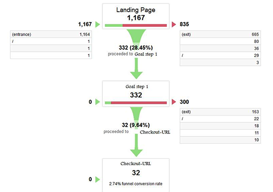
By creating goals for each step in the process, you can see where visitors are falling off and focus on what needs to be fixed.

In short, GA funnels allow you to see at what stage people are leaving your site. In this example, CTR is tracked from the top of the page to the second goal (for example, the pricing page) and to the final goal: checkout.
Well, let's say you run a fancy ad campaign in AdWords with a CTR of 6-8%. Cool, but how does your landing page convert those clicks into leads?
Or maybe your banners try their best, directing visitors to your product page, and you have a lot of abandoned carts as a result. Here are those moments of the GA funnel that you can also track.
No, of course, it's cool to generate traffic with cool banners, but the traffic doesn't pay the bills. Users — do.
Again, this is why it's vital not to get lost in the wide end of the funnel.
For example, you have a banner with an 11% CTR that only results in 2% conversions, while a less effective banner with a 3% CTR can easily generate much more profitable traffic.
The only way to know the truth is to look at the numbers.
If you haven't read an article from Moz Building Your Marketing Funnel with Google Analytics, stop reading this article, click on the link and bookmark it.
Then run GA funnel set up and start looking at the whole picture instead of looking for pixels.
Most marketers pay attention to those banners that are "out there": those that bring users from other sites or search engines.
Good, but then what to do with potential customers or users who are already loyal to you today? Here's the catch: getting a new user can cost you 6-7 times more than keeping your current ones engaged and encouraging them to make a purchase.
Most likely, you should already have fans or readers who know you and like what you do. So why not try to reach them?
Even if your website visitors are not yet your customers, they didn't just come to you. They are already involved. That's clear micro-engagement. Went into a fight — don't regret it.
While many marketers understand the importance of creating landing pages based on user traffic sources, not everyone pays attention to user behavior on each specific page (before and after conversion).
This is why setting up banner ads on your site is vital.
Fanplayr is one of the most resourceful SaaS companies that offers flexible setup of banner ads on your site. In fact, their individual approach allowed to increase the conversion of the Signing Time site by 18%, and the revenue of Seattle Coffee Gears by as much as 49%. Is this a joke!
How?
Fanplayr creates segmented offers and individual incentives (mainly coupons) that selectively appear in front of the user during his stay on the site. At this time, Fanplayr reviews and analyzes visitor history, page views, search queries, referral sources, and the device from which the login was performed.
And here is the company ConversionXL offers a number of other options for personalization.
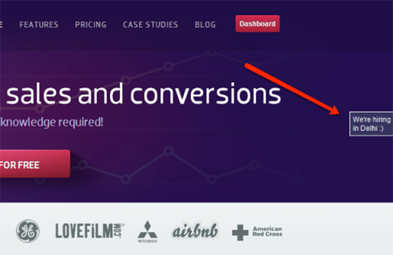
Visual Website Optimizer presented one of the most interesting case studies — they added a simple, personalized banner to the right side of their page when they were looking for employees in India :

The result is increasing the click-through rate on the job page by 149%.
Take a breather and brainstorm ways to level up your interaction with visitors. Tailored offers are your secret weapon to shine in the crowd and keep your potential clients smiling (and more likely to get involved).
Many A/B banner tests only test the reaction to the image and the text on it. That's fine, but what about testing the banner position?
What am I talking about?
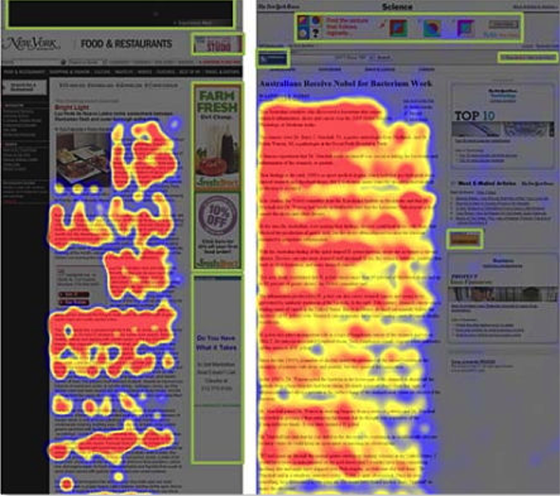
I'm sure you've heard before of banner Blindness is a well-known phenomenon, according to which Internet users ignore content posted in the usual banner places. And here is a thermal map that clearly demonstrates what I'm talking about.

Green squares indicate traditional banner positions, while red and yellow areas indicate the places where visitors pay the most attention.
Since almost all banners appear in the green areas, it doesn't matter how original or exciting your banner is — most people will simply not notice it. (We've already written about this once in our article)
Unfortunately, these are the only places Google's Display Network offers.

Banner slots offered by the Google Ads Display Network.
You can avoid banner blindness — just focus on the reason why your banners might not work in the first place.
You should analyze where they appear — their placement on the page.
How?
You can start by following the example of a company like Infolinks — which has offered four alternative banner placement options as opposed to traditional ones.

Using an Infolink placement approach known as InFold (where banners are placed just above the Windows bottom toolbar), the company Internet Brands.Inc was able to increase their website revenue by 2.5 times.
Additionally, you can test and track different banner placements with their analytics. A cool thing.
This is exactly the case when you look at it in action and think: "why didn't I come up with this?"
The world of marketing is simply buzzing with everything mobile.
Currently, Americans spend more time online on their smartphones than on computers — from 34 to 27 hours per month.
Here you go Responsive Banner Advertising Crash Course from Smashing Magazine — you won't find a better one, and don't even look for it.
For a more practical, functional approach (and especially if you can't live without Google), read up on responsive ad units. (Here this and this article from Google support is a good start).
Responsive ad blocks give you a simple way to tweak how your ads appear — like their size and placement — depending on the screen they're popping up on.
When designing your responsive ads for Google, Facebook, or LinkedIn — keep two cool things in mind:
Because images in responsive ads automatically resize based on the display's aspect ratio, images that contain text are poorly readable on mobile devices.
To avoid turning your ad into a jumble of unreadable words, use text that appears as text (for example, a text box under an image).
Given the limited space for mobile ads, the image you pick should not only grab the viewer's eye but also serve its purpose effectively. It's crucial that aesthetics don't overshadow functionality.
T-Mobile learned a valuable lesson from their recent ad campaign featuring Catherine Zeta-Jones. Let's see how the User-Interface Engineering resource reacted:
One elderly woman who wanted to buy a T-Mobile phone with large, easy-to-press buttons was very upset when she couldn't see the big buttons in any of the pictures. When she looked at the photo of Catherine Zeta-Jones holding the phone that she liked, she only became more annoyed. "No, she's certainly a very nice woman," the woman told us, "but I'd just like to look at the buttons."
In other words, if you sell a specific product, don't overdo it. Just use a high-quality image of the product or a zoomed-in shot of its key features. After all, that's what your customers want to see.
Digital Marketing Blog shows an example of three quality product images in action:

Notice how the first two pictures show the product in use? This is a great example of displaying a product in real-world conditions.
As a reminder, here are our four steps:
1. Track the visitor’s journey through the funnel from beginning to end, not just clicks on banners
2. Optimize your on-site banners, not just those "out there"
3. Test the placement of your banners, not just the slogans on them
4. Make responsive banners for mobile devices
Just don't jump into the whirlpool with your head. Start with the first step, do what is needed, and gradually move on to other steps.
And finally, remember: the dumbest (and least profitable) thing you can do is to do nothing at all.
Author — Aaron Orendorff. (Adaptation — Bannerboo.com)