Have you noticed that some billboards or banners attract your attention like a magnet? The irresistible desire to look at the details forces you to put aside all current affairs to enjoy the richness of shades and the harmony of color combinations. Although a modern person views on average from 4000 to 10000 advertisements, only a few manage to leave a lasting impression. What affects our perception? The secret lies in the skillful use of colors! The main thing is that everyone can create such combinations! That is why we will consider how, through the art of color combination, to convey a certain idea to the audience, cause associations, convey a mood and even inspire action.
Colors are an important part of a person's everyday life. They create a mood, help emphasize the individual style of each individual person, and also influence our decisions and actions. According to webFX, 85% of shoppers consider color one of the main factors influencing their consumer behavior. As visual creatures, humans rely on colors as a form of communication, evident from road signs to storefronts. Utilizing color effectively becomes a powerful non-verbal tool in crafting advertising campaigns that evoke emotional responses from the audience.
As color is a tool, designers use it to achieve practical goals. Choosing certain color combinations can improve text readability, draw attention to important elements, and create a sense of visual hierarchy. Here's how it might look in practice:
These are just a few examples of how color can influence design and development. By understanding the psychology and theory of color, designers can effectively use it to create attractive and comfortable designs.
Anyone can learn to perceive and use colors as a working tool. For this, you don't even need to have a special artistic flair, to begin with, it is enough to simply understand the principles of color theory.
Artists and graphic designers often use a vocabulary that is not always clear to a person far from art. Basic terms related to color theory are:
The nature of colors has always intrigued physicists and artists. Thus, as a result of experiments with a prism, Isaac Newton discovered that sunlight contains all colors except purple. After that, he arranged them in a circle. Red, orange, yellow, green, blue, and purple made seven unequal sectors. In the 20th century, the Swiss artist Johannes Itten refined the color wheel, increasing the number of colors. His circle is still used by designers and artists.
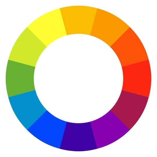
*Itten's color wheel
How to use the color wheel?
The standard color wheel contains 12 colors. Among them are:
If you are not sure how to combine colors, the theory of color harmony will help you. While diverse color combination techniques exist, most designers favor complementary, analogous, triadic, and monochromatic schemes. We will consider each of them separately.
How to determine complementary colors on the color wheel? They are located opposite each other. Thus, blue will match orange, red will match green, and purple will look great paired with yellow.
Analogous colors nestled closely together on the color wheel, are often favored for their harmonious appeal, especially when opting for softer hues. Their prevalence in nature and their pleasing effect on the human eye make them so popular.
If you look at the color wheel, then triadic colors will be located at the same distance from each other. For example, red, blue and green.
Monochromatic colors are colors that are derived from the same base hue, but may vary in their shade, tint, or tone. In other words, a monochromatic color scheme consists of different tones and shades of a single color.
This knowledge will help you create unusual color combos.
Color psychology delves into the intricate relationship between human perception and visual stimuli. While color preferences may vary among individuals, there exists a universal language of color that evokes a spectrum of emotions and influences our perception of the world around us. Using knowledge of color psychology, designers and marketers can communicate more effectively with users.
Red evokes the strongest emotions in people, both positive and negative. The first ones include love, passion, attention, energy and strength. If we talk about negative emotions, then this includes anger, aggression, war.
This vibrant color is often associated with happiness and joy. It also symbolizes hope for the best and self-confidence. If a brand wants to inspire its customer to believe in the future and optimism, they will most likely choose yellow.
Orange is the color of adventure and youth. Calmer than red, it is very cheerful and warm, and it is also loved by extroverts.
The blue color evokes in people a feeling of calmness, reliability and confidence. Blue can often be seen in the identity of banks and insurance companies.
Green is about life. It is the color of renewal and growth. Just look around, nature itself proves this point. That is why we associate green with harmony and inner peace.
The pink color is often associated with innocence, naivety, optimism and pacification. This color also evokes gender associations because, until recently, it was considered exclusively a feminine color.
Violet can be different. These are lavender, lilac, and purple shades. It is interesting that each of these shades causes different psychological reactions. Purple is associated with wealth, power and wisdom. It is the color of creativity, which is why it is especially loved by brands.
Creative block can strike even the most seasoned color experts. To rekindle inspiration and discover fresh color combinations, look no further than the world around us. Nature, art, and everyday objects provide a treasure trove of color palettes waiting to be unearthed. So now we bring to your attention 100 color combination ideas. You see most of them almost every day.
As we wrote, all the above combinations can be found and seen in ordinary life. If you are not sure about this or that combination, just think if there is something similar in nature or urban space. With a high degree of probability, you will still find the combination you need. And now we suggest viewing visual examples from our palettes.
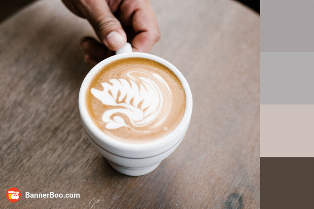
If coziness could be described with the help of colors, then we would definitely choose them! Use this combination in your design projects, if you want to convey an atmosphere of softness and comfort.
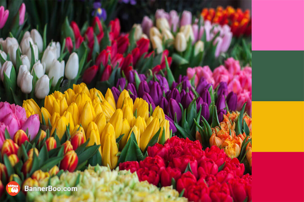
A cheerful combination that can be often seen in advertising before the start of the spring-summer season. Choose these colors if you want to convey a bright and optimistic mood!
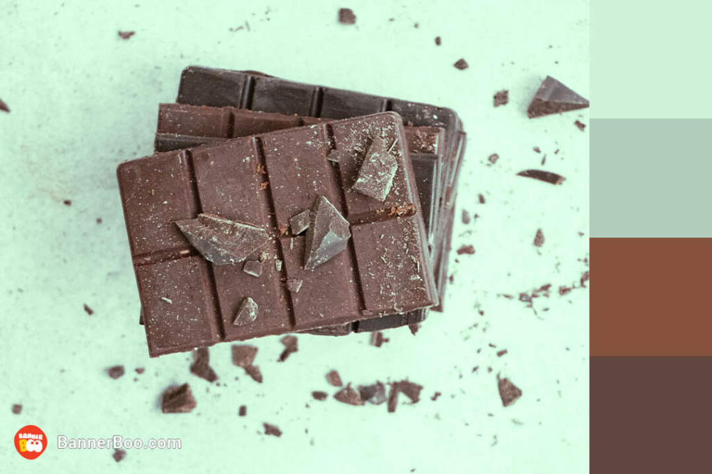
Brown and green are a match made in heaven. When using this combination, remember one secret: brown acts as an accent against the background of various combinations of green.
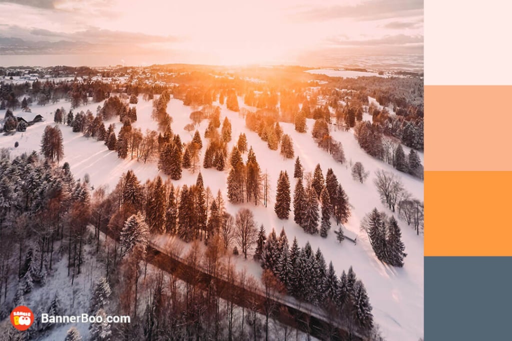
At first glance, it is a rather calm combination, but dynamics and power are felt in it. Often used in graphic design.
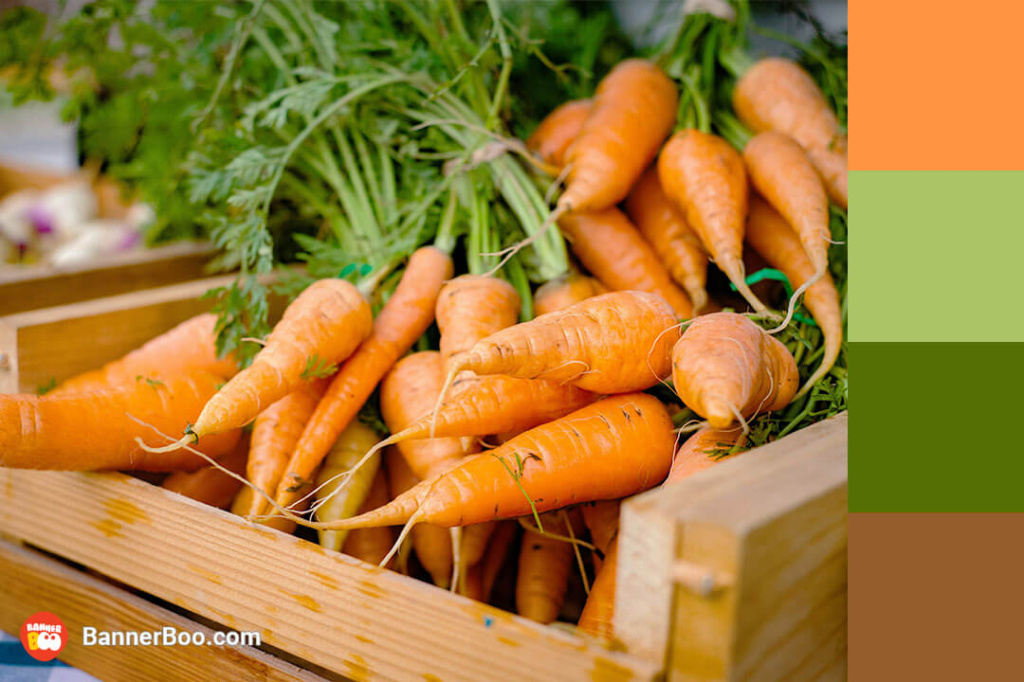
The combination of brown, green and orange creates a fresh color scheme that looks great in food advertising.
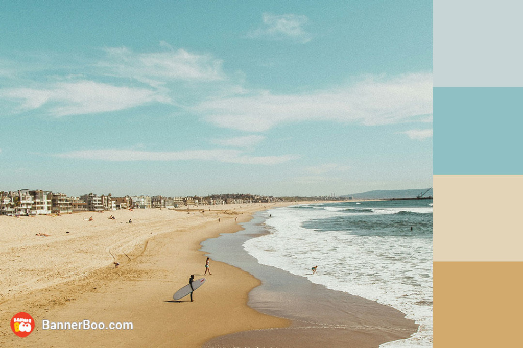
Light and bright colors are ideal for reminding the audience of carefree summer days, as well as for advertising banners with summer offers.
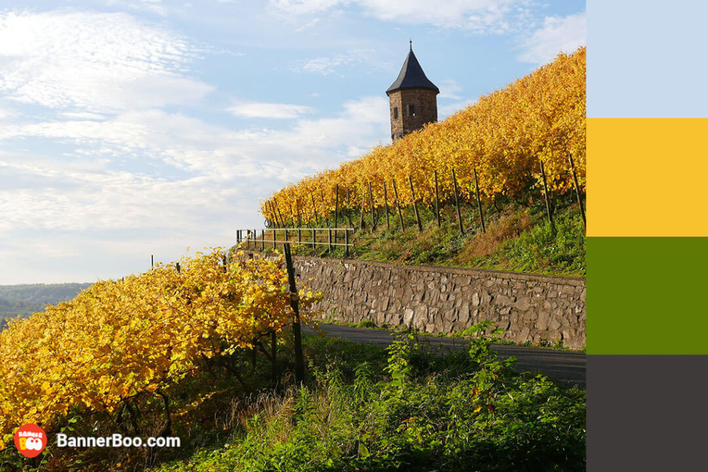
A combination that is the embodiment of autumn aesthetics. Blue and green go well with warm colors, adding balance to the image. A great choice for creating a visual identity for a wine shop.
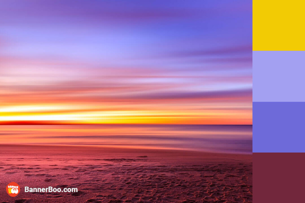
A dreamy combination that sets you up for a calm and relaxed time. This palette has captivated and inspired generations of interior designers.
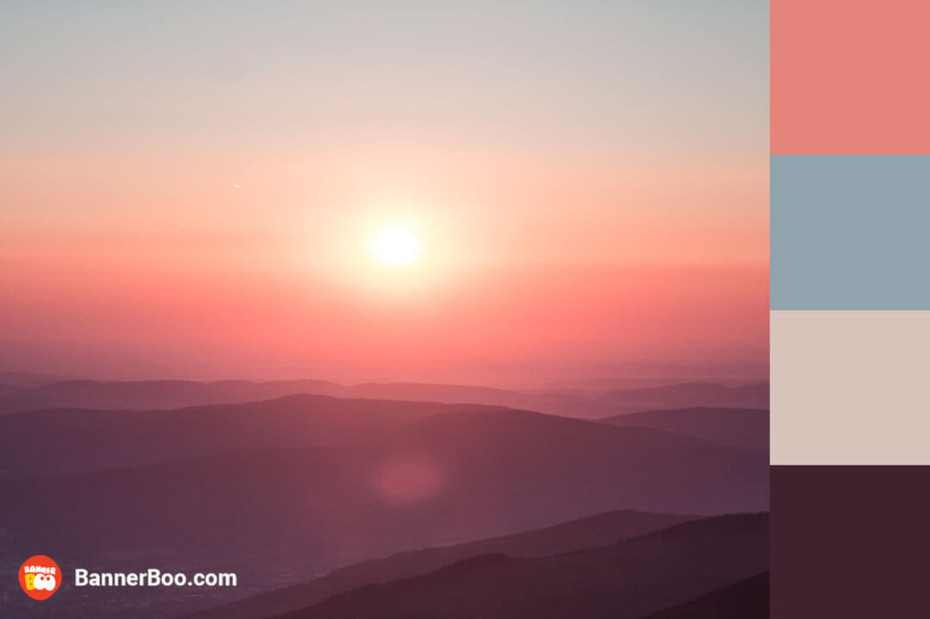
Variations of blue and orange are reminiscent of a spring or summer sunset. Fashion designers like to combine blue with orange.
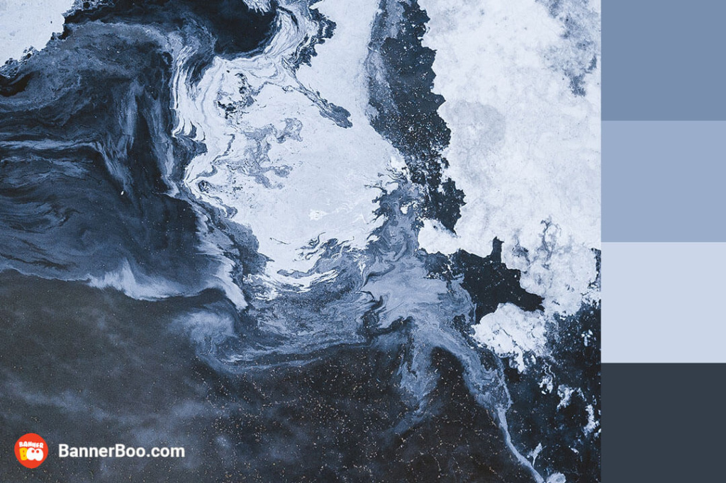
Cold blue shades exude a sense of tranquility and harmony, making them a popular choice for companies that prioritize fostering trust and confidence in their clientele. While this palette evokes a wintry ambiance, its rich contrasts render it adaptable to a wide range of design applications.
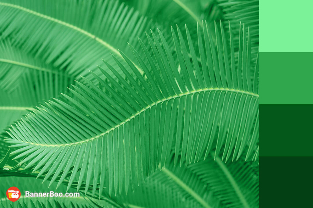
The combination of delicate shades of light green with rich emerald is a real pleasure for the eyes. The calm and life-giving energy of these colors is especially suitable for ecological brands.
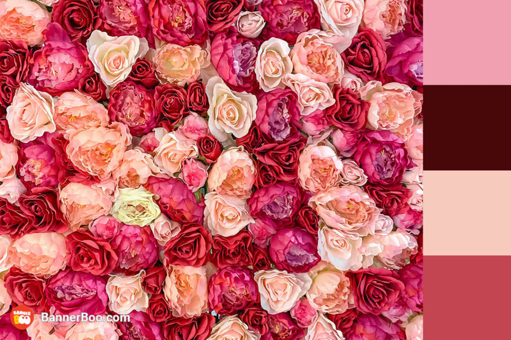
You can immerse yourself in the fairy-tale atmosphere of the most romantic holiday of the year with the help of a pink-red color combination. In this case, a small amount of black adds balance. The perfect solution for promotional banners for Valentine's Day.
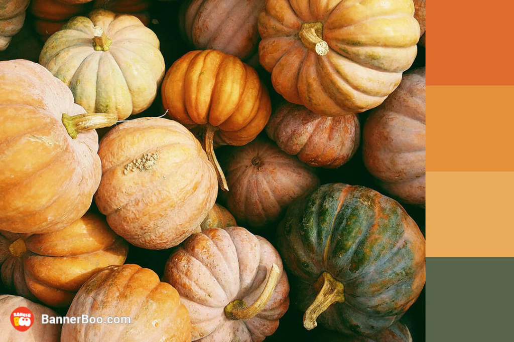
No other color can convey the autumn atmosphere like orange does. Black and green colors add to the palette earth tones.
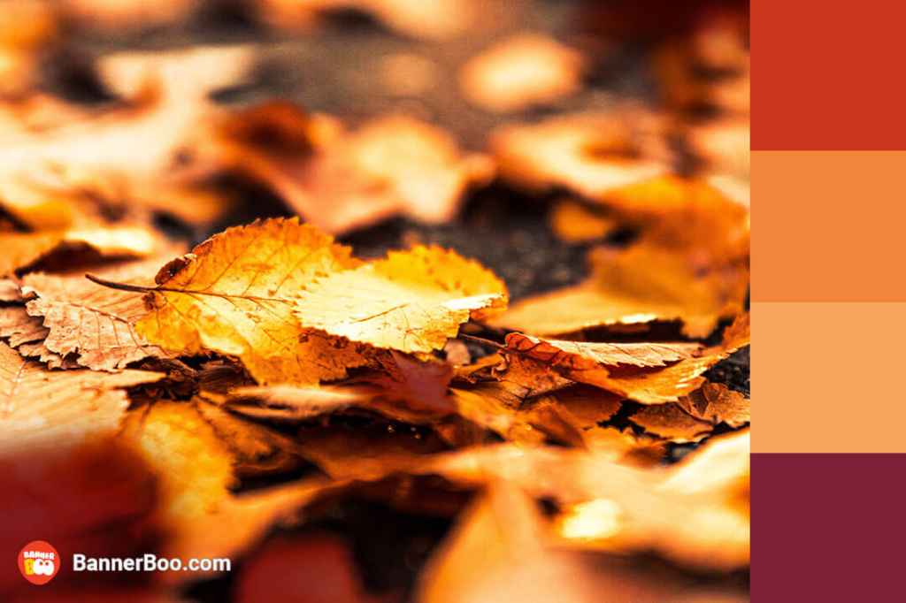
Bright colors united in this palette so that we can enjoy a warm autumn look. Every fall, graphic designers around the world use it in their work.
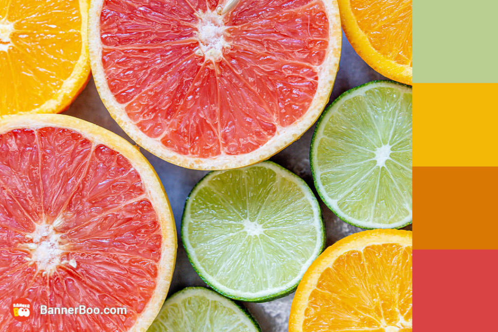
Such a bright fruit color palette makes the design playful, youthful and attractive.
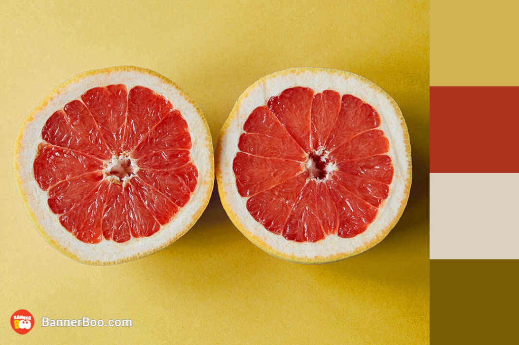
These bright red colors on a pleasant yellow background are invigorating at first glance! Designers especially like to use their cheerful effect in summer advertising campaigns.
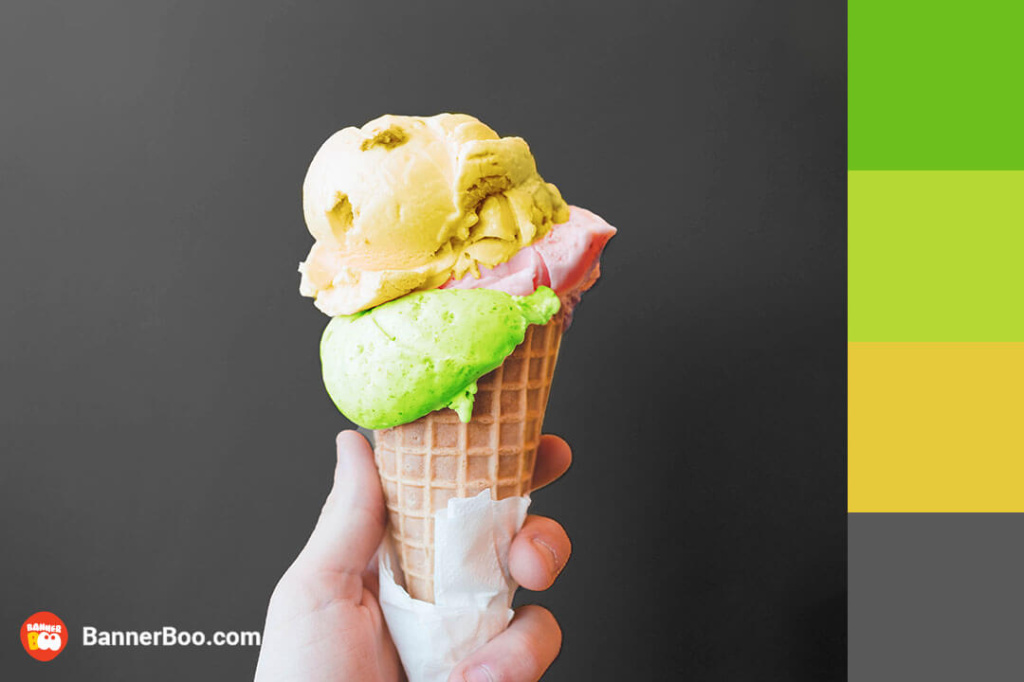
Bright fruit colors combined with a dark blue background to enhance the contrast. It can often be seen in advertisements for summer cocktails and desserts.
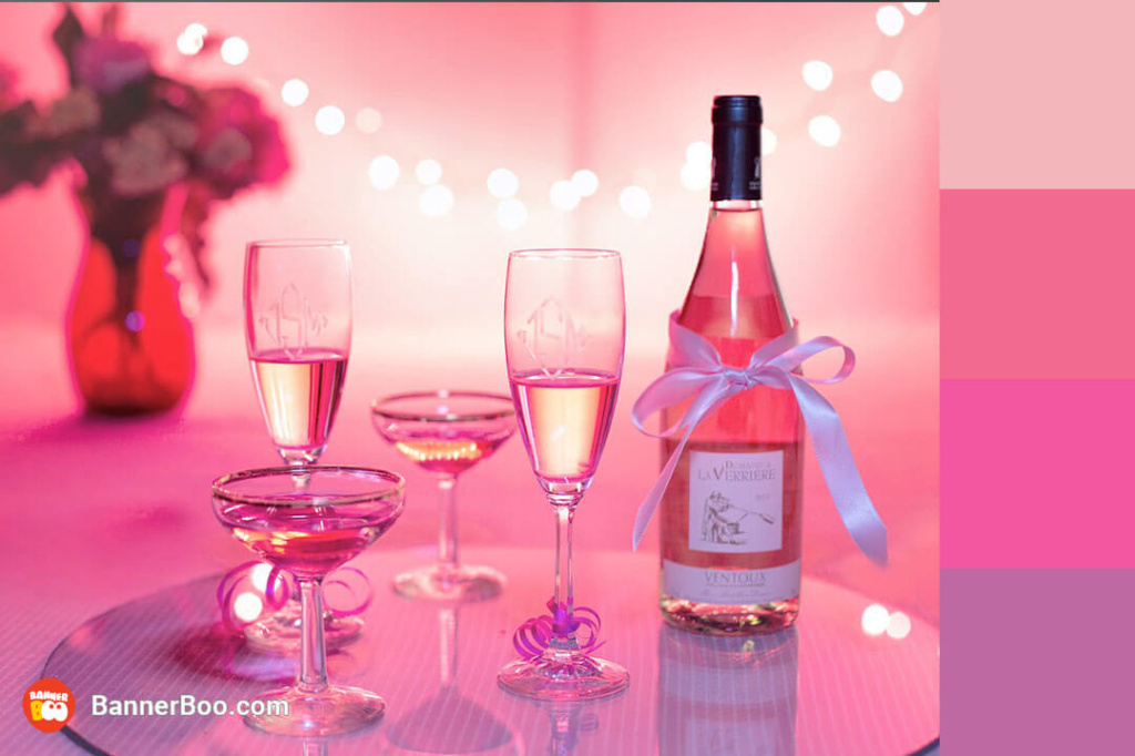
A similar monochrome color scheme is actually quite multifaceted. It fits both advertising of clothes and accessories, as well as themed parties. In general, 2023 is the year of rethinking pink.
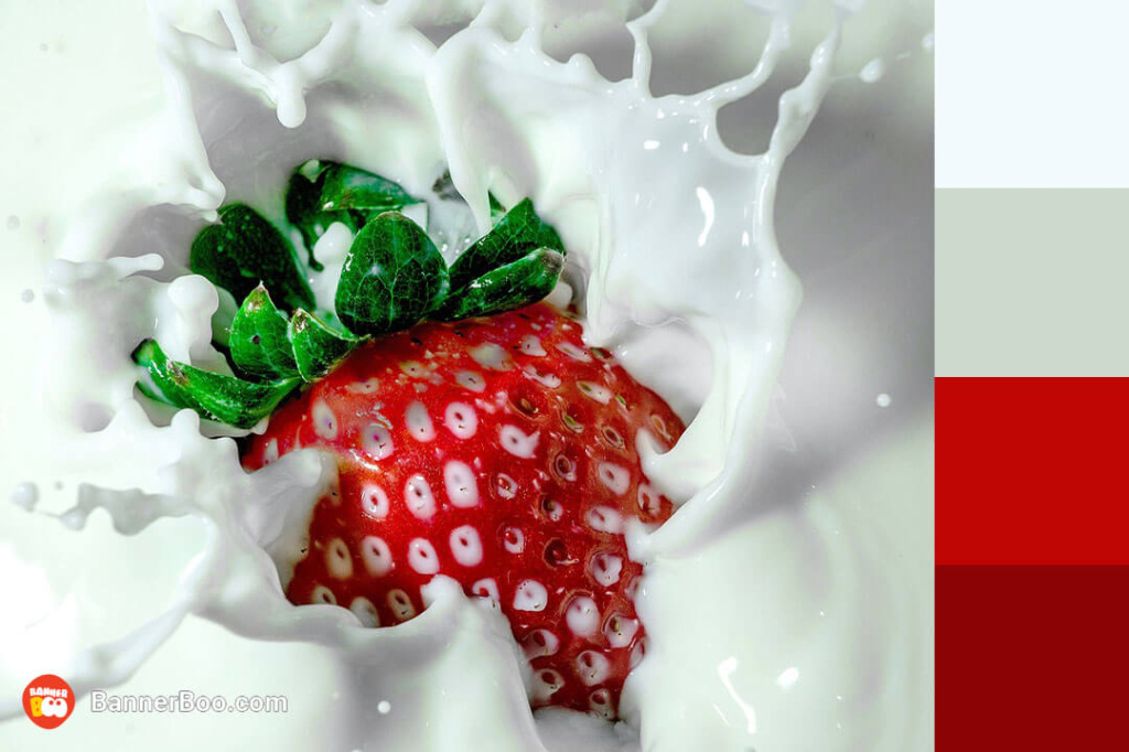
This cheerful blend of colors instantly sparks nostalgia, evoking memories of beloved childhood treats. Its widespread use in organic food store advertisements is a testament to its ability to evoke feelings of wholesomeness and natural goodness.
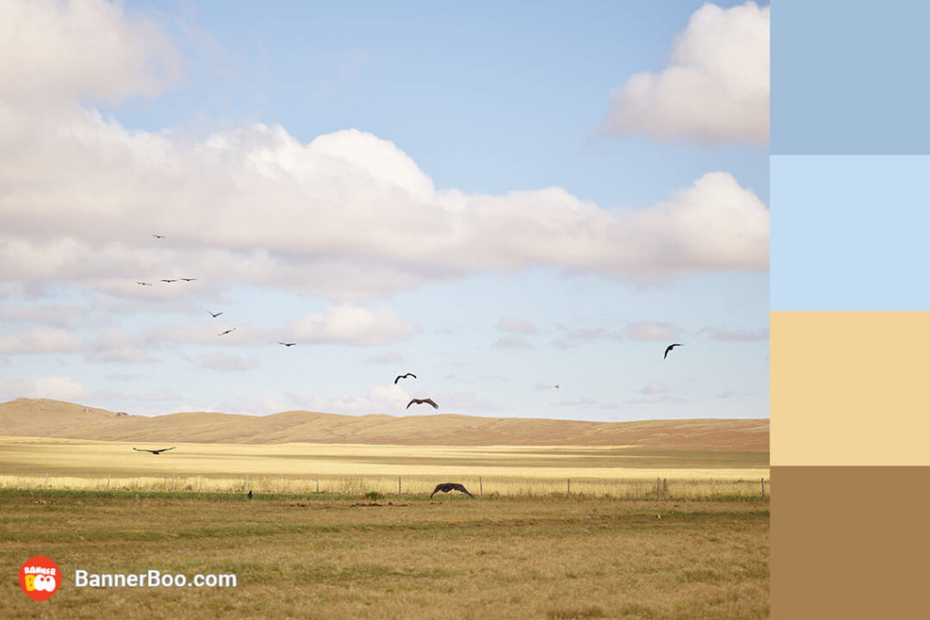
Calm, natural colors that evoke a feeling of harmony and freedom. An ideal palette for an advertising campaign of clothes made of natural fabrics or psychological courses.
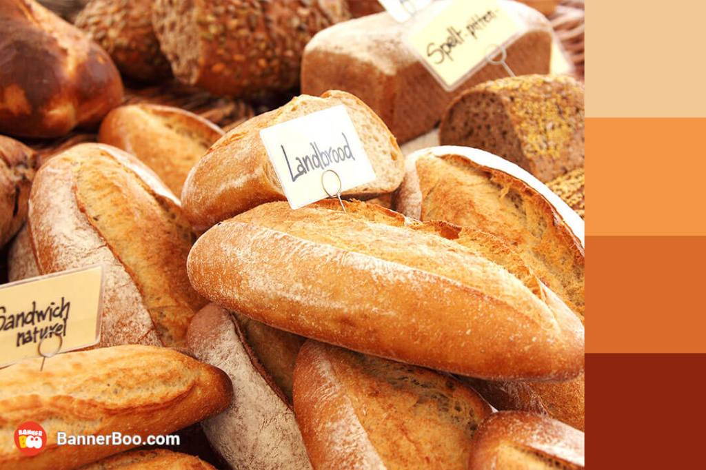
Brown tones perfect for advertising anything related to working on the land or vacationing in the country, and it also resembles fresh baked goods.
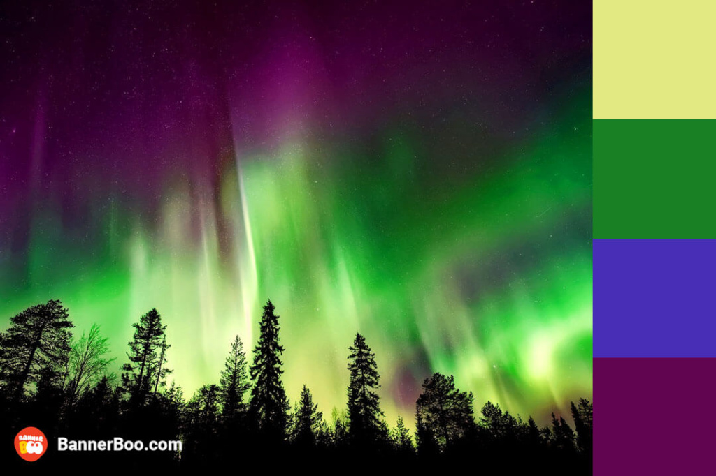
This color combination resembles the northern lights and conveys the atmosphere of something unusual, mysterious and mesmerizing.
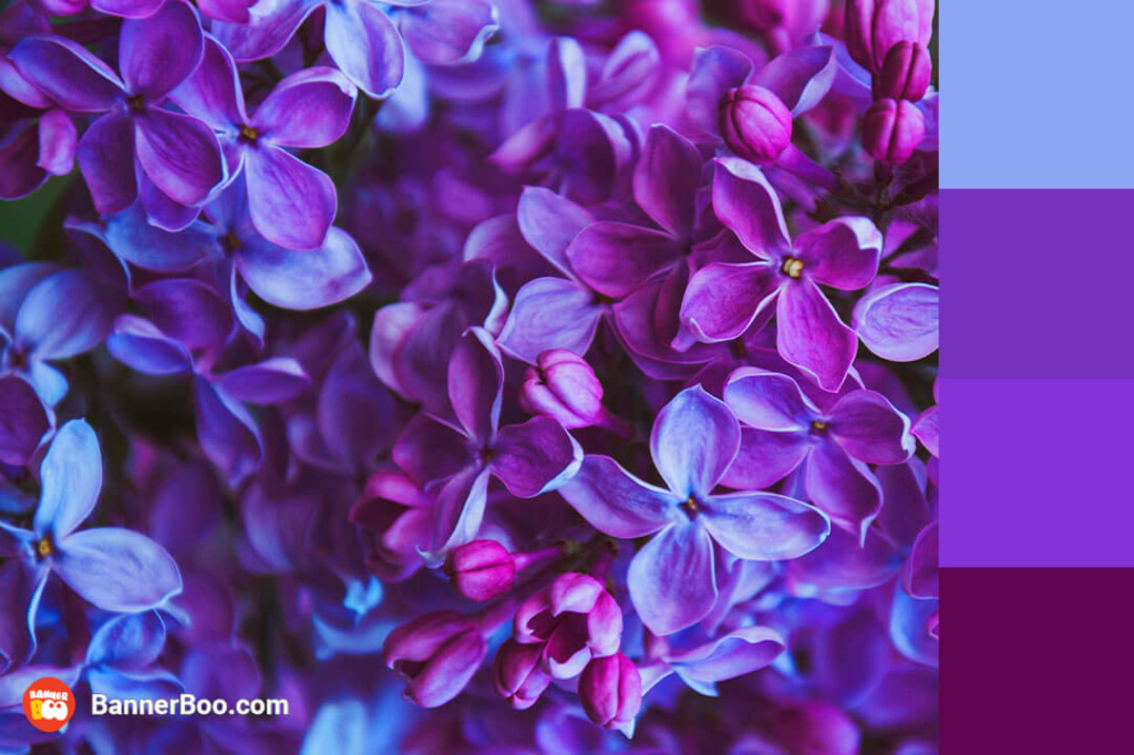
Nature-inspired shades of lilac and a calm blend of blue and green inspire optimism and faith in the best. It is also a color associated with creativity, so it will suit creative applications.
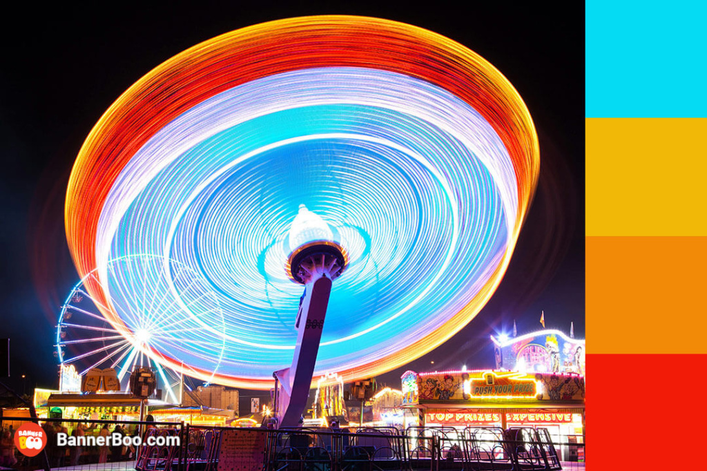
A dynamic, bright combination that conveys the carefree atmosphere of an amusement park and summer evenings.
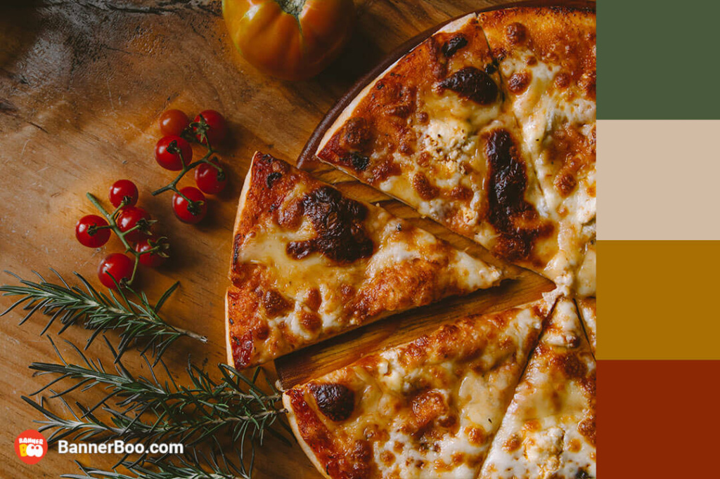
These rich and earthy tones evoke a sense of abundance and freshness, instantly stimulating the appetite. This is why restaurateurs have long favored these hues.

A harmonious combination of colors that conveys the atmosphere of a relaxed morning and comfort. Yoga instructors love to use this palette to design their personal blogs.
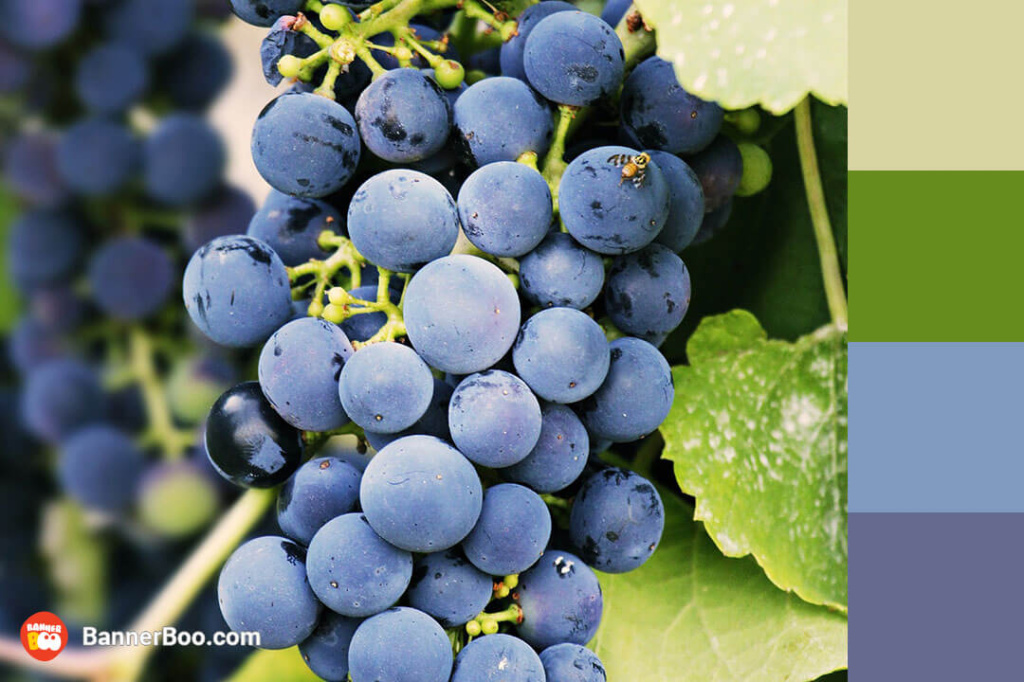
The elegance and majesty of this combination has a positive effect on a person's emotional state.
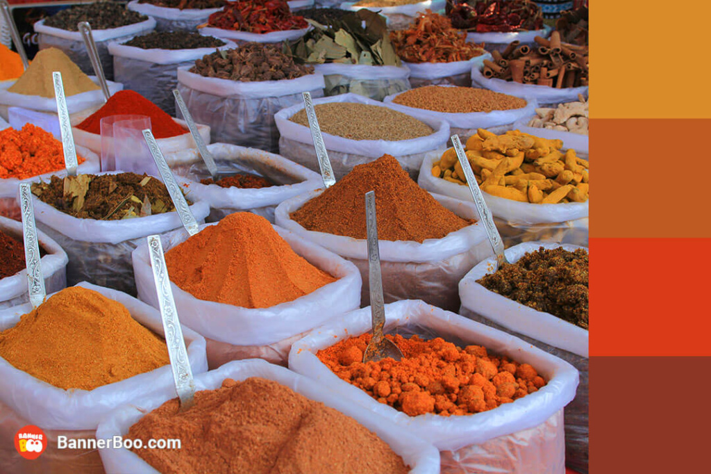
Bright colors for bold design solutions. This combination is also used by web designers for online stores of nuts and spices.
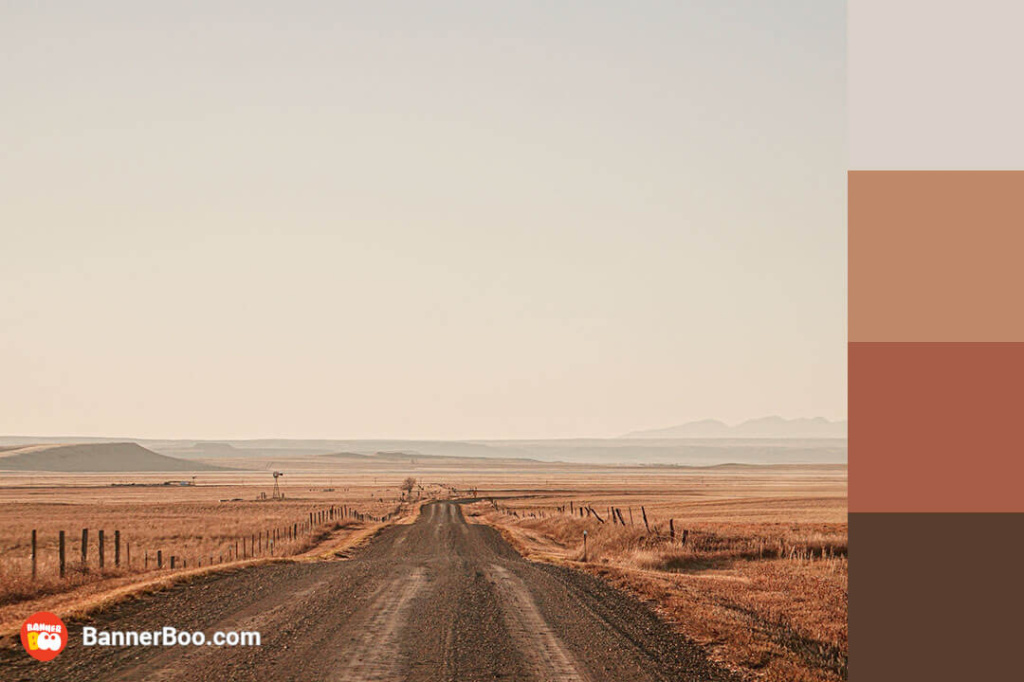
A palette of warm, rich brown tones. The variety of shades makes this scheme practical and versatile.

A cute combination of pale pink and soft gray colors, perfect for advertising cosmetics.
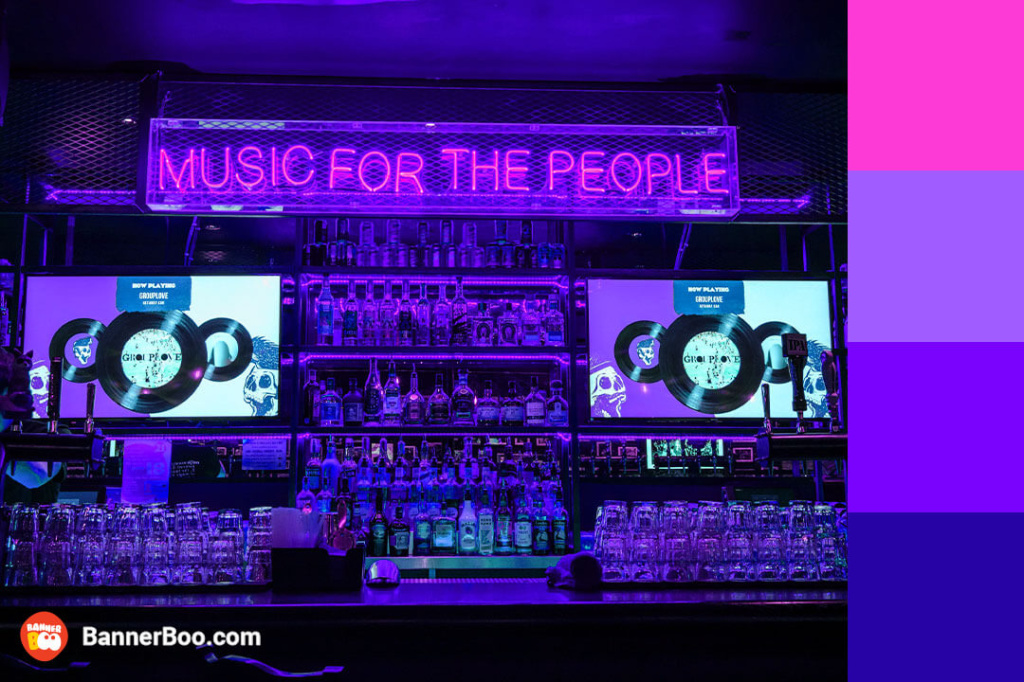
Neon hues are making a triumphant comeback, and pairing them with noble purple color, you can capture the attention of the audience with this bright accents.
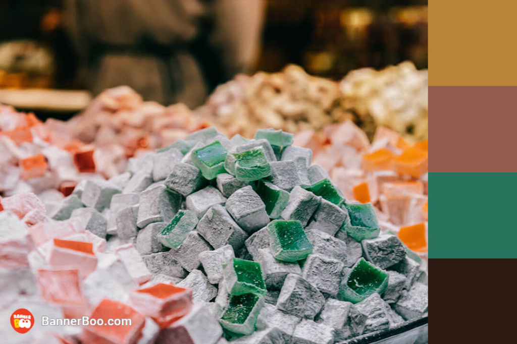
Color combination to create a pleasant and warm atmosphere. It is quite expected that interior designers often use it in coffee shops.
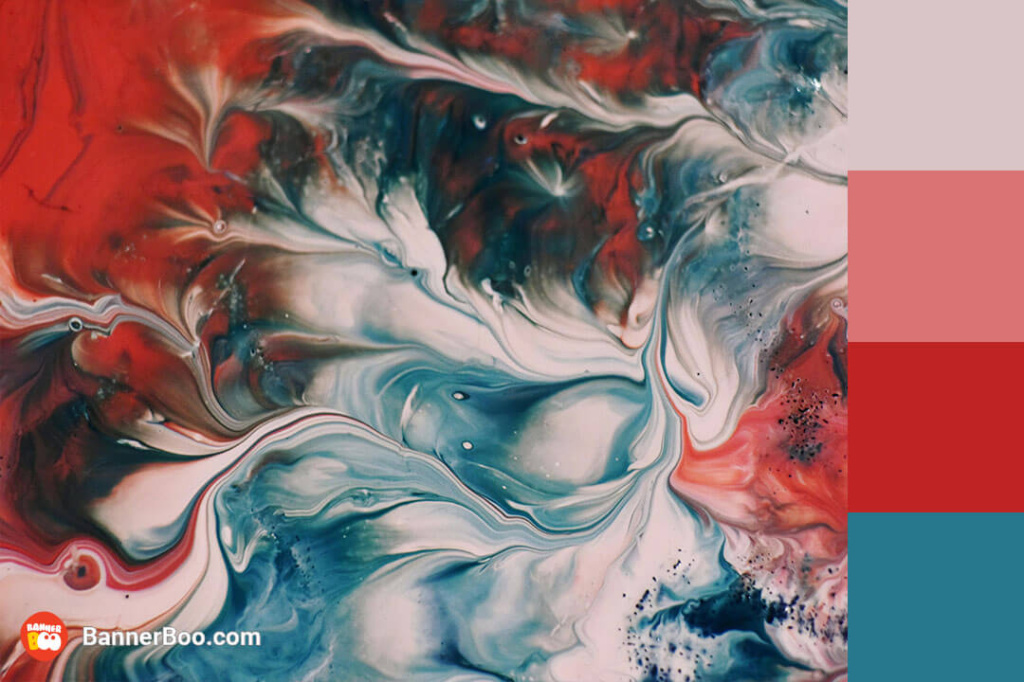
Such combinations help to create a dynamic design and convey a sense of movement.
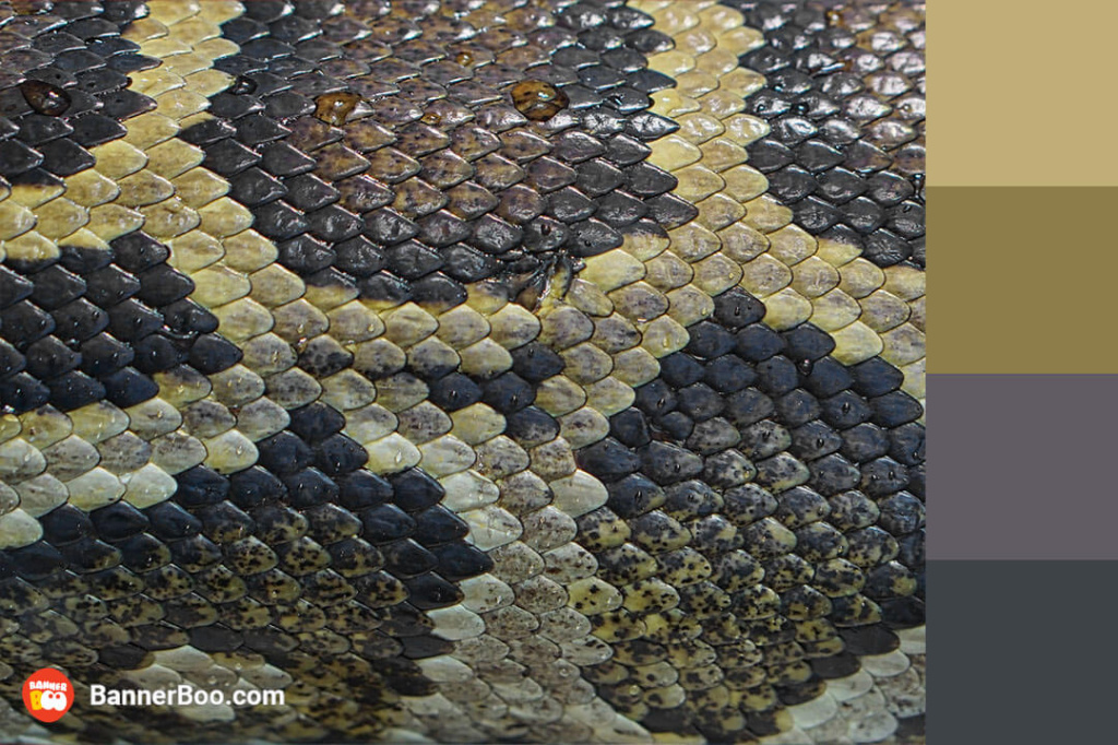
An original combination of colors that will look great in advertising fashion clothes and accessories.
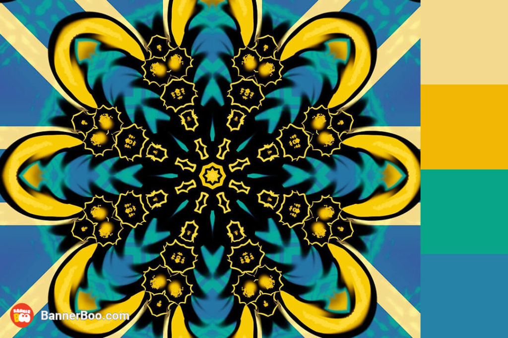
The use of intricate patterns with many colors is a new trend. Such complex motifs are well-suited for use as a background.
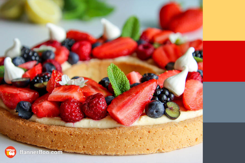
This tetradic color combination will make anyone dream of a slice of such a tart. Bright and rich, and most importantly natural, they easily evoke associations with summer fruits from the farmer's market.
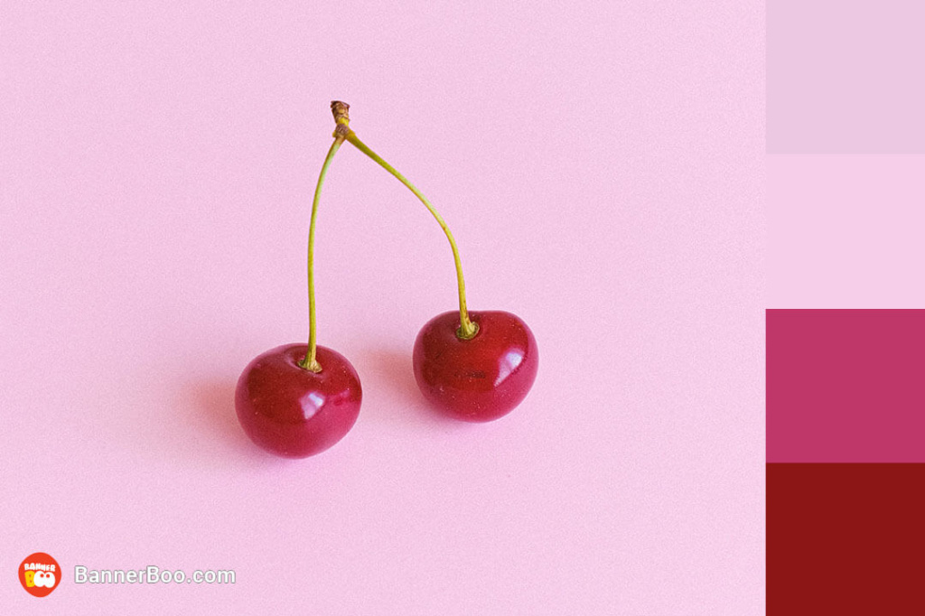
This fiery palette exudes an irresistible allure, evoking the vibrant energy and passion of summer. It's no surprise that this color combination is a staple in advertisements for swimwear, cosmetics, and other summer essentials, as it instantly transports us to sun-kissed beaches and carefree getaways.
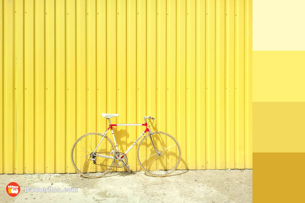
Joy, happiness and positive emotions radiate from the color palette dominated by yellow.
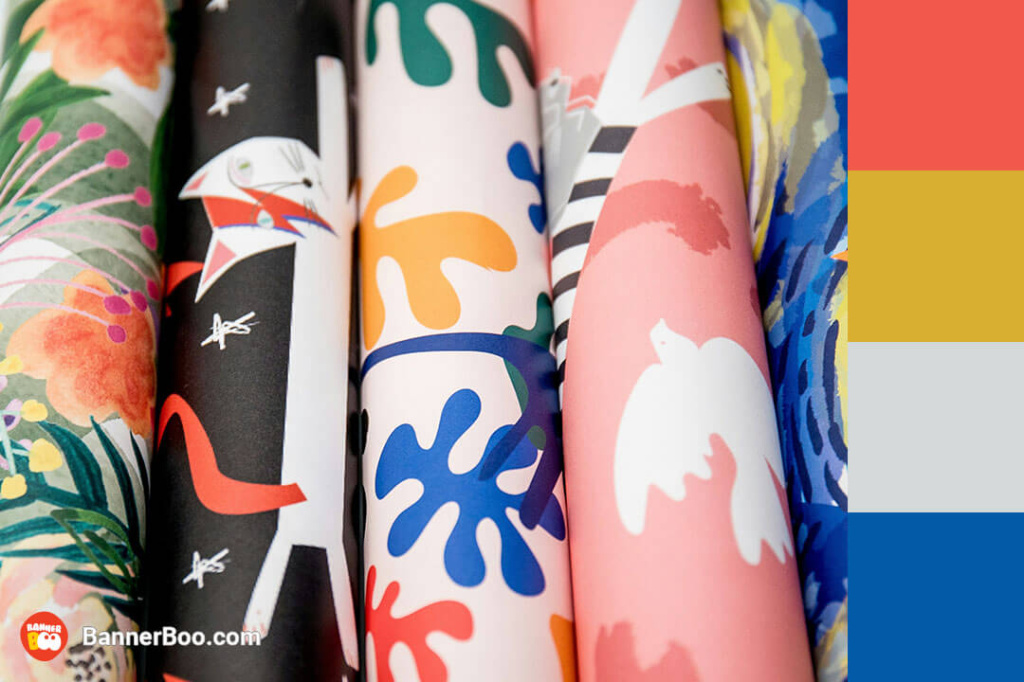
Bright pastel colors evoke a feeling of joy and childish delight. Similar combinations can be used as a background.
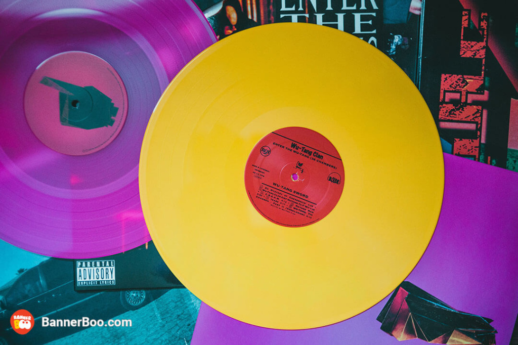
If you want something vintage, but not too old at the same time, this retro color combination will take you back to the crazy 90s!

A bold color palette, where all bright colors are harmoniously combined with each other. It creates a summer mood and makes you want to travel to exotic countries.
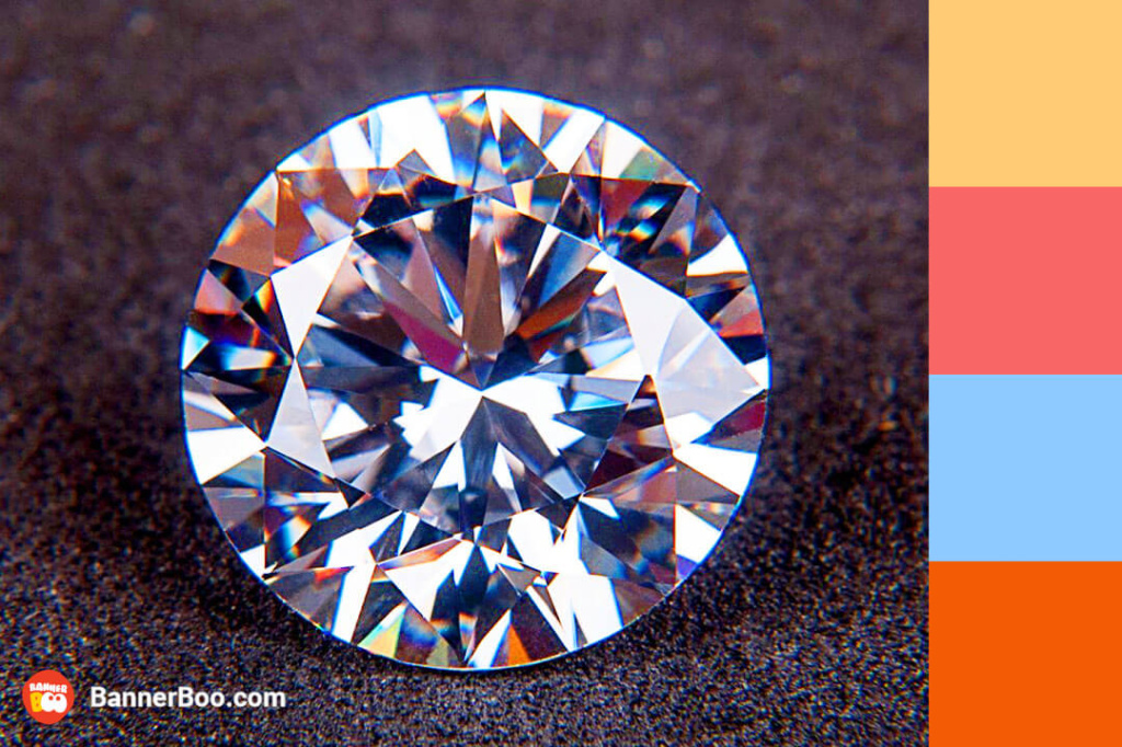
Bright shades of precious stones mesmerize people. If you want bold combinations, do not hesitate to choose such combinations.
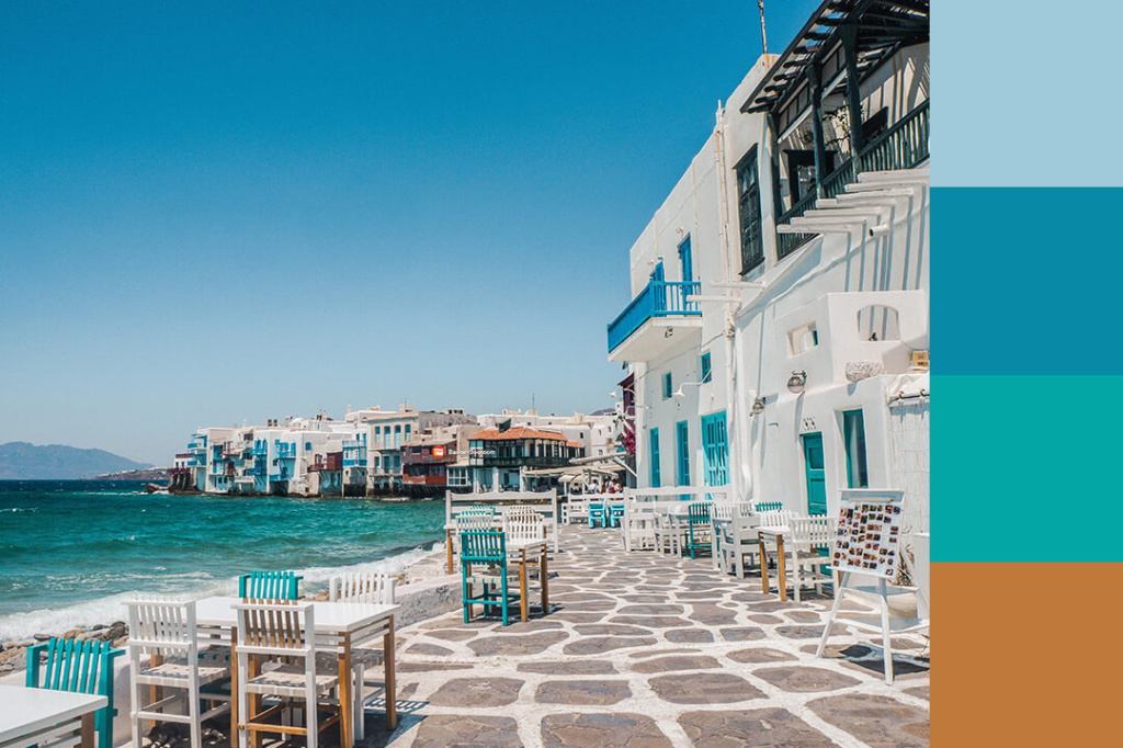
Santorini gained particular popularity thanks to its white azure color scheme. Such a combination not only creates a feeling of absolute peace, but also gives a sense of space.
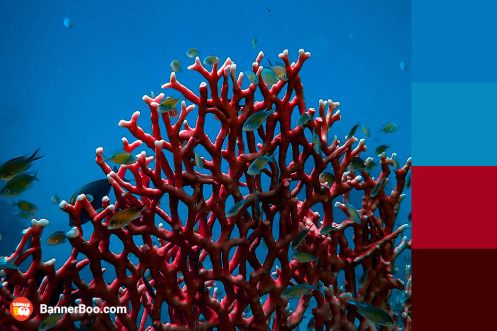
Red is a bright color. Add blue to it, and you will definitely receive a beautiful, rich palette that makes any design stand out.
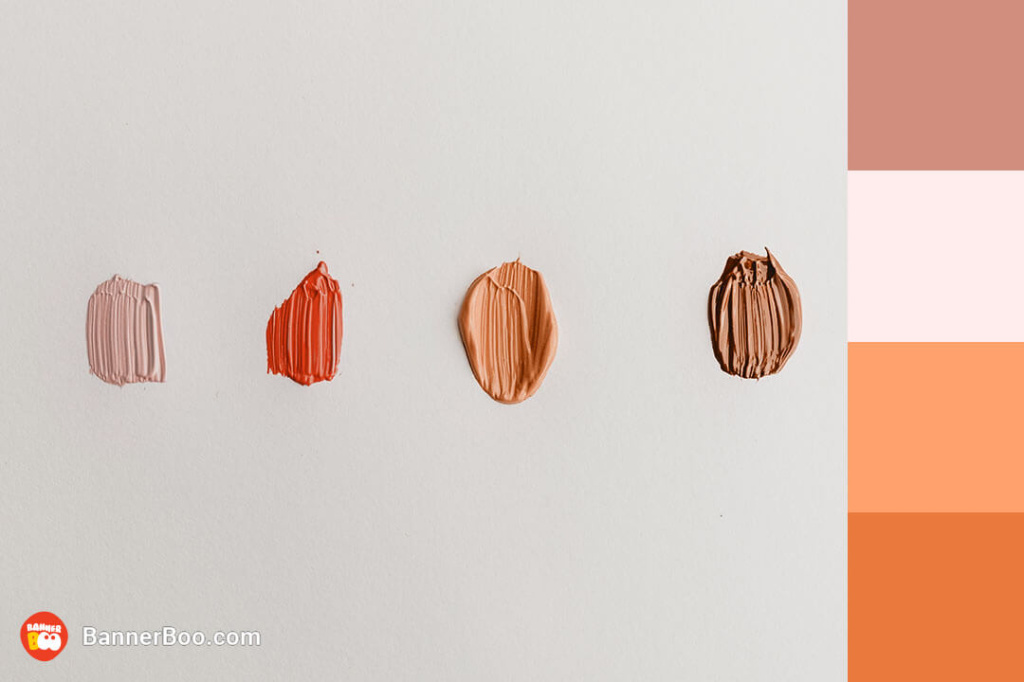
Even subdued hues, when paired thoughtfully, can create amazing scenes. This harmonious blend fosters a sense of comfort and tranquility.
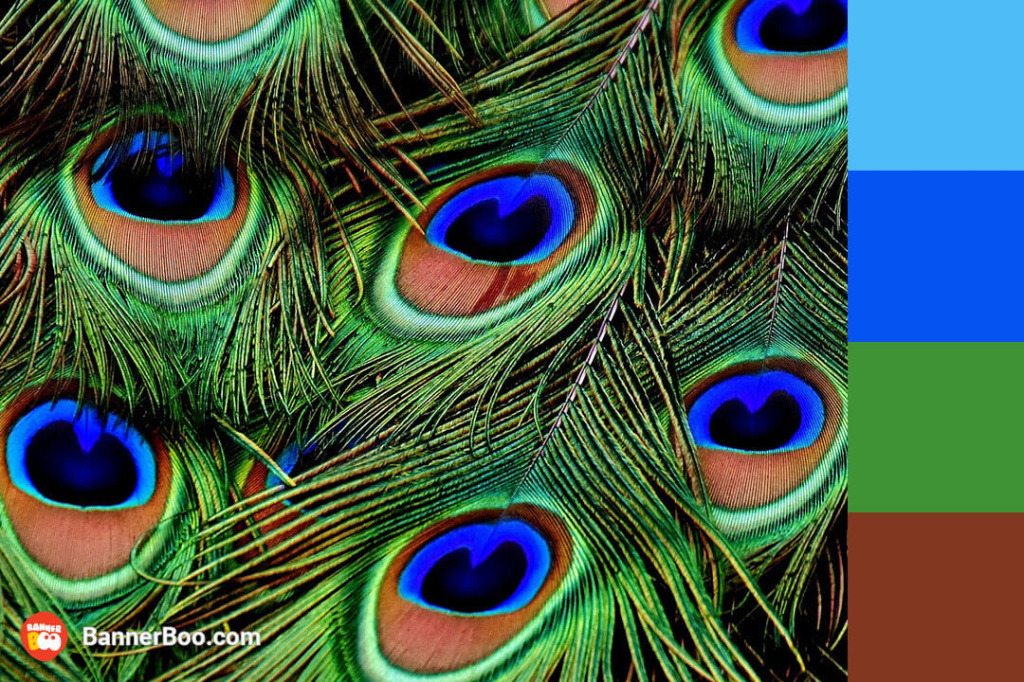
This combination of colors can add energy and extravagance to any design.
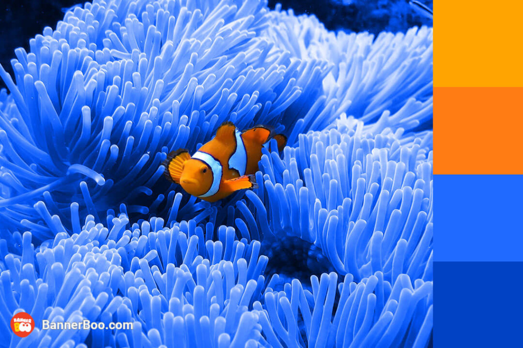
Orange and blue are a great pair. Both colors are full of energy and, when used in several shades, create a bright palette.
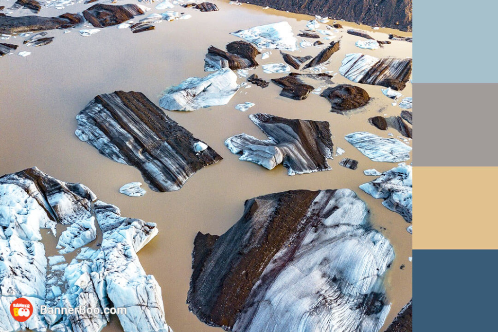
These gentle and calm colors, despite their delicacy, can enhance any design. Suitable for interior use.
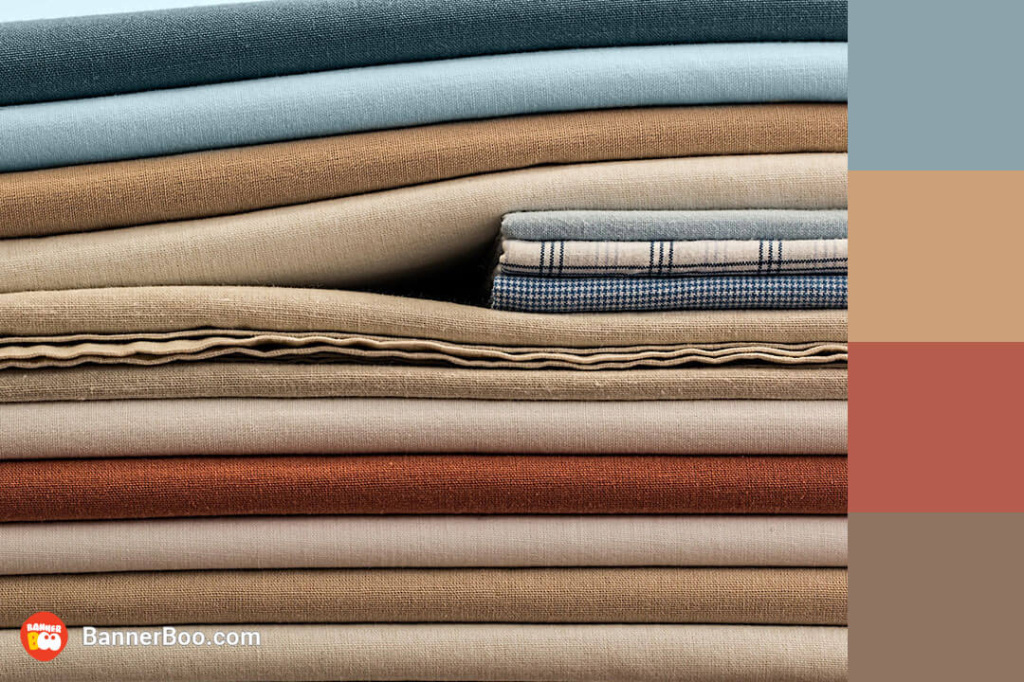
These neutral tones can create a sense of calm and comfort to your design. It's a growing trend of using similar combinations in interior design.
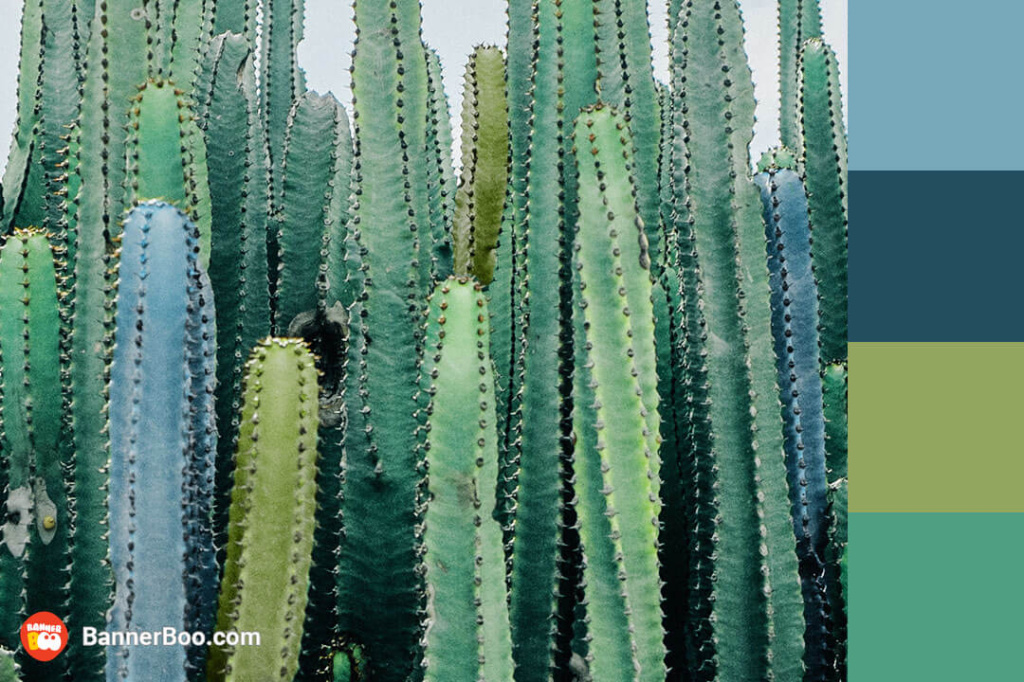
Incorporate the vibrant hues of desert cacti into your next important announcement and watch it capture attention like never before. The rustic charm of these colors evokes the spirit of old Western landscapes, creating a unique and memorable visual impact that will leave a lasting impression.
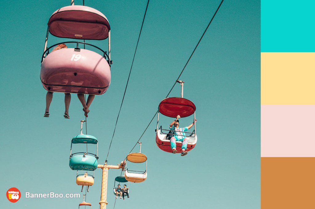
This palette of muted rainbow hues evokes a sense of sweet nostalgia, perfectly capturing the essence of a retro aesthetic.
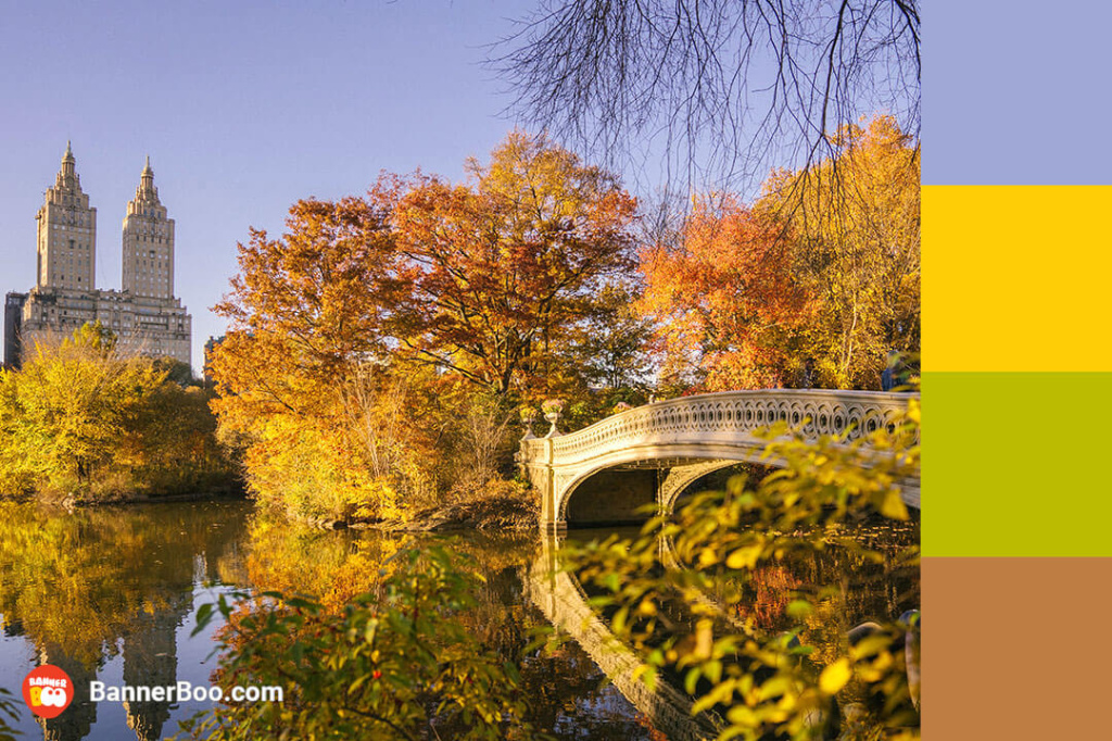
Analogous colors convey perfectly the peace and harmony prevailing in nature. This combination is suitable for a mental health app or a positive habits calendar.
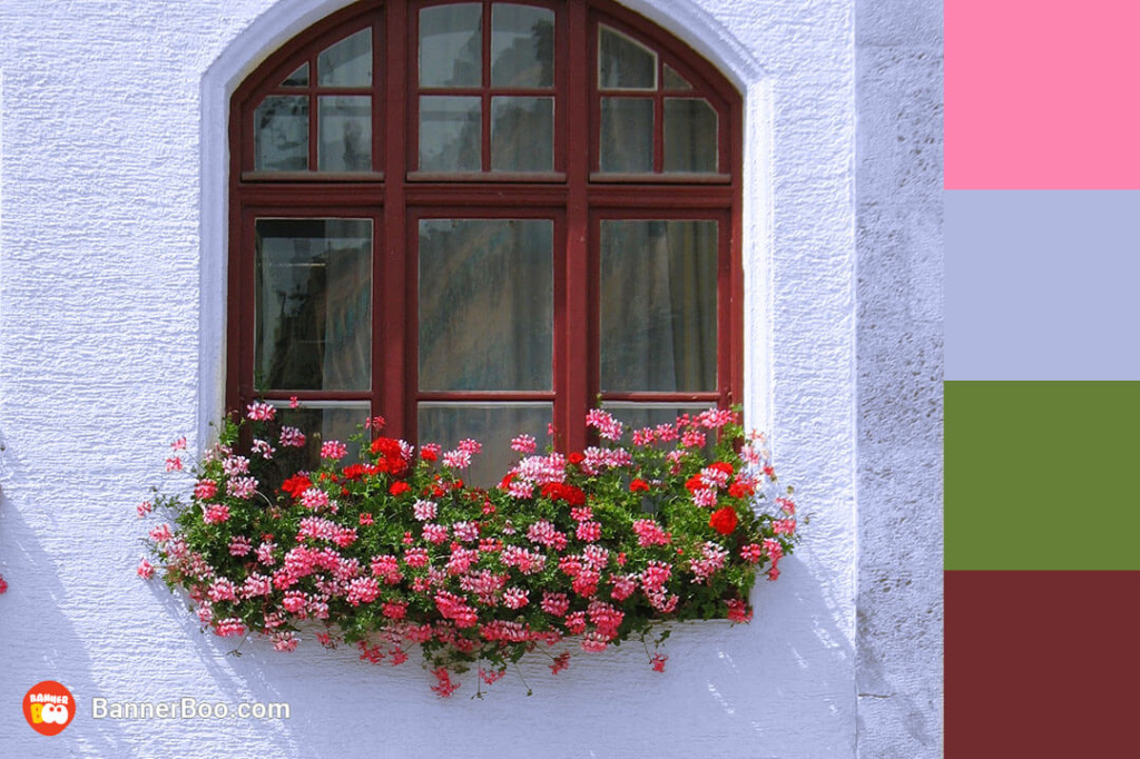
A classic combination of complementary colors, where the proximity of pink and green makes them visually brighter. Such solutions are especially popular in interior design.
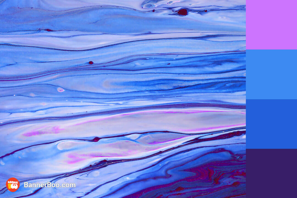
Electric blue injects a burst of energy into this color palette, harmoniously balanced by its calmer companions. Consequently, this interplay of colors creates a dynamic and visually stimulating palette, with electric blue emerging as a captivating accent color.
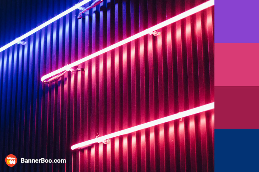
Neon light adds originality to typography and simple lines. This combination looks retro, but also a bit futuristic at the same time.
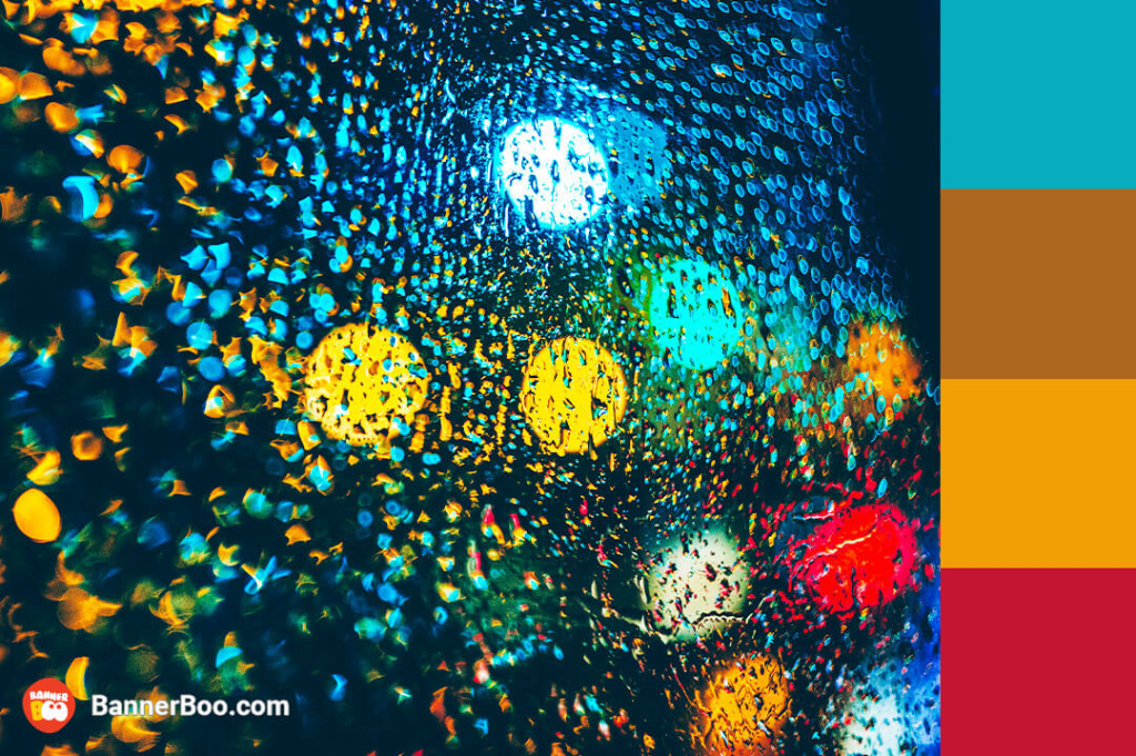
These complementary colors can make your design deeper, more interesting and brighter.
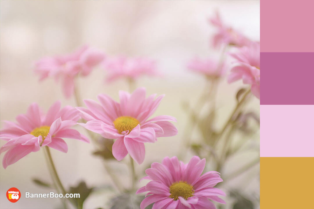
You can immerse yourself in the incredible atmosphere of romantic May simply by using these gentle pastel colors, which are so reminiscent of lilac blossoms.
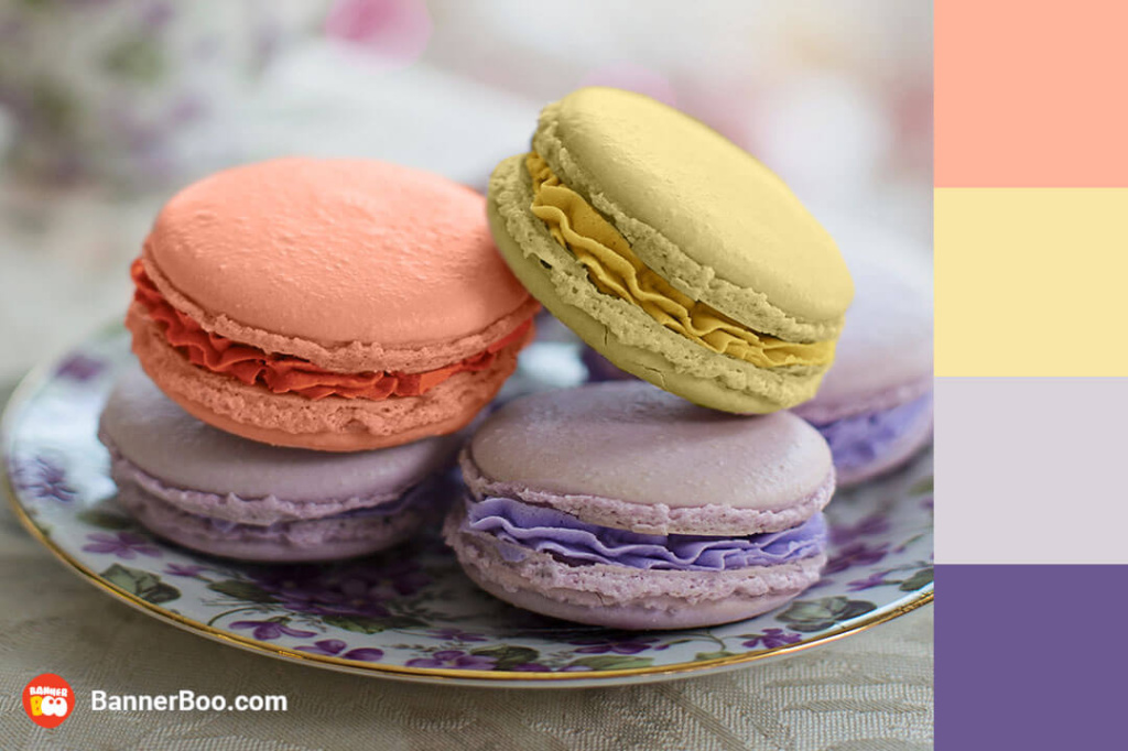
Gentle, airy shades create a sophisticated color scheme. You can use them as a background for your Instagram ads, and also to decorate your business page on social networks, especially if you are a pastry chef.
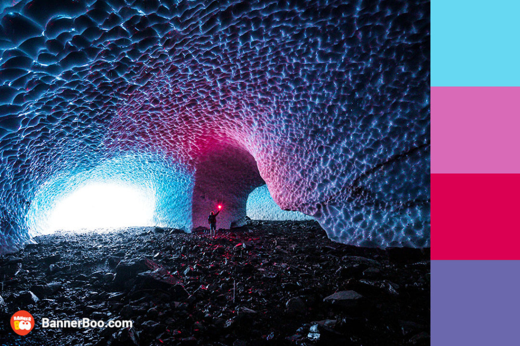
Such a color combination not only fascinates, but also inspires creativity and self-discovery.
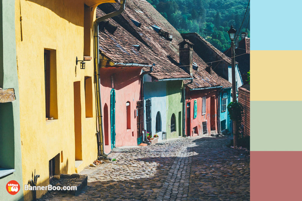
If you want to create a really cheerful and energetic design, try combining pink, green and orange colors. We guarantee that you will get an optimistic and aesthetic design!
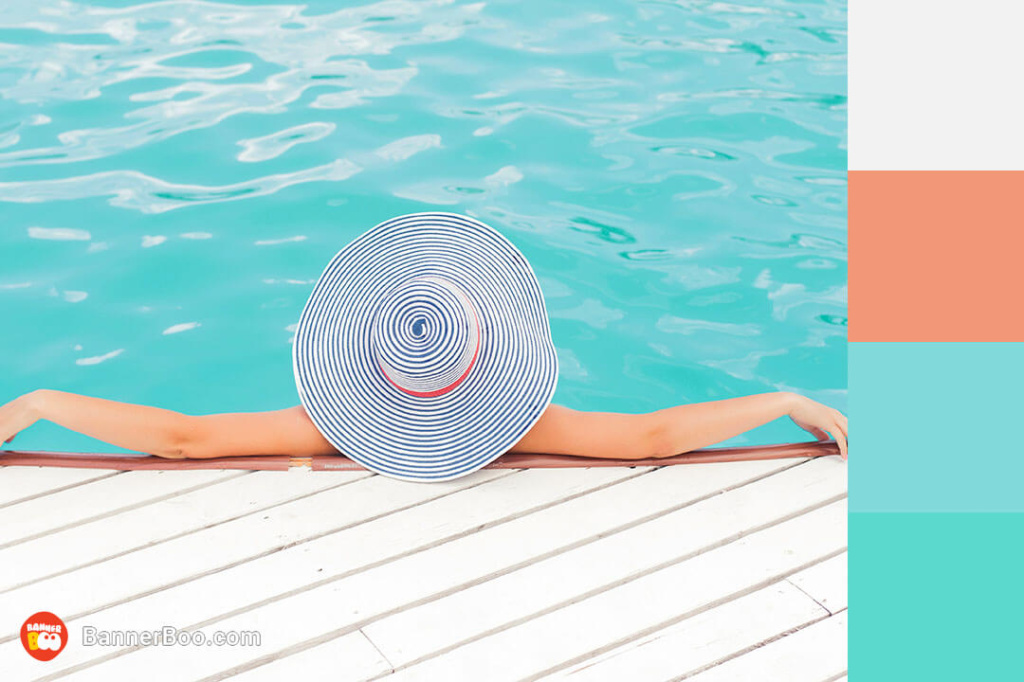
A bright summer combination that warms even in winter! Perfect for designing banners with information about hot summer offers.
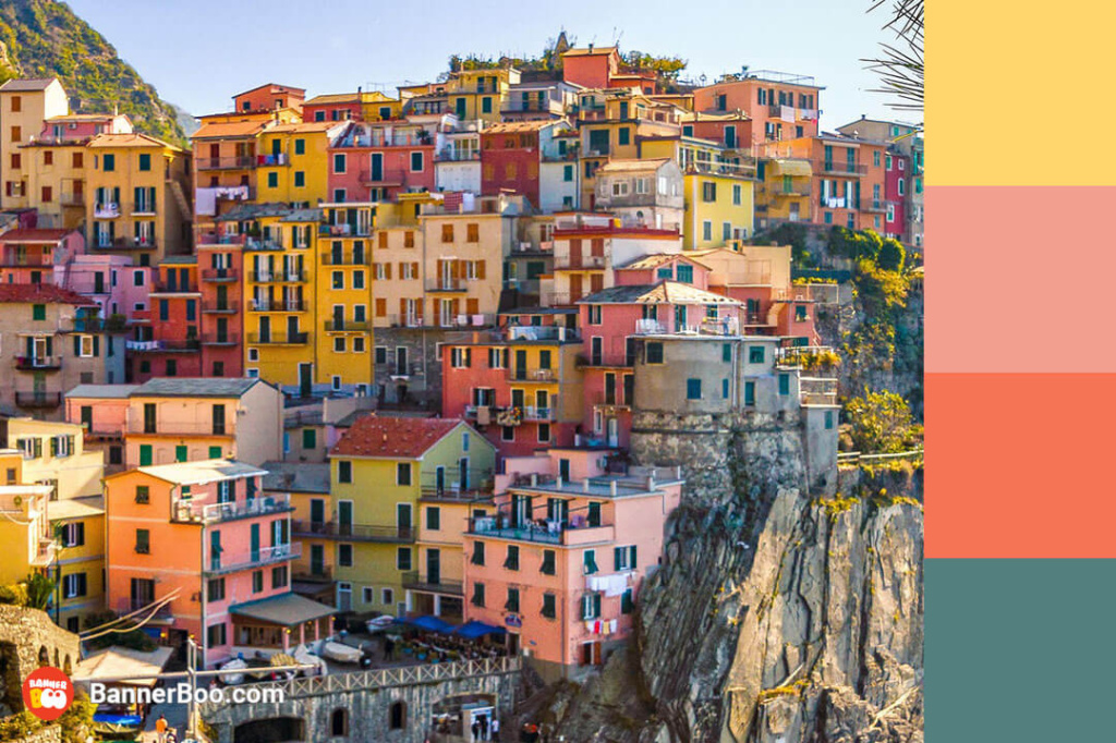
A Roman vacation is the dream of many people, so such combinations are especially appealing to them. The colorful, bold and sunny palette will look great in both interior design and banner design.
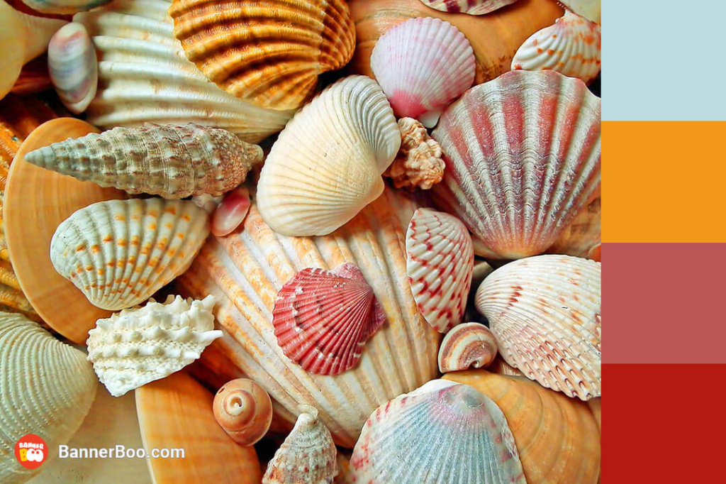
A warm and sunny palette that will help you create such a design that even the biggest lover of sea beaches will hold their breath for a moment.
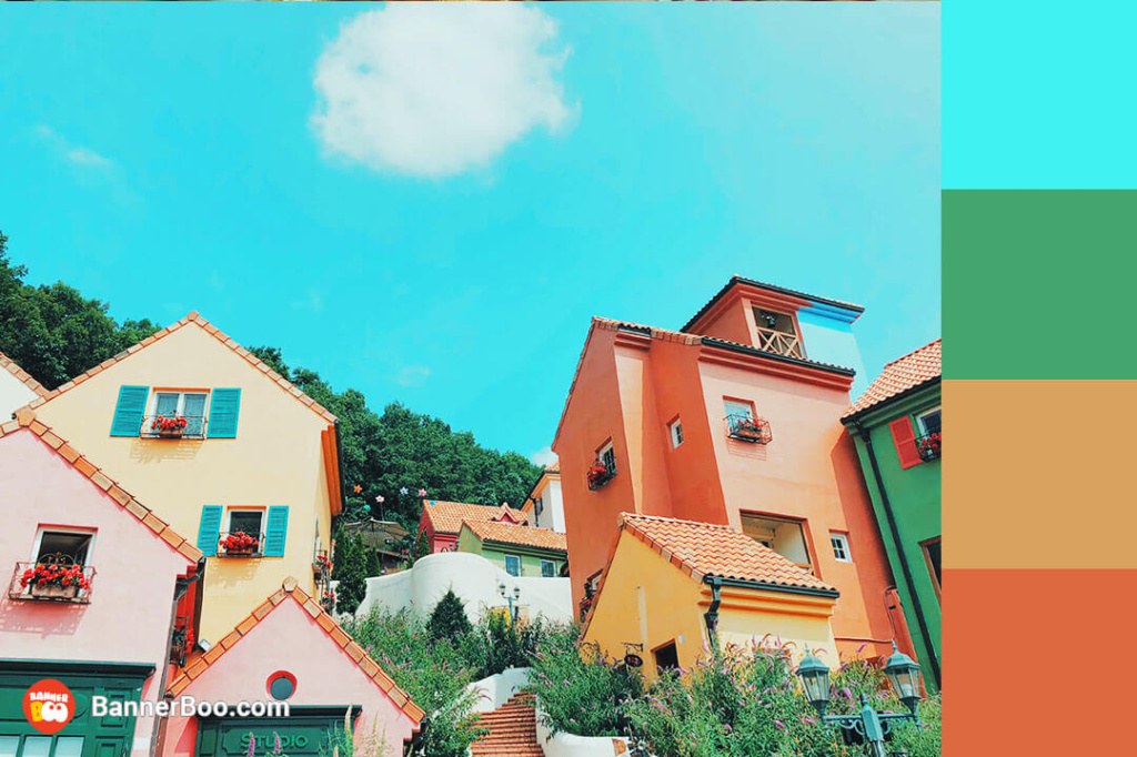
A rainbow palette of colors not only pleases the eye, but also improves mood. Thanks to the calm atmosphere, such a combination is suitable for both branding and interior design.
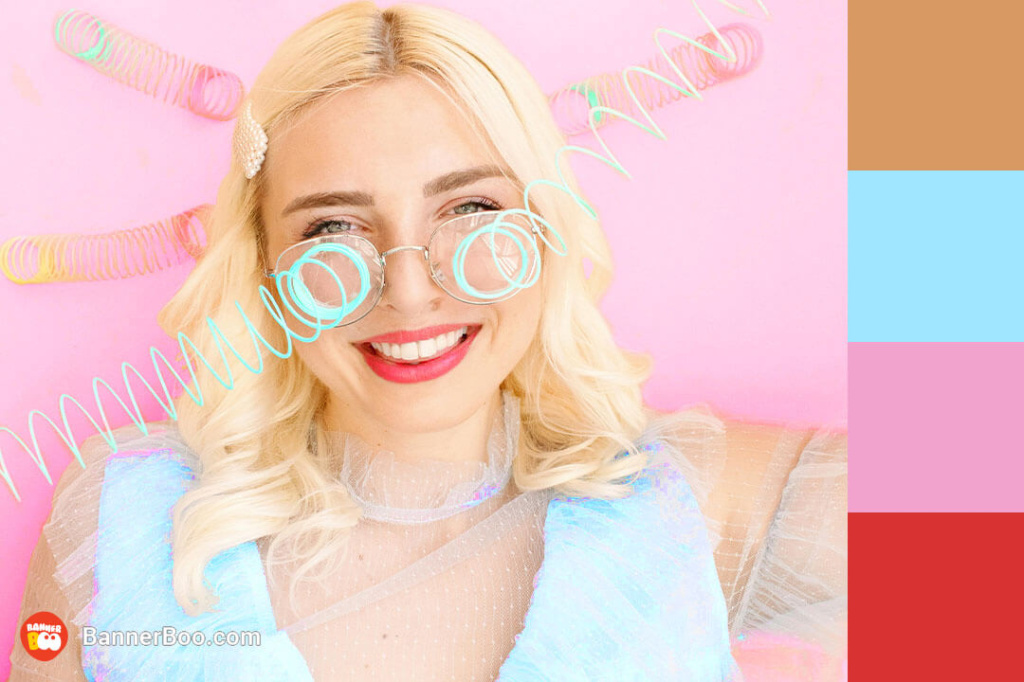
Pastel colors are not only delicate, but also juicy and bright. Richer options can be used for layouts or ad designs.
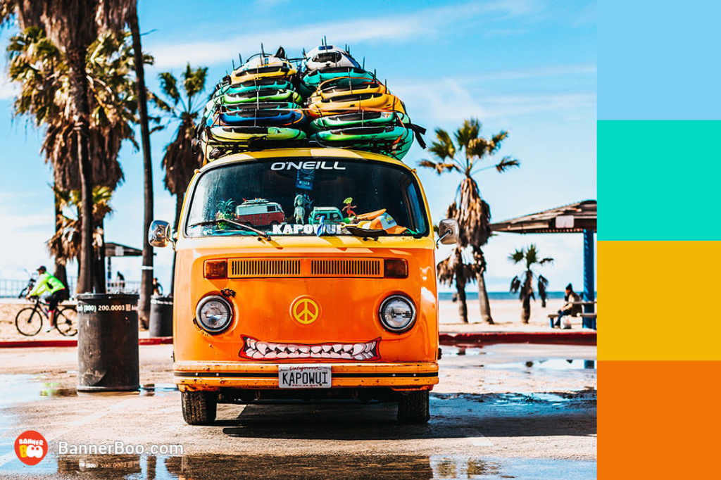
These colors seem to literally radiate energy. Original and unusual, they can awaken the adventurer in you! And you can often meet them in advertising, interiors and even movies.
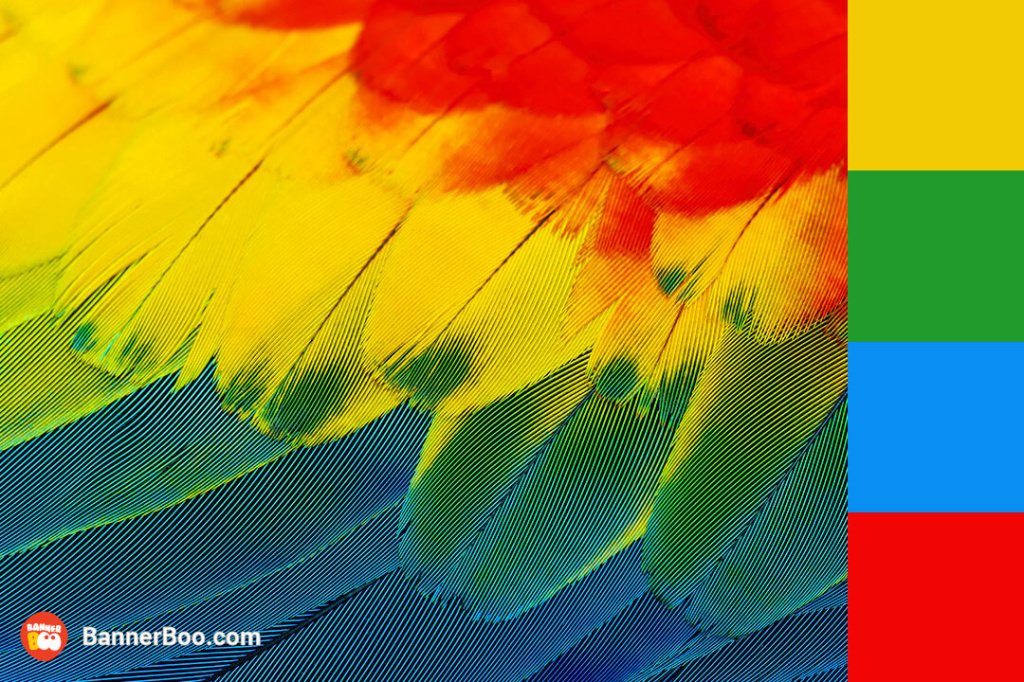
If you're developing an app for kids, consider using this tropical palette. Her boisterous, cheerful energy is especially liked by babies.
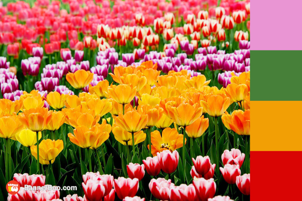
Use shades of spring flowers in any design to convey that feeling of delight when you first find yourself in the bosom of spring nature after winter. They are also suitable for the design of cards, posters or posts on social networks.
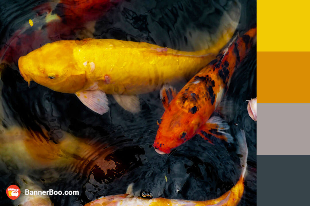
The colors are inspired by Japanese carp ponds and best convey the feeling of peace and harmony. They will fit both for the design of personal blogs and advertising banners.
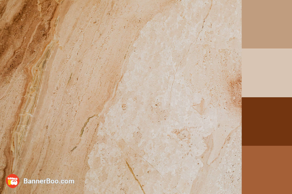
Marble has an original structure, and its intricate lines and patterns delight people. For a long time, it was associated exclusively with luxury. Now, artificial marble of original colors is used in interior design.
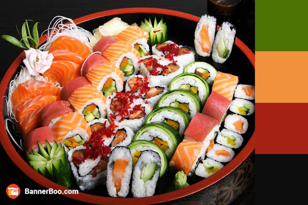
The bright color combination, which is so reminiscent of seafood, looks very appetizing! Similar colors are often chosen for restaurant applications.
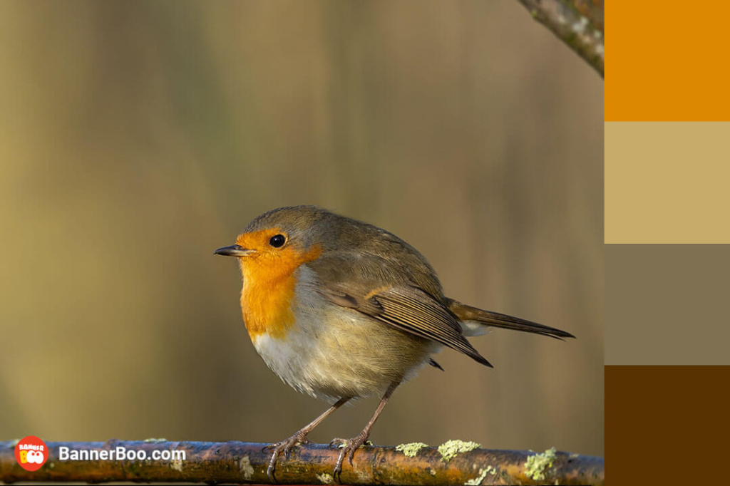
This monochrome color scheme, which combines pleasant pastel colors from light to dark, suitable for all types of design.
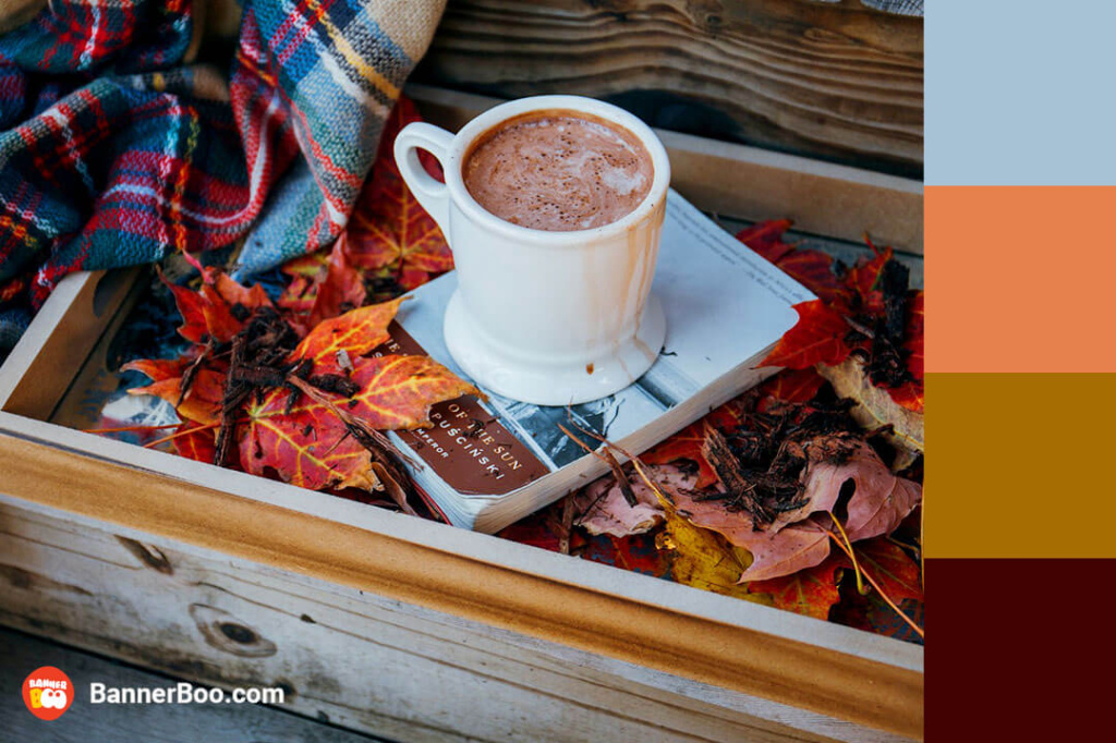
If you are looking for a timeless color combination where calm shades are enhanced by bright accents, this option should suit you. If your activity is related to traditional crafts, such as farming, you can use these colors for branding. Traditional style is also a hit in interior design.
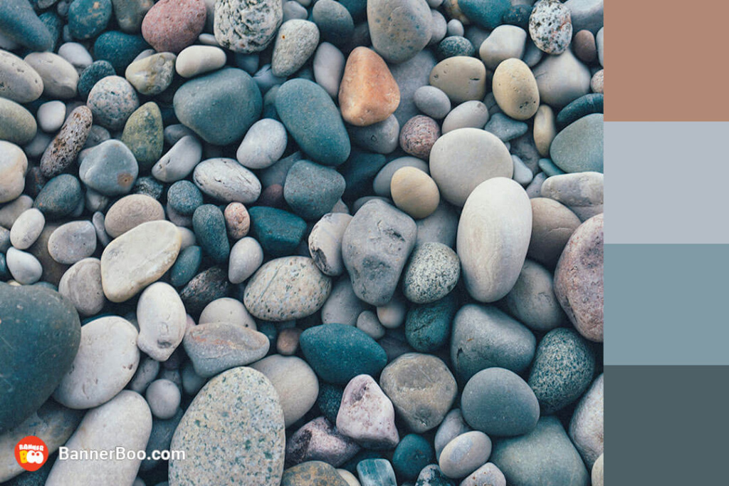
While these colors appear understated, they possess an inherent harmony, blending seamlessly to create a visually appealing harmony. This tranquil color palette exudes a sense of serenity and composure, resulting in a strikingly balanced and visually intriguing palette that has become a popular choice for interior design, with its calming and harmonious appeal.

A sophisticated combination that represents harmony and renewal. A good choice for advertising invitations.
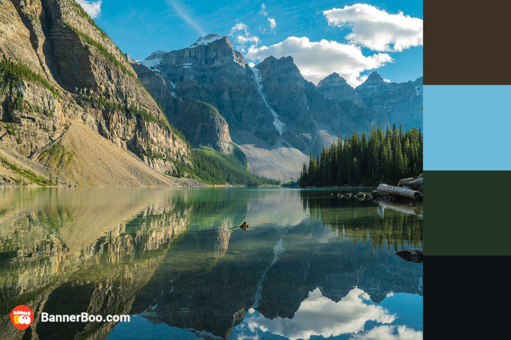
The cinematic combination of rich dark shades and calm blue evokes an irresistible desire to climb high into the mountains. A great option for branding a company that develops equipment for tourism.
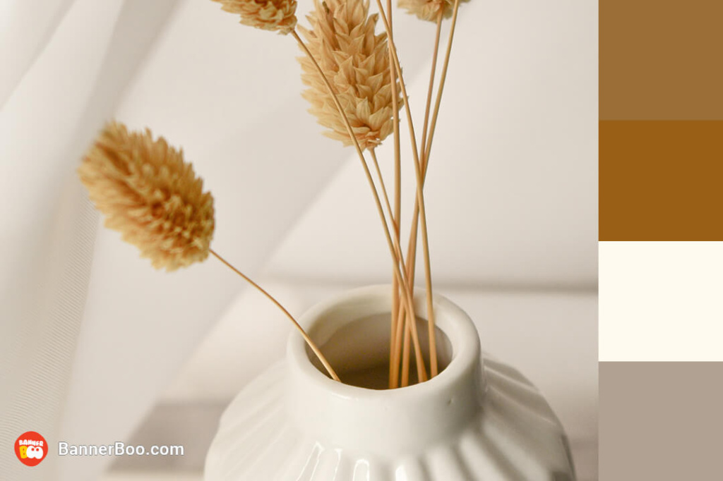
For a modern and sophisticated combination, try pairing warm colors with neutral whites and grays. Such calm and warm combinations are often used to design personal pages in social networks.
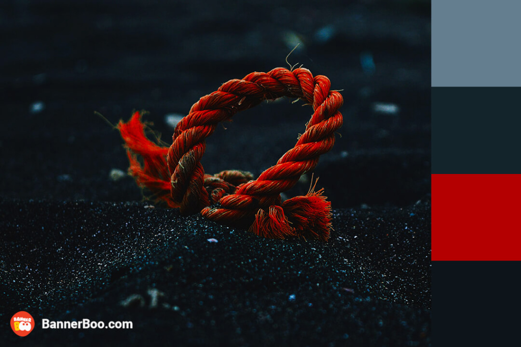
If you need to create a dynamic and interesting picture, try placing a bright accent color on a calmer background. This method of attracting attention you can found in advertising of clothing and advertising of accessories. The use of red, which itself additionally attracts the attention of the viewer, makes the combination more emotional.
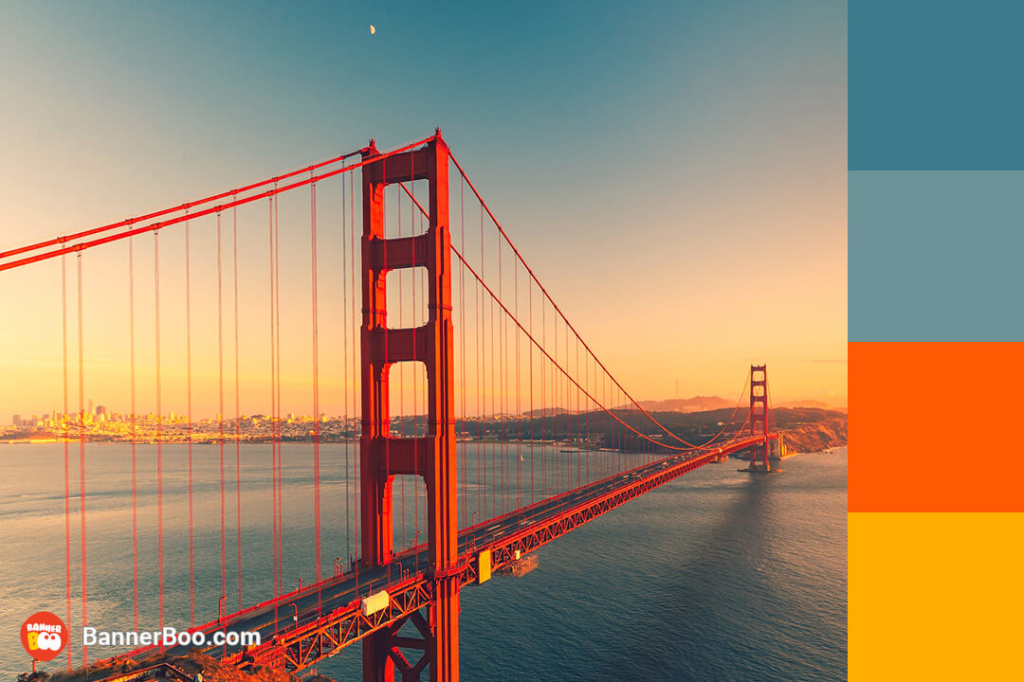
The bright orange color combines with gray and blue in the best way. If you want to convey to the viewer an atmosphere of warmth, acceptance and harmony, definitely try this option.
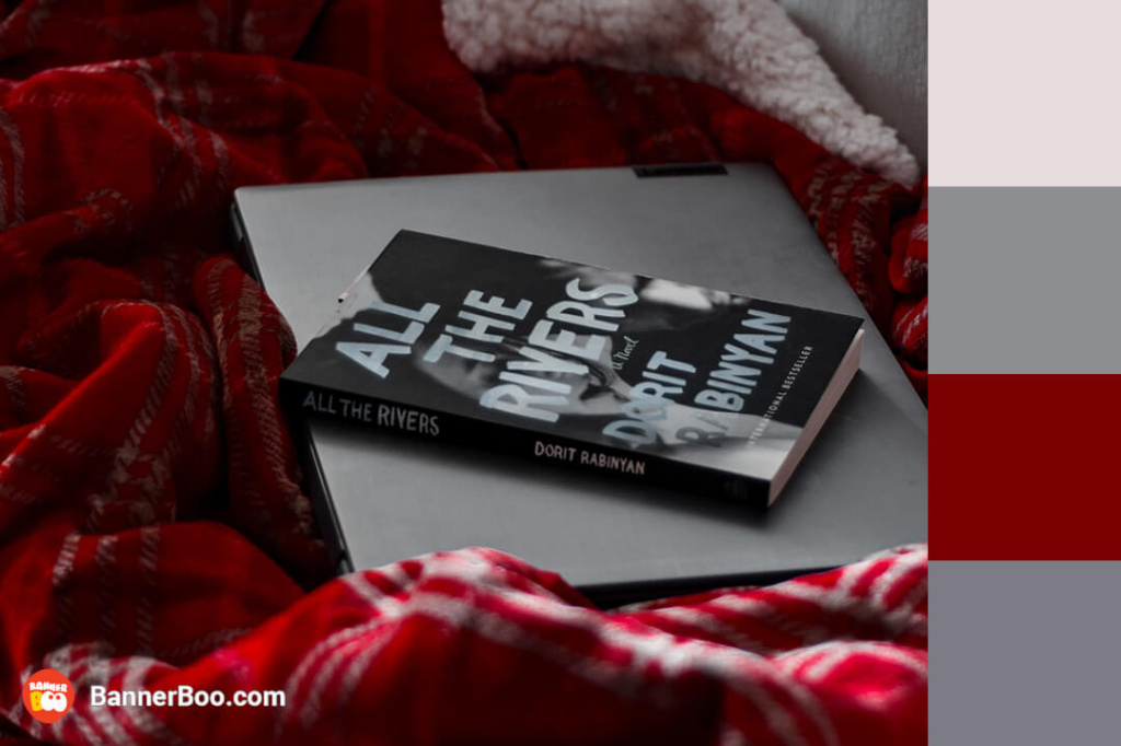
Gray colors become a great background for red. The combination is suitable both for branding and for use in interior design.
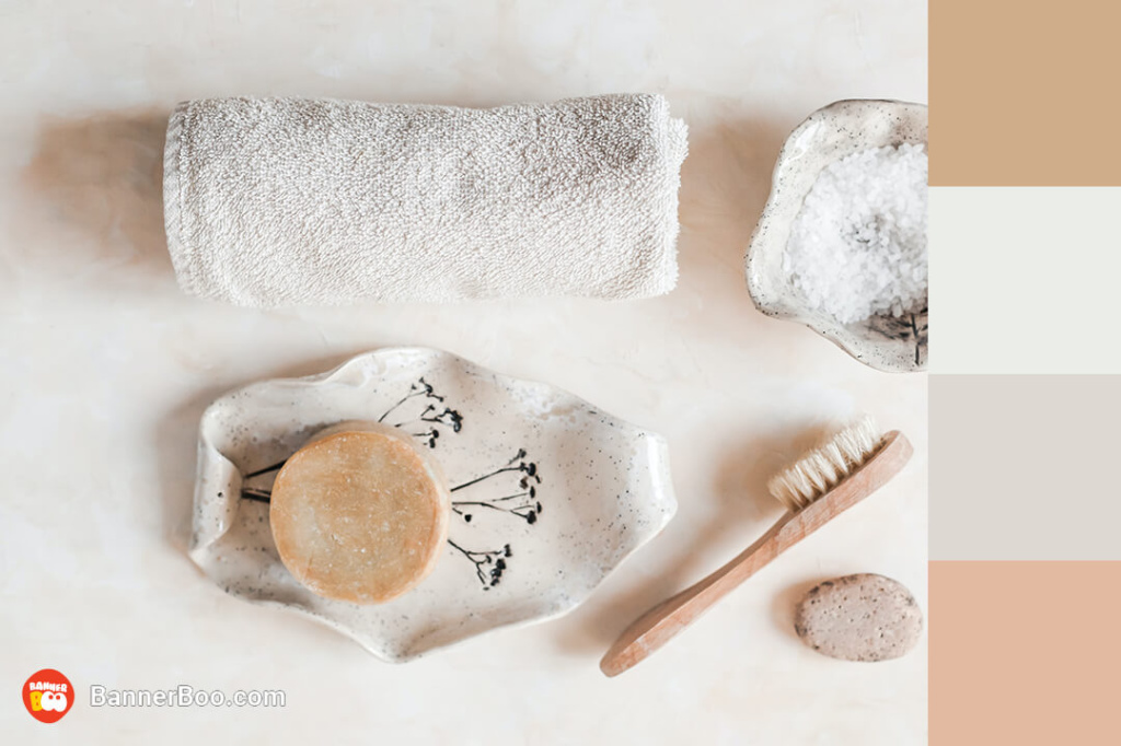
Neutral colors, if they are chosen correctly, will give you a feeling of peace and comfort. Such combinations are well suited for branding spa salons and massage parlors.
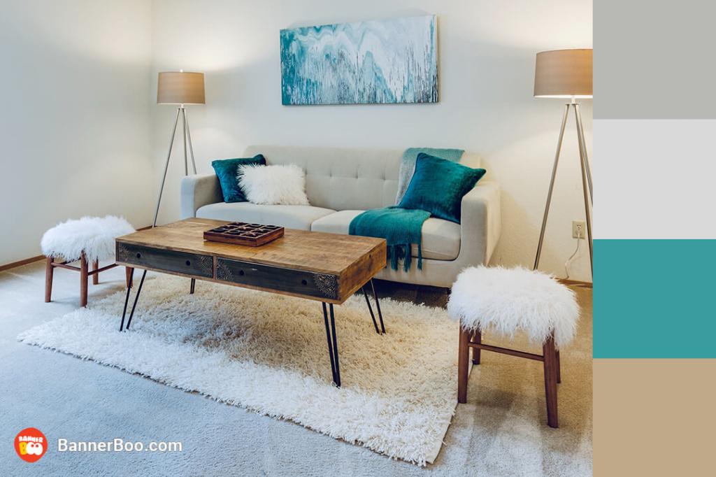
A neutral color palette, where there is usually one bright accent. A calm and pleasant combination, which is often found in interior design recently.

Black and white is a classic color combination that is still in fashion! This palette is ideal for creating an elegant and modern look, which is why it is highly valued by fashion designers.
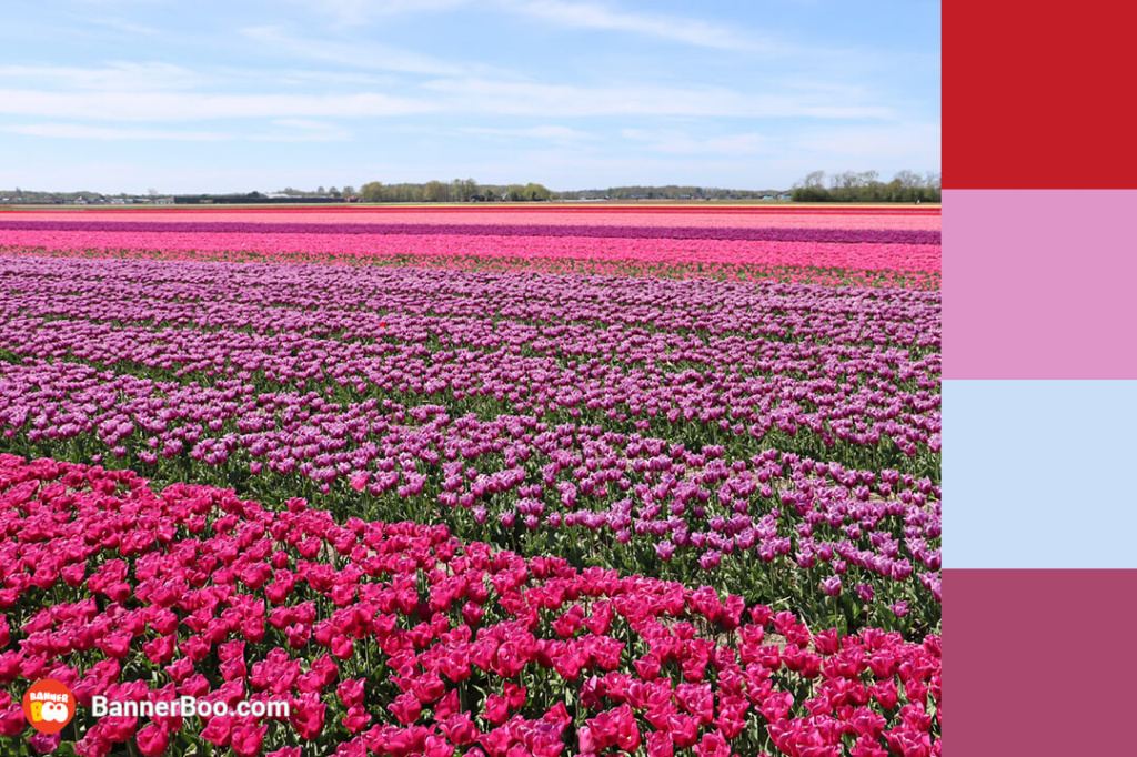
Bright and cheerful colors of fresh flowers inspire customers to make spontaneous purchases and romantic gestures. Such a beautiful color combination will be perfect for an online store of flowers, desserts or gifts.

A magical palette consisting of energetic olive green, orange and pink, and deep black adds balance. Such natural colors give a person a feeling of emotional stability and kinship with nature. Relaxation app designers can feel free to use this palette.
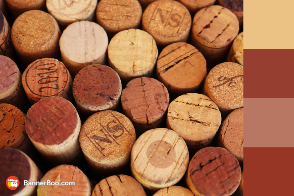
A warm and saturated palette, which owes its appearance to wine. Such colors are valued for their warming effect. It can be used both in the design of an online store and for advertising banners.
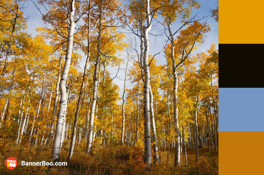
The golden color occupies a central place in the composition, and the soft blue and contrasting black only emphasize its warm atmosphere. Such a palette will look great in the interior or in an advertising campaign for warm clothes of the autumn-winter season.
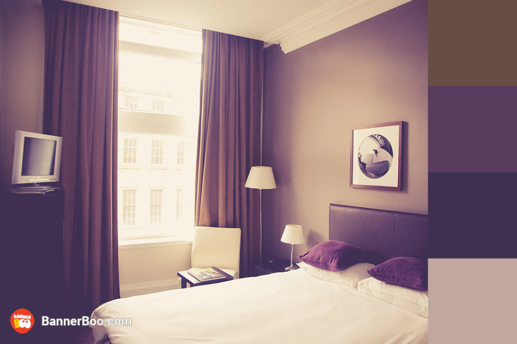
A subtle and delicate color scheme of various shades of purple proves that minimalism can be interesting. Purple is usually associated with tenderness and innocence, so such colors are often found in the interior of rooms for teenage girls.
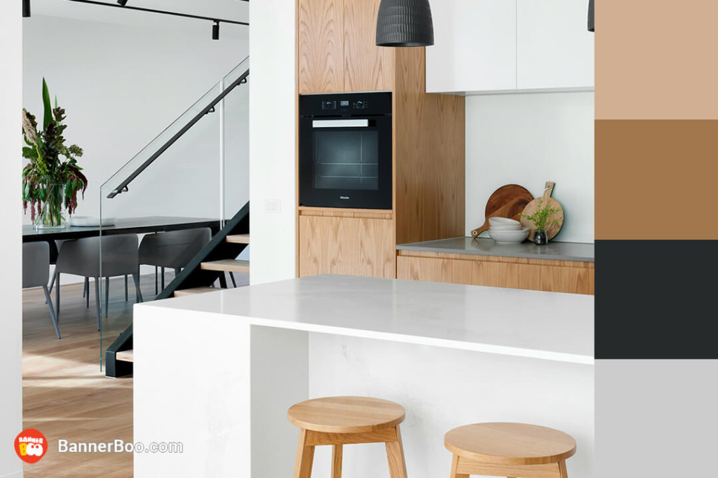
Gray is a color that looks best in modern designs. It is also a great background for warm colors. Such a palette is often used both in clothing design and advertising.
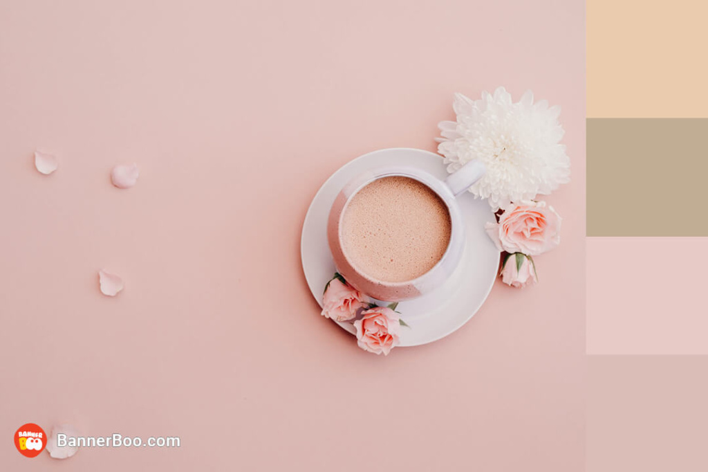
Dreamy and somewhat even infantile, this is how pink is usually described. Try to combine it with other contrasting neutral colors, and you will get a clean and gentle palette. An ideal option for branding a nail studio, cosmetic office or creative studio.
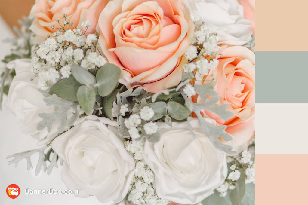
The color palette, which consists of pink and green, is often reminiscent of spring and evokes a feeling of happiness and awakening after winter. A similar combination is suitable for branding a flower shop.
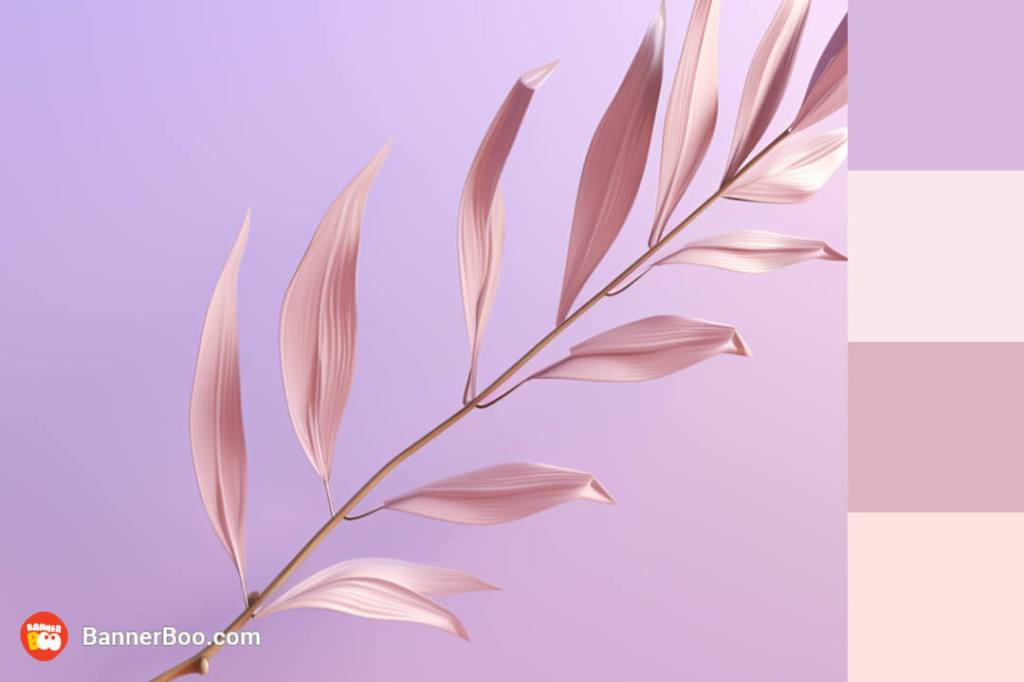
Really sophisticated colors that create a relaxed, somewhat dreamy atmosphere. Pastel shades are increasingly common in the interior of coffee shops.
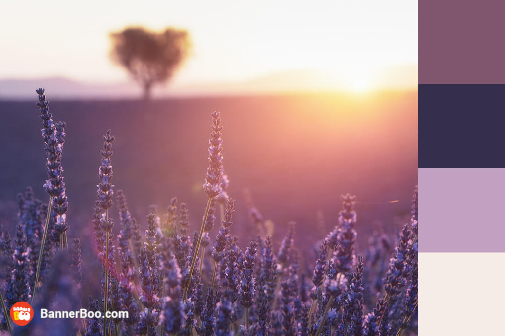
A somewhat fantastic palette that evokes a sense of delight in the beauty of nature. Because these colors are often associated with creativity, they are often used in branding and graphic design.
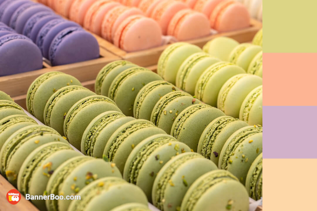
Pastel colors are synonymous with the vibrant hues of spring. Infuse your spring promotions or design elements with a palette of pastel colors to embrace the cheerful energy of a vibrant mix of pastel colors.
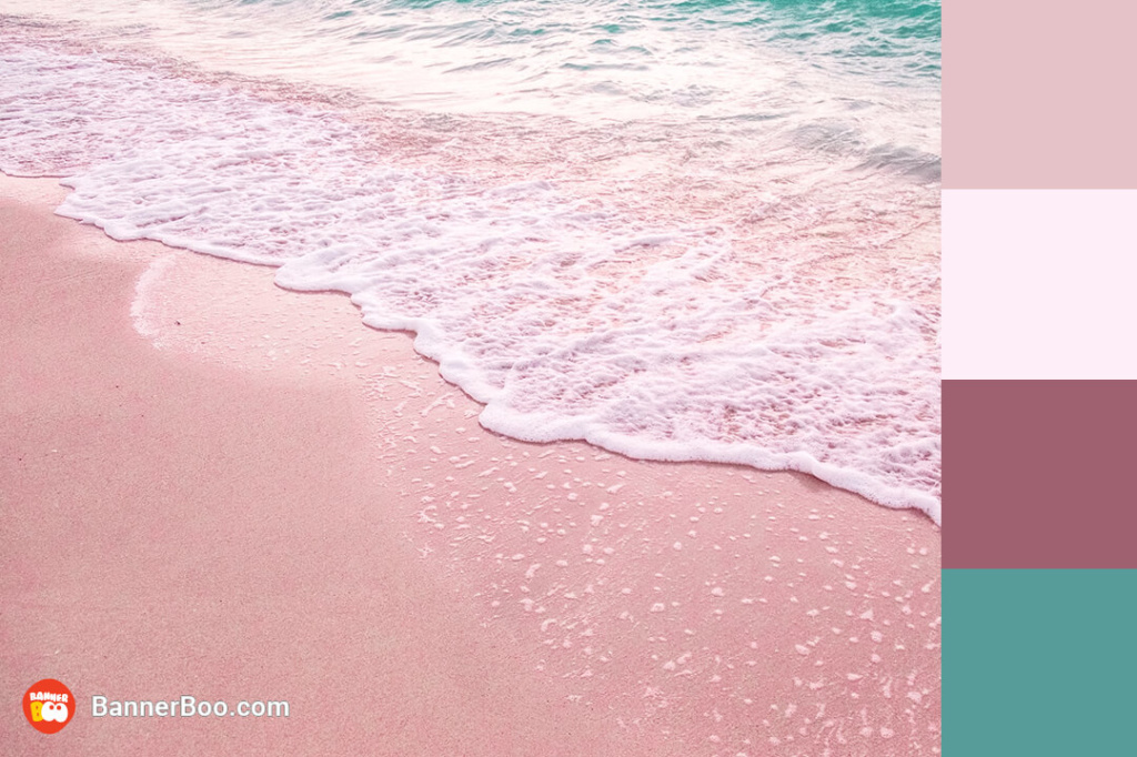
A summer color palette that evokes associations with sunny days and immerses you in the atmosphere of a seaside party! An advertising banner designed in such colors will definitely not go unnoticed!
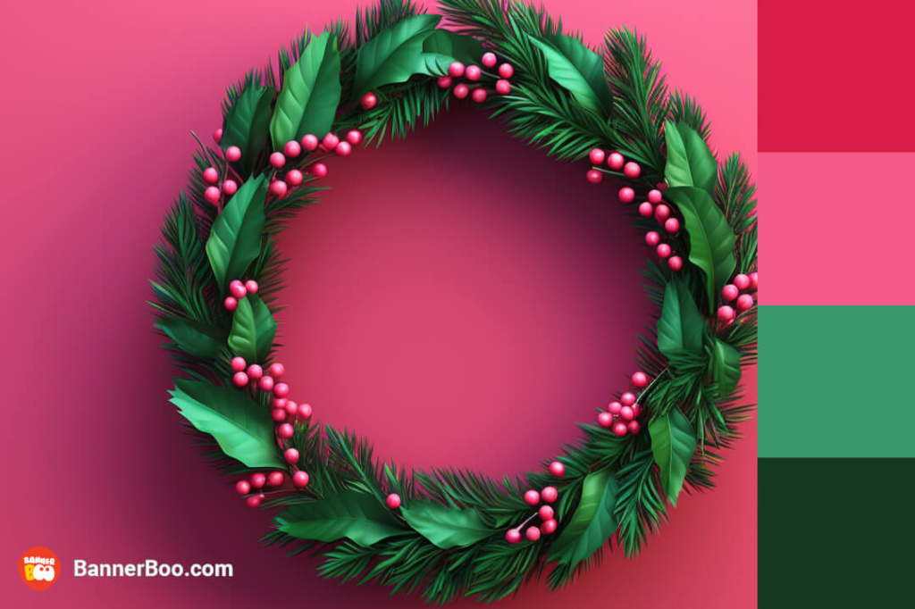
Nothing conveys the atmosphere of the long-awaited holiday better than juicy and bright colors! After this year's triumphant return of Barbie, this pink and green palette will definitely be featured in interior design.
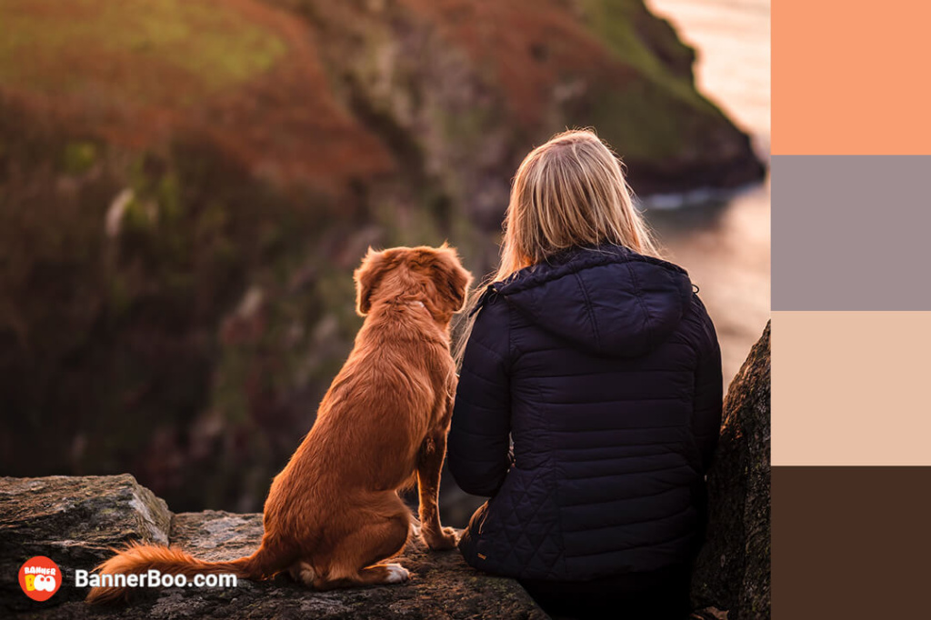
Warm colors are particularly cherished in autumn, as they embody the season's essence. They not only evoke a sense of comforting nostalgia, reminding us of cozy autumn days, but also provide a sense of warmth and cheerfulness that can help combat seasonal blues. Moreover, warm color palettes are frequently employed in mountain hotel designs, where creating a welcoming and inviting atmosphere is paramount.
*example of a Halloween template by BannerBoo
Do you want to give your customers a feeling that something important is about to happen? Then you will definitely need a palette of yellow-hot and blue. If the first color can cause a feeling of anxiety, then blue, on the contrary, has a calming effect. If these two colors are combined, we will get a mystical atmosphere of the most mysterious night of the year. Perfect combination for a Halloween promotion!
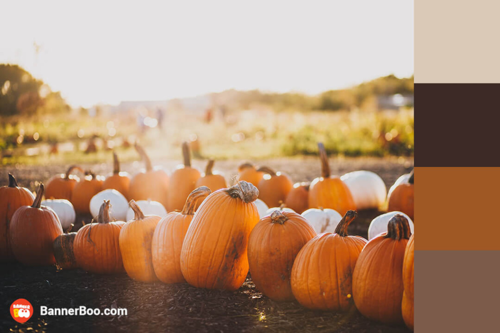
Inspired by the tranquil hues of nature, calm autumn colors possess an innate harmony, making them exceptionally soothing and aesthetically pleasing. Their inherent elegance makes them a perfect choice for graphic designers, particularly when crafting an autumn menu design for a bakery.
*example of a Jewelry template by BannerBoo
A sophisticated combination of deep, serene colors against an elegant gray backdrop exudes timeless elegance. This harmonious palette evokes an ambiance of tranquility and sophistication, making it an ideal choice for creating a sense of calm and refinement. Beyond its application in graphic design, this versatile palette can serve as the foundation for creating a tranquil and sophisticated study or living room.
Color in design is not just aesthetics, but also a tool to influence client decisions. Different business tasks require different emotions: sales should stimulate quick action, premium products should emphasize status, eco should evoke trust, and fintech should demonstrate stability and innovation. That is why there is no universal palette; it always needs to be selected for the advertising goal.
Goal: attract attention, create a sense of urgency
Psychology: energy, impulsiveness, FOMO
Typical colors:
Recommendation: emphasize contrast, use a minimum of shades, focus attention on the discount percentage.
Goal: emphasize status, quality, trust
Psychology: exclusivity, sophisticationTypical colors:
Recommendation: leave a lot of space, choose a minimalist style, without bright accents, as they say – "quiet luxury".
Goal: association with nature and safety
Psychology: care, purity, trustTypical colors:
Recommendation: avoid unnatural shades – naturalness should look calm.
Goal: inspire trust and a sense of innovation
Psychology: stability + technologyTypical colors:
Recommendation: smooth gradients + light UI often work.
Even when you have a grasp of color theory and understand the impact of different shades on mood, selecting the ideal color palette for your design can still be a challenge. To help you navigate this process, we've compiled some practical tips to guide you in making the best color choices.
Today's aspiring designers are fortunate compared to their predecessors because there are now numerous tools available for exploring colors.
For example, there are many online tools where you can match colors.
In addition to platforms where you can familiarize yourself with various palettes, it is worth working on the ability to notice successful combinations of colors. The best places where you can do this are:
Finding the same perfect color is quite a difficult task. Even after studying all 7 color schemes, it is not always possible to choose exactly the palette that exists in the imagination. However, all the efforts invested in the creative process are 100% worth it because the choice of color is a search for another way of communication with the client and an additional way to reveal the potential of your product. Remember that you can always look for inspiration in the BannerBoo background library, and in cases where creativity is completely lacking, use a template. Train your skills to see and create beautiful things with us!
Red, yellow and blue are a classic triad.
This is the rule according to which clothes cannot contain more than three primary colors. This is how 2 neutral and 1 bright colors are most often combined.
Pink is formed by white and red.
By combining blue and yellow, you get green.
Yellow, white, green, blue and black
To combine colors, artists and designers often use the color wheel.
Distinguish monochromatic, complementary, split-complementary, achromatic, analog, triadic and tetradic schemes.