Have you ever been shocked by yourself?
I'm talking about that moment when your eyes accidentally open to something.
For me, that moment came when I realized how many ads I've seen in my lifetime.
I was going to write an article about how to increase conversion in banners, and I got thinking. I don't really watch a lot of banner ads, but I wanted to know how much it could be.
I have been in marketing for about 10 years.
How many banners did I manage to view during this time?
I found research by the marketing company Yankelovich, in which they state that people view about 5,000 banners per day.
Considering that I have been solely involved in marketing all this time, it's not hard to imagine that I have indeed viewed exactly the specified number of banners per day (if not more).
And now let's count.
10 years is 3650 days. Multiply that by 5,000 banner views/day and you get an incredible number.
When I realized this, my jaw dropped.
Over the past decade, I've viewed over 18 million banner ads.
And I've learned a lot during all this time – especially about conversions.
This is what I want to talk about today. I'm going to take everything I've learned from looking at those 18 million banners and break all that information down into short examples for you.
To make it as relevant as possible, we will only talk about banner ads. Banners remain highly popular and are extensively utilized in Internet marketing.
Yes, I agree, it sounds like rhetorical advice, but hear me out.
So many banners are just plain boring. They are not attractive.
Do you like this kind of advertisement?

(Your shares. Unbelievable 90% profit! Make your money work 24/7)
Not sure if this is a really exciting picture.
So my first advice is to be curious!
The majority of banners are uninteresting, lacking creativity, and ineffective.
In 2015, Google itself published an article titled (unsurprisingly) "Banner Advertising Can Be Creative and Effective."
Admit it, by default, banner advertising is often perceived as boring. Yes, "banners can be creative" because usually this is not the case.
Here's how Google's Bob Arnold talks about it:
"You ask why banners don't get clicked? Well, as with any marketing campaign, the success of a banner campaign is directly dependent on the quality of the creative. The best banners are the ones that attract attention."That's why if you want to get a clickable banner, it should be interesting first!
Be abstract, look at your task from a different angle, come up with a crazy text. Create ads that hook.
Yes, I agree, it also sounds like a set of tips for newbies.
Have you done it at least once? You will not believe how many people have never done this in their life.
In general, split testing just might make the small difference between success and failure.
Take a look at Optimizely's case study:
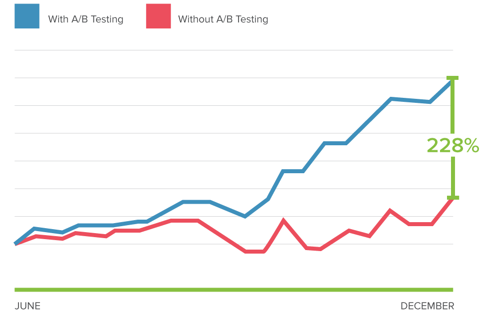
Application of simple A/B tests allowed to increase conversion by 228%
And where is the best way to use split testing? That's right, in your advertising banners
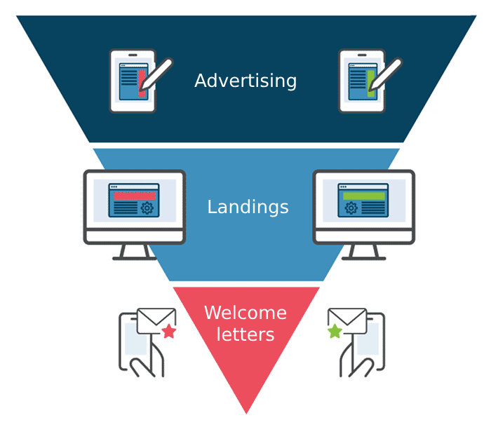
Because banner ads are at the top of the sales funnel, they have the highest potential to get the most clicks compared to other stages in an advertising campaign.
Don't procrastinate. Do it and see the results.
When you hear about tracking banner metrics, you're probably thinking about sales, right? Yeah, of course, can't do without that. But sometimes, in addition to this, you need to track other metrics as well (such as email subscriptions or just visiting the site).
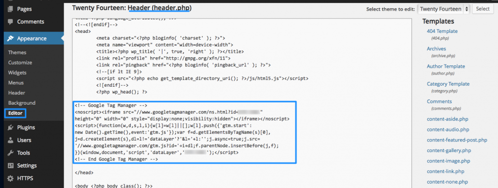
Google Tag Manager one of the best ways to track various metrics.
Most marketers start creating advertising by creating the banner itself, well, or from the landing page.
But this is not quite the right approach.
The smartest thing to do is to reverse engineer user behavior.
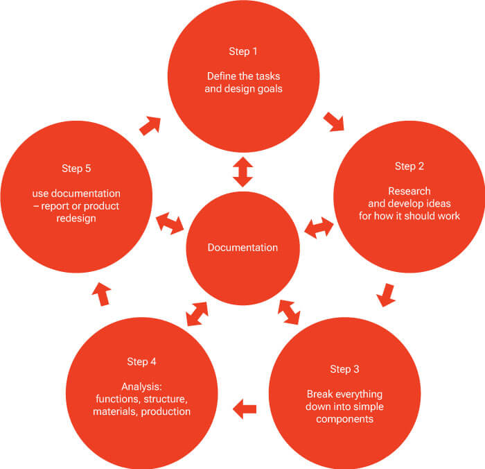
Think about the result you want to achieve and work from that. Define your keywords and come up with ad text based on the result.
If your advertising texts are everywhere, it will only confuse users. Make a clear, understandable picture that uses appropriate texts and references.
See how GAP did it:
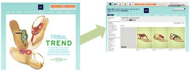
The ad directs users to an internal page, where everything that was promised in the ad becomes available to them. (We will talk a little more about visual correspondence in point 28).
Conformity, as in the example above, is essential. Your ad link should sound the same (but not boring) throughout the user's journey through the sales funnel.
This is an easy and fast way to help you get more conversions.
If you only use one type of match, you only cast your nets from one side of the boat. But, if you take more nets, you can catch a lot more fish!
More general keywords allow you to reach more users:

But on the other hand, the more specific keywords – the more CTR!
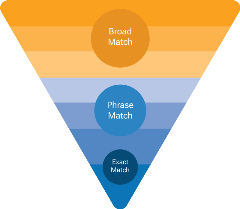
Both of these strategies can be used, just don't forget before doing so find out more about it.
Since we have already discussed with you the types of keyword matching, I want to recommend that you take a look at the close options.
Close variations are variations of your primary keywords that, while similar to the keywords, are not exactly the same.
Close variants include errors, singular and plural forms, common root words (for example, "Act" and "Action"), abbreviations, and accented spellings.
They can come in handy, especially if your keyword has clone words (like mens vs. men's).
And they can not only come in handy. Close options also increase impressions!
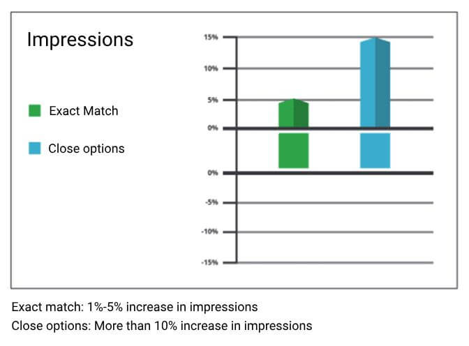
However, be careful. Some studies indicate that conversions may be adversely affected by this.
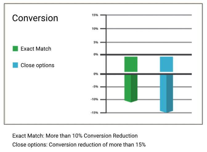
Why is the conversion decreasing? Maybe because close options aren't as relevant as exact matches.
But who knows for sure? It is not a fact that the conversion of your advertising campaign will decrease because of this. In this case, there can be many variations, which can cause your conversion to fall or skyrocket.
What do I offer? Test close options, see how they perform, and decide what works best for your brand.
Want your ad campaign to be super successful? Don't forget the little things that other people don't take into account. For example, minus-words. They will help improve your campaign by excluding some keywords.
Here is a scenario where negative words can be used:
The advertiser pays for the word "iris"
The user searches for the word "iris" trying to find "iris flowers" for sale
Your candy ad is shown on demand
The user clicks on your ad with fright, "eats" your advertising budget, while guaranteed not to buy your "sweet candies".
In essence, negative keywords make sure that only people who are genuinely interested in buying your product will see your ad campaign.
This will not only increase your conversions, but also help keep your advertising costs to a minimum.
You'd think that with everyone glued to their phones, marketers would be all about mobile formats. But for some reason, they're not.
Creating ads for mobile devices will significantly increase your chances of success!
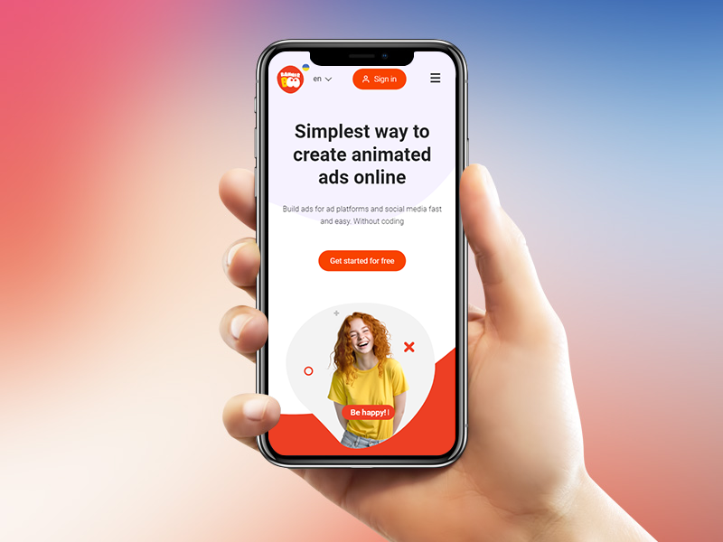
It's pretty easy to do, and believe me, it will generate you a lot more clicks and conversions.
The more you segment, the better you can identify micro-communities among all your users. This often leads to the best conversion rates.
Segmentation sometimes scares marketers because it sounds like a very complicated process.
Actually, this is not true at all.
You can start with a few basic segments, such as dividing your audience by geography. It's simple, right?
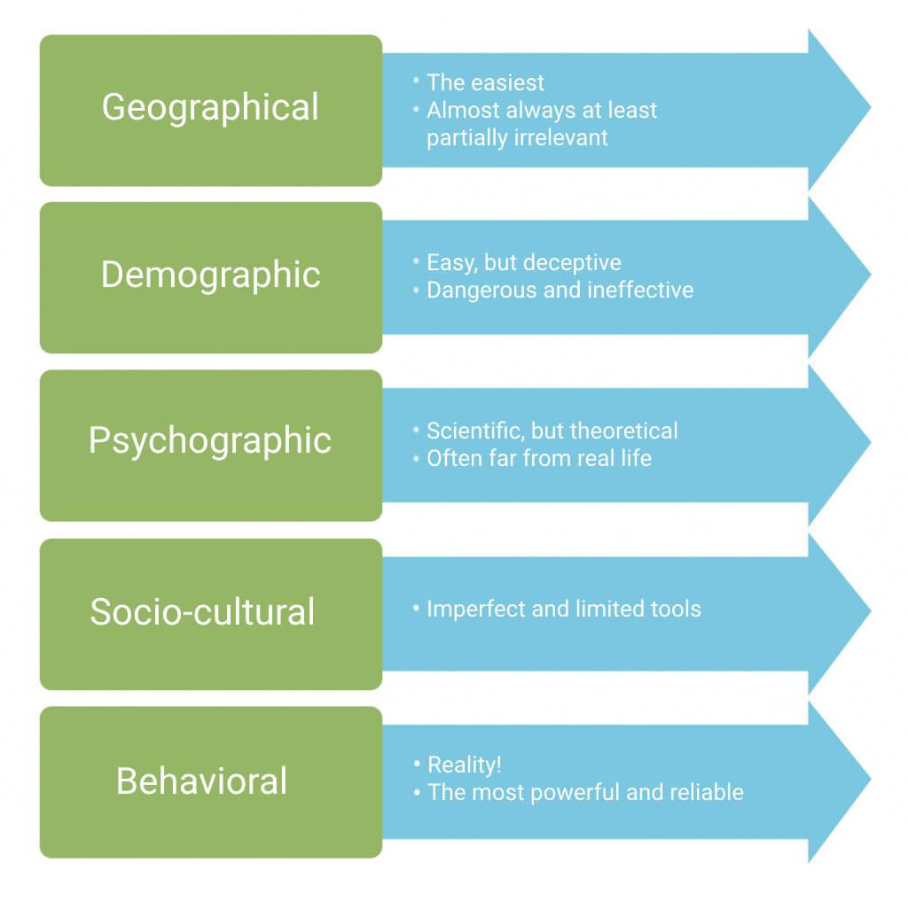
The more you segment, the more you get the hang of it and see the doors it opens up for you.
This is a tip directly from Google. If any part of your business model is based on attractive prices, try adding prices directly to the ad itself.
See how Dollar Shave Club did it:
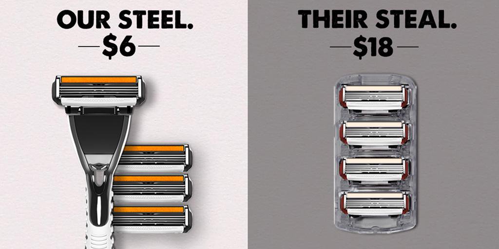
Yes, it won't work for every business, but if your price is really that attractive, give it another chance to play in your favor
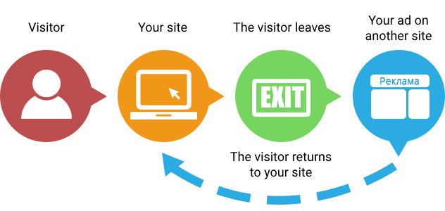
When you do remarketing, you show the same ad to users more than once. You might think it's overkill, but it's been proven to increase conversions significantly.
According to research, buyers need a minimum of four contacts with a brand to make a purchase decision.
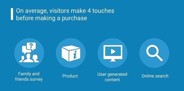
In other words, when you don't use retargeting, your leads slip out of your hands like slimy eels.
Starting from February 2018, Google Chrome blocks ads that do not meet their requirements.
It's just part of a larger global Internet cleanup trend that the Coalition for Better Advertising is starting.
It's best to go through these guidelines and keep an eye on any updates that may arise.
No one will penalize you for running unsuitable ads, but trust me, it will make a significant difference in the long run.
To stand out with advertising, you need to offer people a great deal.
When I say big, I mean it.
I'm talking about font size. Give your main message plenty of space. (But don't overdo it) In other words, it should be the visual center of the ad.
Check out some great examples of banner ads from Amazon:
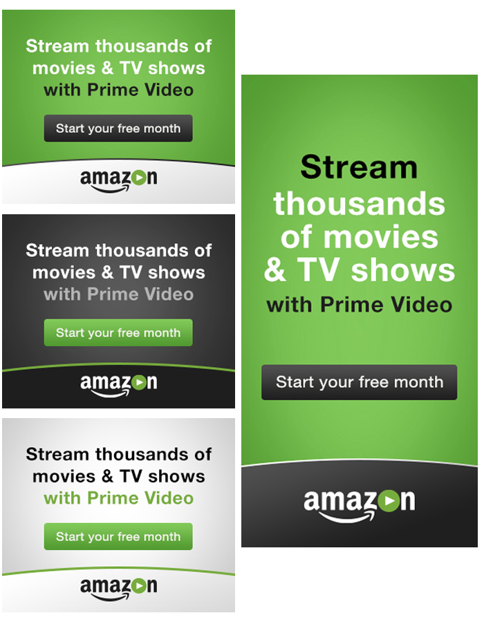
(Stream thousands of movies and TV shows with Prime Video. Free for a whole month)
It's hard to go wrong with exactly what Amazon Prime Video does, right? It's as simple as two times two.
If your users don't understand exactly what you're offering them, they likely won't convert.
Tell your audience about it in plain language. Ask yourself, "Is it possible to understand somehow differently?" If so, spend more time and make your link perfect.
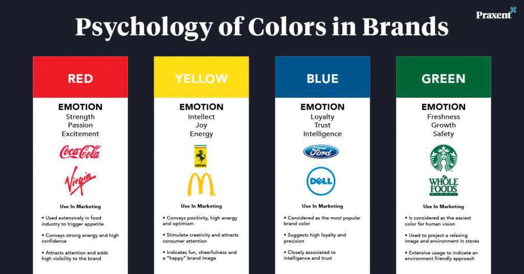
I know this isn't a graphic design blog, but I gotta say, color really impacts the purchase process!
In fact, 85% of shoppers make purchasing decisions based on color preferences.
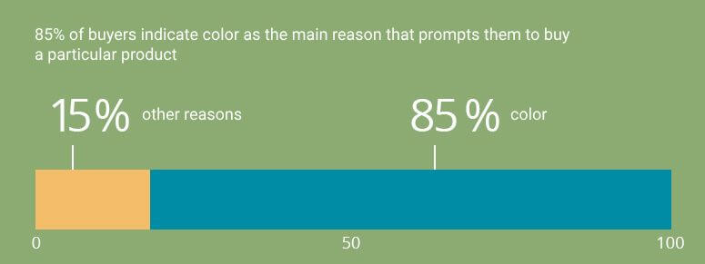
It sounds far-fetched, but it's true.
And that's all because we have these special psychological associations with colors, you know? For example, green is the color of money in many cultures.
Different cultures have their own color associations, but if you know what colors mean to your audience, you can use them to boost conversions.
Learn about some of the common color associations and use this knowledge to your advantage.
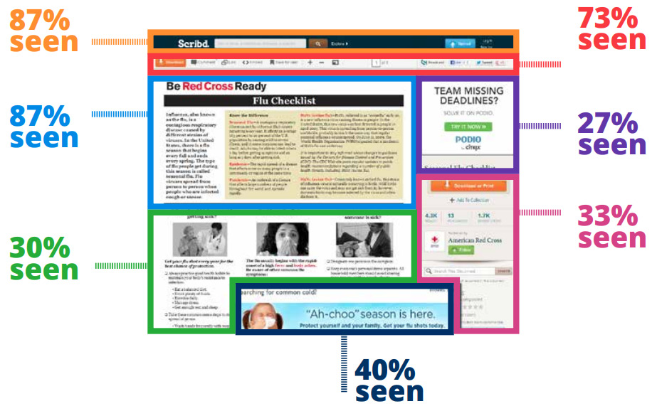
Did you know that users are paying less attention to the content on the right side of the website?
Changing your ad placement can give you a nice boost in conversions.
First, try positioning your ad at the top of the page. This is the place that attracts the user's attention the most.
You only have seconds – maybe even milliseconds – to get someone to click on your ad.
Want a chance to win? Create A Unique Commercial Offer that no one can resist.
Your USP is your main benefit.
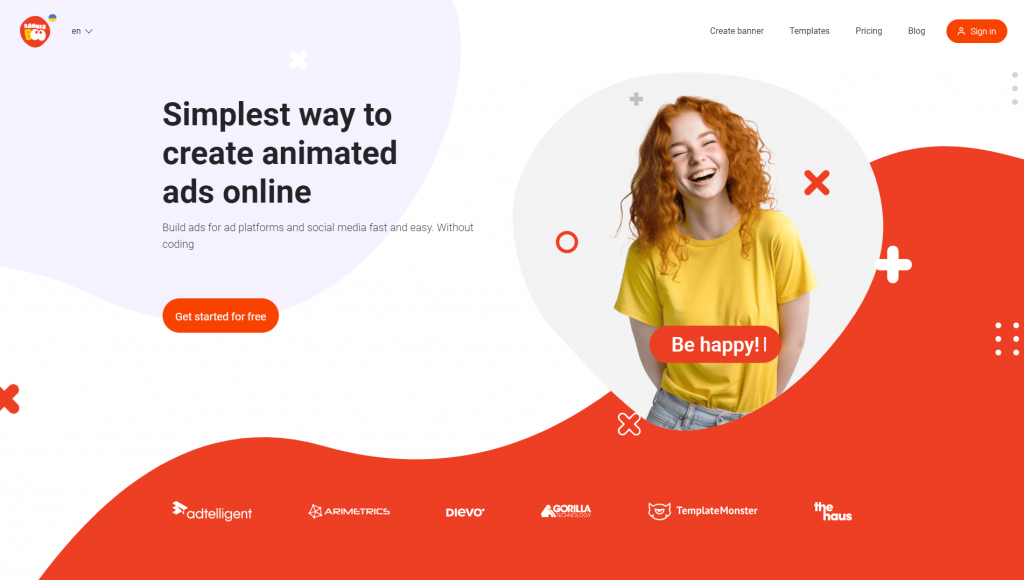
USP from BannerBoo.com banner designer is easy to read at the top of the page.
Your goal is maximum clarity. Make it simple, but at the same time very attractive.
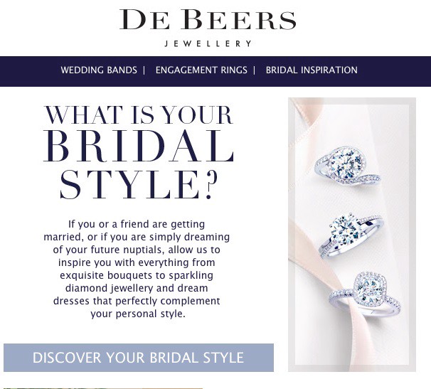
You already know that CTAs (calls to action) are important. How often do you come across boring calls to "buy now"?
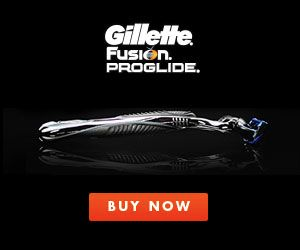
Choose a unique catchphrase that fits your brand.
This 'Find Your Wedding Style' ad from DeBeers is a great addition to their brand.
You know, some things' success totally depends on color. The same goes for CTAs. While there's no one "right" color for CTA design, you should make it pop against your ad background.
See how well the bright yellow button stands out of the green and blue background in this ad:
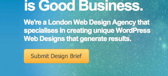
Complementary colors (such as red and green) and triadic colors (red, yellow, and blue) are great for creating contrast.
Most advertising managers and marketers tend to focus on advertising on external sites, while ignoring the potential of advertising directly on the brand's website.
But experts unanimously say that attracting new users is 4-10 times more expensive than keeping existing ones.
I think you've heard it before: retaining a user is cheaper than acquiring a new one.
So use all these ad tricks on your site too. Don't ignore your loyal users.
The fonts you choose can either inspire trust or put off your audience.
Look here, for example:
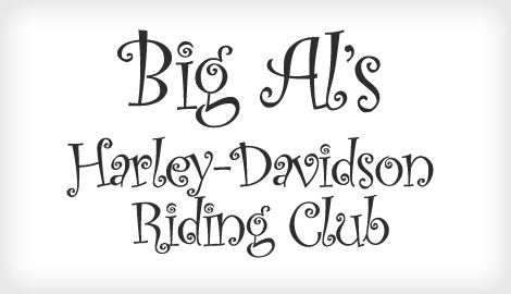
Do you think this font is suitable for Harley-Davidson bikers?
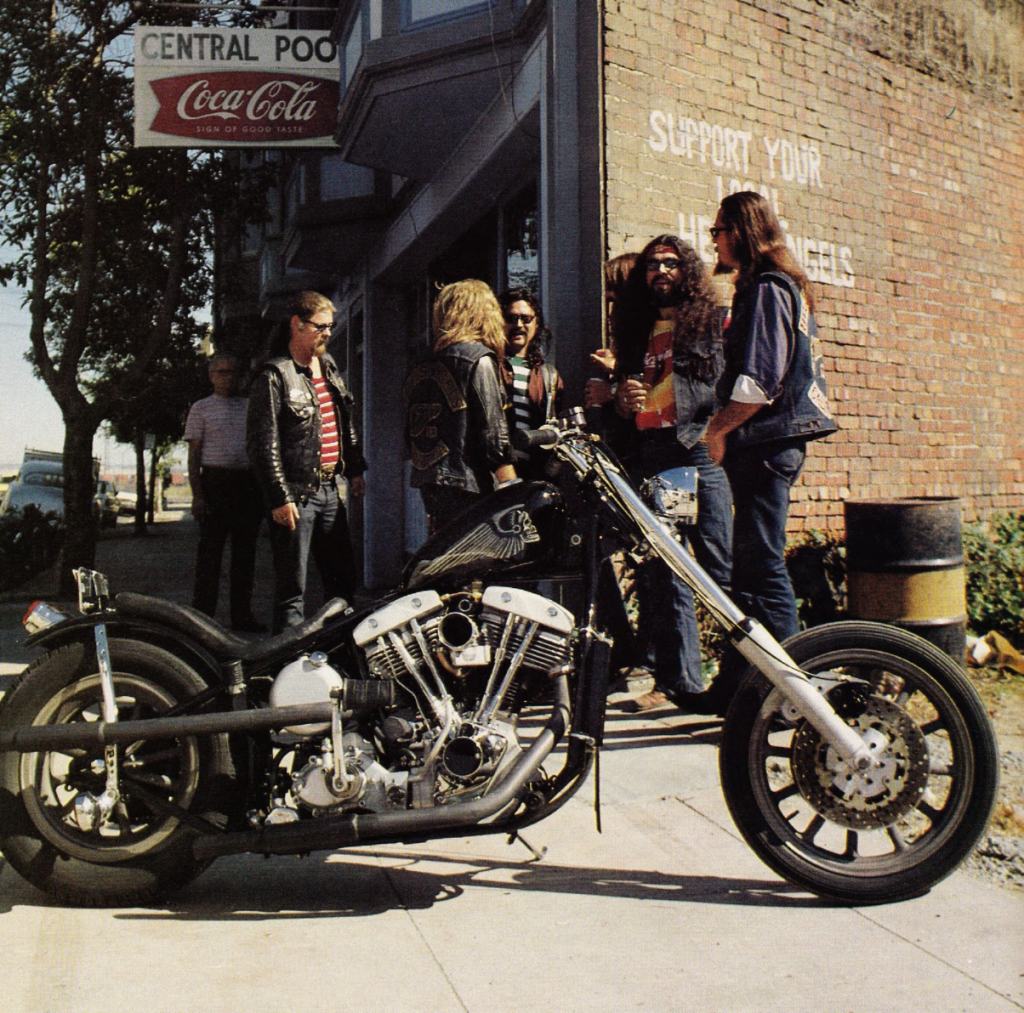
I think not.
Fonts are important.
In 2012, the New York Times conducted a study disguised as a quiz.
People found statements printed in Baskerville to be more credible than statements in a font like Comic Sans.
Keep this in mind the next time you design your banner ad.
If you use Google Ads, try using their adaptive media ads.
Responsive advertising is especially useful in mobile advertising.
These banners are automatically adjusted to existing ad slots throughout the Google Display Network. The size and format of the ad will be adjusted to match the look and mood of the web page, the targeting and the campaign goals you have set up.
For example, like this:
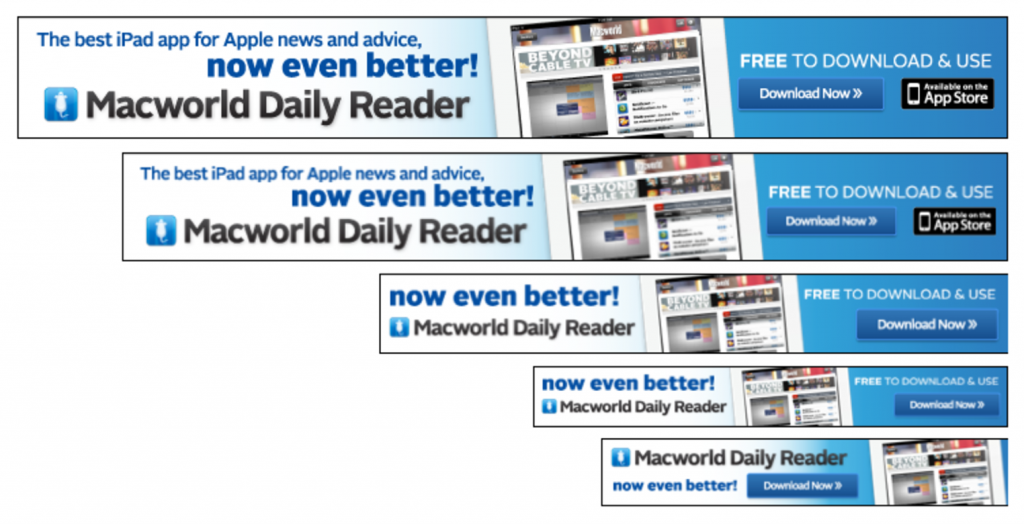
And according to MarketingLand research, here's how it actually helps:
10% increase in CTR
59% increase in conversion
19% increase in CPA
Not a bad gain for such a small change, right?
It's a fact – our eyes are naturally drawn to anything that moves. Use this advantage and create animated ads.
Don't make it flash too much. Just add some movement to grab the user's attention.
And whatever you do, beware of doing anything like this old-school pushy ad:
No one likes that, for sure.
On the other hand, unobtrusive and thoughtful animation easily outperforms boring static advertising.
Studies have proven that motion and animations, such as explainer videos and animated GIFs, increase conversion rates.
Of course, this also applies to advertising banners.
Users love when information loads rapidly. If it's longer than 2 seconds, you're in trouble.

The solution is to optimize your advertising, making it as light as possible.
Google, fortunately, helps with this as well. They made "acceleration" of ads that run in the Google Display Network using AMP technology.
Editor's note: Online banner creation service Bannerboo.com was one of the first to implement AMP HTML support so that you can easily place your created banners in Google advertising.
You might not be too keen on the idea of making your banners bigger. You could be worried that a larger ad might appear intrusive and receive fewer clicks.
But research says otherwise.
Large ads usually work better because they are more likely to be noticed, especially on sites that are overloaded with information.
Google has published a study that says vertical ads are the most visible.

So, we can conclude that the most visible advertising banners are vertical banners located on the left side of the page.
Sounds like a cool title, right?
It's a cool theory that promoted by Barry Schwartz. It says that it's actually better for people when they have fewer choices.
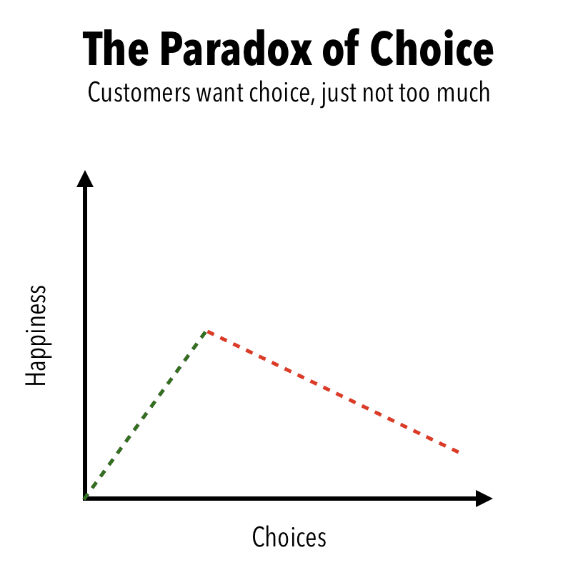
It sounds contradictory. But it is true.
There are several ways you can apply this to your ad.
First, the more banner ads you have on your site, the more you will confuse users. Therefore, try to show no more than one or two banners on each page (ideally only 1).
Second, each of your banners should only have one call to action. Otherwise, visitors to your site may experience the paradox of choice and leave without ever clicking anywhere.
You can get hundreds of clicks on your banner, but if they are not the clicks you wanted, their usefulness is close to zero.
Find sites that have your target audience and post there. It's critical to know who your target audience is before you even run your first banner ad.
If you're hosting on Google, read these two articles before running your ad campaigns.
About manually selected placements
Advertising in the context-media network
If you go through this whole list again, you'll see that I often mention relevance and consistency.
You recognize iPods everywhere, right?
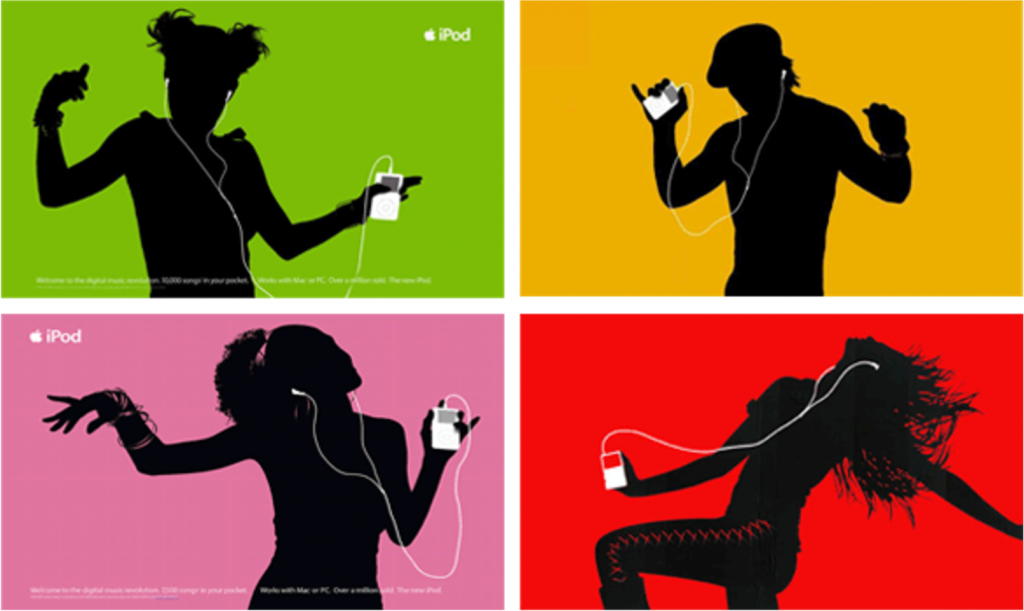
Apple advertising is always relevant and recognizable.
Your banner ads should be part of your brand. This means you can't just take and change your brand vibe, your color scheme, or your entire design style.
But here's an interesting thing: your niche can dictate the conditions of how your banner ad should look.
Agency B&T researched that advertising for travel, media and restaurants has certain properties. For example, advertising banners that indicated the price had a good response:
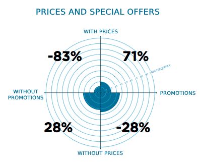
But advertising hotels with prices did not work so well
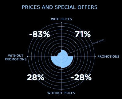
So remember – general rules are not always suitable for every niche. Look at what your competitors are doing and analyze their ads to understand what factors lead to successful results.
Income is an important criterion, but you may not even realize how much.
This can be a major factor in how people respond to advertising. In particular, studies have shown that:
Users who earned more than $100,000 per year were 35% more likely to be exposed to advertising than those who earned less than $50,000 per year. Moreover, the advertising product was something that they had not even thought about before.
On the flip side, when it comes to making a purchase, users earning less than $20,000 were 12.5% more likely to be influenced by an ad compared to those earning over $100,000.
Overall, it seems that individuals with lower income, such as workers or students, are more susceptible to advertising's influence and are more likely to engage with and make purchases from it.
10 years and 18 million banners later, I'm a lot smarter than I was before.
But it was not easy.
Some of these lessons I shared took years to learn and fully understand. Often my teachers were the mistakes I made.
I was embarrassed, wasting a lot of time and money doing things that didn't work.
I don't want the same thing to happen to you as happened to me, and for you to learn from your mistakes as well.
That's why I wrote this article.
And especially I wrote it because banner advertising is not an easy thing.
Many people dislike banners because of their reputation for spam and poor quality.
Moreover, with the rise of adblockers, many people have already declared that banner advertising is dead.
But many people also say that SEO is dead, even though it was never dead.
Even though adblockers have become the norm, there are still millions of users online who still see ads. People click on it and it still leads to conversions.
Should you invest all your money in banner ads? Definitely not!
However, you should not ignore it. Advertising is a powerful mediator that has access to an audience you wouldn't normally have access to and that effectively represents your brand.
So don't write off banner ads so quickly. If you work with it correctly, you will get tons of conversions and eventually sales.
Author of the article: Neil Patel. Translation and adaptation: Bannerboo.com