Is there a formula for successful advertising?
For most people, an ad creative may be their first exposure to a brand or mobile app. It's like a "book cover" by which people judge the content. Strong ads can make a big difference in the success of mobile ad campaigns.
That is why we are constantly trying to write about the best way to design banners. In one of the articles, we've already talked about techniques for creating effective advertising banners. Today we're getting down to the basics and sharing some tips and insights on how to create professional mobile banner designs.
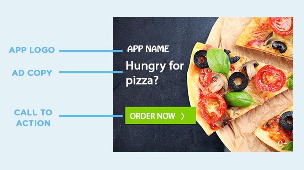
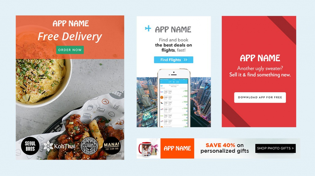
The formula to remember is surprisingly simple — Logo + Copywriting + Call to Action + Image.
Make sure to include your company logo. It adds credibility to the banner and is a great chance to showcase your brand, so make sure not to overlook this opportunity.
It should be short and result-oriented. Who is your target audience? What is the ultimate goal? Are you targeting people who haven't downloaded the app yet? Maybe you want to reach users who haven't made a purchase yet? If your goal is to attract those who haven't installed your app yet, provide them with clear and relevant information. "Free UK Delivery" doesn't mean much if you don't know exactly what you're offering.
This element is often not taken into account, but its presence plays an important role in the effectiveness of advertising. In the graph below, you can see how the same ad has a significantly higher CTR when a CTA is added.
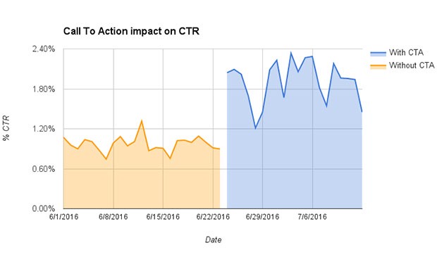
This does not mean that any CTA will have this effect. It should be specific to a particular advertising campaign. If it's an app install campaign, the appropriate CTA is "INSTALL" or "DOWNLOAD". If it's a retargeting or experimental campaign, the CTA refers to the action you want the user to take within the app, such as "BUY NOW" or "SUBSCRIBE."
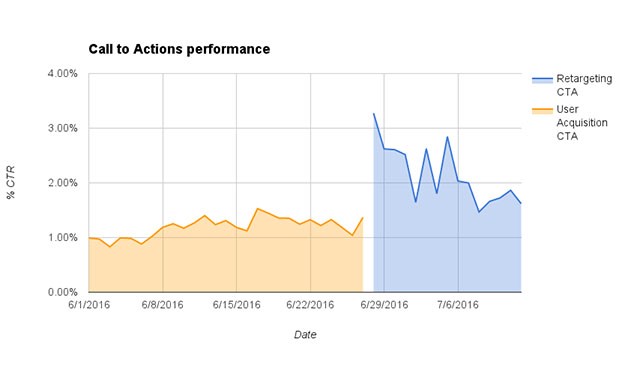
If a user has already downloaded an app, and you show them a "DOWNLOAD NOW" banner, they probably won't click on it. Why does he need it?
Unfortunately, there are no magic rules when it comes to using an image in a banner, but either way, it's better with one than without. As long as the image is high-resolution and harmonizing with the rest of the ad message, you can experiment with it. For those who still need instructions, here are some tips:
In vertical ads, position your logo near the top and your CTA at the bottom. Since we read top to bottom, align with: who's selling and what, then how do I acquire it? It doesn't make sense to say "BUY NOW" and then tell them exactly what you're selling. The same logic applies to horizontal banners – logo on the left end, CTA on the right end.
Do you sell great products and want to show them all? Great! Just don't show them in the same ad. Mobile screens are small and it is easy to overload them with information. Limit the number of products you show in one banner (it's better to show only bestsellers). Typically, 2-3 creative versions are produced, allowing you to display different products or app functionalities with each version.
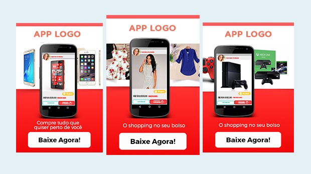
Make sure the CTA is clearly visible, and its color contrasts with the rest of the ad. Get users' attention, reach out to them, tell them to click and get high conversions.
For banners in native applications, choose high-quality images. Otherwise, they will look blurry on new phone models. For native ads, you need to upload your logo, image, ad text, and CTA separately. Native ads adapt to the look and feel of the surrounding content. Therefore, they look different depending on their placement.
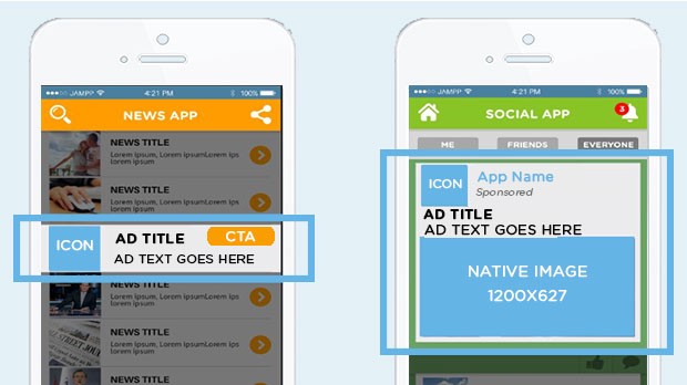
Native mobile ads outperform standard banners, they are more attractive, relevant and interesting, while being less intrusive and less annoying.
Once you've launched your ads, it's important to update them from time to time. Even if an advertising campaign starts very well, it will eventually lose its effectiveness.
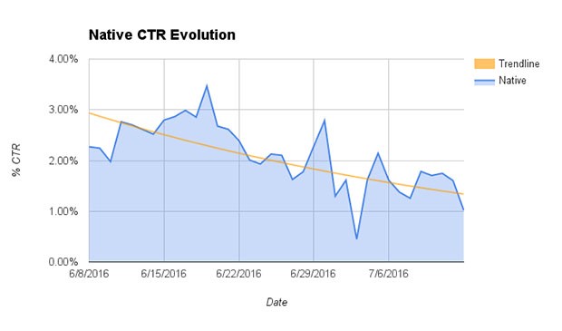
It comes from the fact that users develop "banner blindness" and will ignore the ad they see several times a day.
Here's a quick checklist to review before creating your ad campaign:
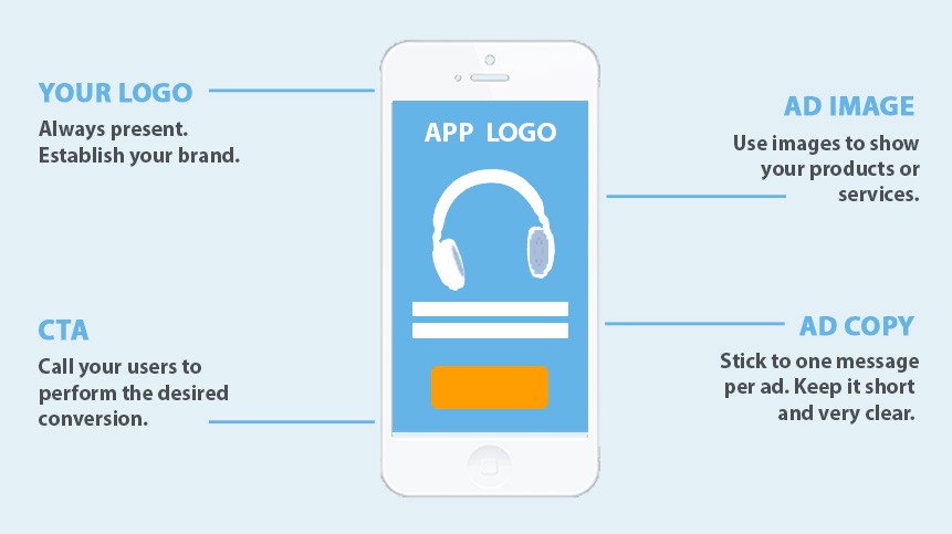
Remember the formula – Logo + Copywriting + Call to Action + Image.
Author: Pamela Corvino. Adaptation: BannerBoo.com