Running a banner ad? Pay attention to the HTML5 banner format! Most of the content, including advertising, is viewed by users from mobile devices, and HTML5 perfectly adapts to various screen sizes without losing quality, interactivity and aesthetic appeal. Get inspired by the ideas of brands to start working in a new format and see all the advantages of HTML5.
Advertising banner campaigns always require resources to create, which is perhaps why the HTML5 format is often underestimated. Most often due to technical features, because banners must be created in a special HTML and CSS3 environment. Is it difficult? Definitely more complicated than just a static banner. But, once you understand the principle and algorithm of creation, you will be able to develop effective banners in just a few clicks.
The HTML5 standard provides a huge space for creativity and opportunities to develop dynamic and exciting advertising materials. You will be able to create banners that not only attract attention, but also interact with your audience, creating deeper context and the right interaction.
HTML5 banners, developed in a special environment, have greater interactivity and professional visual elements compared to standard graphic banners. Advertising networks often moderate this format much faster, promote it more efficiently and display it optimally on different devices.
From the point of view of creativity and efficiency, HTML5 banners are simply necessary to run successful advertising campaigns. In addition to more space for creativity, they can be used on different platforms and devices using responsive elements. An example of an HTML5 banner would be a video banner, where the video starts as soon as the user hovers over the ad.
The advertising market is experiencing a constant increase in the number of smartphone users, and therefore banners are increasingly being viewed on phone screens. Therefore, the ad should look as cool as it does on a laptop. It is very important that the user experience is equally positive, regardless of device and platform. And it often happens that some elements that work perfectly on a large computer screen cannot always be displayed on smaller devices.
This is where HTML5 will quickly solve the problem. This format makes it possible to develop banners that are easily adapted to mobile devices, adapt and retain fullness of content and functionality. In this way, you create guaranteed competitive and effective ads for the "Mobile First" market.
HTML5 can be both in static and animated versions. A simple ad with an image and text that animates on a banner within the first three seconds can grab attention in the news feed and motivate a click.
So, what should be paid attention to:
size and format matter (think about where your audience is viewing your ad);
text overload (too much text can look cool on a laptop, but unreadable on a phone);
smooth animation (users will remember ads that are interesting and logical more quickly than traditional static images).
Since HTML5 banners can be of different sizes and designs, it also opens up the possibility of reaching a larger audience. Some users like text, others like video. HTML5 banners contain all the functionality to convey information to a much larger audience, and also adapt banners specifically for specific target groups.
Key features of effective ads (including HTML5):
clarity of the message (everything should be clear at once: product/service, key offer, brand name, CTA, how to buy or what to do to order);
relevance of the target audience (advertising should meet needs and interests, and not just be beautiful);
captivating design (ads should stand out, attract attention and be visually pleasing);
high-quality images (do not experiment with quality, because this is the brand's reputation);
active CTA (encourage viewers to take a certain action: click an ad, register or make a purchase);
a minimum of text (do not overload the viewer with details so as not to reduce the effectiveness of advertising);
brand consistency (stick to corporate style to increase company recognition).
The effectiveness of the banner directly depends on how detailed and how often you analyze your own and competitors' advertising campaigns. Quick reaction to changing preferences and interests of the target audience is always a good idea!
The best banner ads are a combination of many different elements that have worked over a period of time with a selected category of target audience. They contain high-quality images, unique interactivity, concise text and use the best advertising technologies. Your task is to take interesting ideas and test them with potential customers
Effective banners not only attract the viewer's attention, but also successfully achieve the set goal: increasing recognition, sales and building brand loyalty.
So, without further ado, let's move on to examples of effective HTML5 banners in media advertising campaigns of well-known brands.

PayPal's creative department is working full time, as always! The target audience for this ad is business owners who receive an offer to increase the number of loyal customers.
Why is this ad effective?
The banner boldly emphasizes the key advantages and attracts the attention of everyone to whom this information is relevant.

Is it possible to show the entire history and philosophy of the brand in one banner? Looking at this WordPress example, there is no doubt about the reality of such advertising. The company that created the most popular blogging platform has put some very powerful text to grab the attention of the target audience.
Why is this ad effective?
Taking into account all the information above, the CTA button can be completely removed! Audiences now know exactly where to build the best sites.

To be heard, it is necessary to follow the trends. Like MailChimp, encouraging the use of AI for businesses and guaranteeing its support to make the most of modern technologies. AI has gotten a lot of attention, with more to come (according to Forbes 64% of businesses believe its potential to improving relations with customers and partners).
Why is this ad effective?
MailChimp advertising provides a clear picture of the platform, technology, service effectiveness and results for businesses.
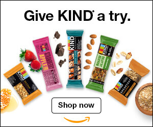
A healthy food brand can be more than just green leaves and wheat sprouts. KIND Healthy Snacks chooses a color format to show the entire range and motivate the purchase.
Why is this ad effective?
The KIND Healthy Snacks ad can be a great example to follow, especially if you work with food.

Sephora's display ads talk about possible delivery and pickup options: courier pick-up, in-store pick-up, same-day delivery and free delivery.
Why is this ad effective?
Do not be afraid to experiment with advertising formats, because one banner can work with all segments of the target audience, and very successfully!
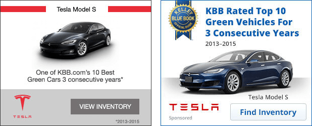
Few people do not know this company, so the logical question is: why do they advertise at all? Well, no matter how well-known a brand or popular product is, you must always be in touch with your audience! Share your news, reiterate your benefits, and show potential customers that you're waiting for their attention.
Why is this ad effective?
So, do not forget about advertising banners, even when you confidently occupy a leading position in the market. When you have the trust of the audience, it is even more interesting to come up with more and more meanings and benefits for them.
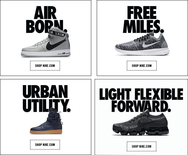
Brand marketers always develop ads that hit the target! Nike is one of the leading brands of sportswear and they are very cool thinking about their campaigns to always be in trend.
Why is this ad effective?
If your product is the main one, then let it become the star of advertising banners.

Asana's task manager has created ads that perfectly match the needs of the target audience. Created in the most convenient format, a horizontal banner, the ad immediately attracts attention.
Why is this ad effective?
If your customers are businesses, then using statistics and feedback is a very good idea. Master the art of persuasive messaging and quantitative evidence for effective advertising campaigns.
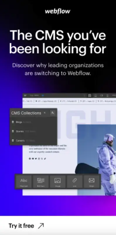
Webflow site developers skillfully combine creativity and advantages in their advertising campaigns. Customers immediately pay attention to the "CMS you've been looking for" headline, and that's exactly the motive that will prompt them to click and learn more.
Why is this ad effective?
If you have samples, free versions and test periods — write about it in the advertisement. This makes it easier for the client to agree to the first contact and learn about all the possibilities of cooperation with the brand.
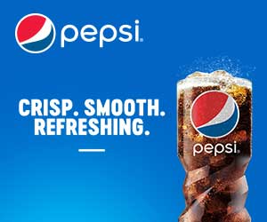
Agree that when you see a drink being poured in an advertisement, you immediately want to try it. This is how the brain works: the sound of liquid pouring into a glass serves as a reminder of thirst. Pepsi marketers know this, because they successfully use this technique in advertising.
Why is this ad effective?
The goal of advertising is not only in an immediate click or sale, in many campaigns banners are created in order to form a stable emotional connection with the brand. Customers will look for it on the shelves in offline sales points with a greater probability.
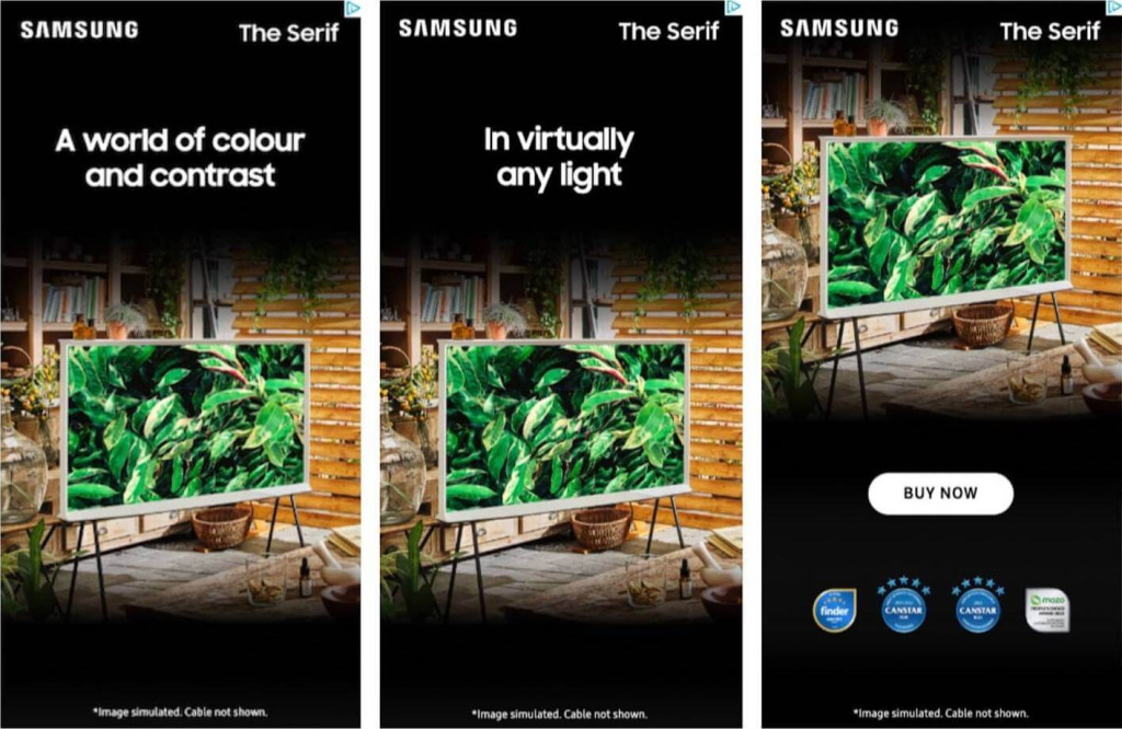
Samsung's stylish advertisement for the Serif model is a virtuosic combination of high-quality image, benefits and dynamic graphics to emphasize the strengths of the product. These are three announcements connected by a single motive and concept.
Why is this ad effective?
In this example, the key role is allocated to the product, so for a successful presentation, make sure that the product is in the center of attention.

The company Atlassian knows exactly the principle of creating effective banners: only one design option, and in it the whole spectrum of the necessary authority and trust for a business application.
Why is this ad effective?
Do you have trust or confirmation of brand professionalism from a well-known business community? Try creating a story around it to get to know your potential customers!

LinkedIn, a platform for professional and career growth, uses audience inquiries as key advertising drivers. It's a great solution that boosts results and delivers high engagement rates.
Why is this ad effective?
If you clearly know your audience, then work for them. Do not make advertising understandable to everyone, choose personalized and relevant options to the needs of real customers.
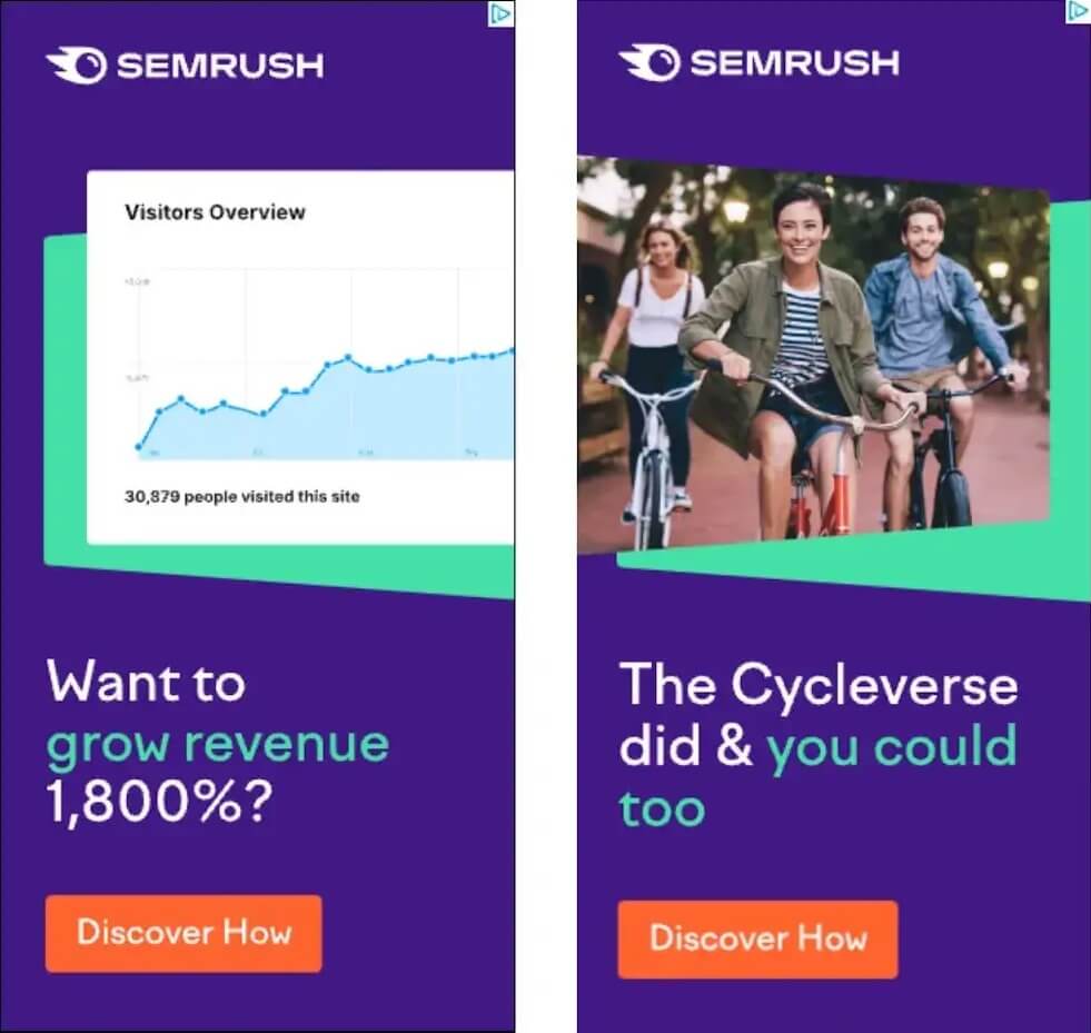
For companies operating in the B2B sector, it is critical to offer real business tools. Semrush very often uses effective accents in its own banner advertising campaigns.
Why is this ad effective?
When social proof and concrete numbers are combined in a banner design, the result is automatically a more credible and engaging ad. And accordingly, STR!

Of course, the giant Apple could not be on this list. The banner for Apple TV is an example of high-quality and well-thought-out design to achieve the brand's marketing goals.
Why is this ad effective?
Of course, we can still recommend testing various options, but this is already one of the most concise and visually aesthetic advertising banner options. As they say: laconic, but tasteful!
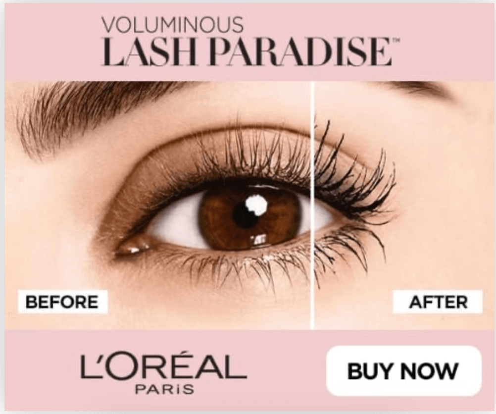
The cosmetics brand Loreal often delights with interesting banner formats in advertising and social networks. Videos, and even real advertising films, look especially effective. But media formats also show the professionalism of the team and its marketing goals.
Why is this ad effective?
If your product has a pronounced effect, then try to show it in advertising. So the client immediately understands what is expected of him and will be ready for the result. By the way, this also applies to services and applications, where it is worth explaining what awaits the client after the purchase.

A spectacular brand offers spectacular advertising! Watchfinder & Co creates really great ads that showcase the style and character of a luxury watch brand.
Why is this ad effective?
The ad contains an attractive image of a luxury watch, attracting the attention of the audience who would like to buy it. A noticeable CTA drives a purchase. This format always gives good results, so we recommend using it for your brand as well.

The jewelry manufacturer Tiffany launches advertising in its signature style, which has long been recognized around the world. The quality and aesthetic appeal of the brand can be seen in every element of the banner.
Why is this ad effective?
Stories and interesting combinations are what will distinguish your brand from competitors and colleagues in the market. Look for your uniqueness and win a place in the heart of a loyal audience.

Chanel fragrances are fascinating with their history, and banners from the screen have only 2-3 seconds to evoke emotions and delight. And the brand successfully copes with this task.
Why is this ad effective?
Chanel's ability to convey a compelling message with minimal content demonstrates the brand's mastery of creating impactful, memorable advertising. Maybe this is your option when you don't need many words?

Puma and Balmain Paris brands have created effective advertising that meets all the needs of the target audience. A vertical rectangle is great for product presentation, especially if it's such stylish and modern images.
Why is this ad effective?
The combination of a popular model and a collaboration between two well-known brands helps the ad reach a wide audience, including fans of fashion, sports, Puma and Balmain Paris. Think about which company you can partner with to scale your marketing efforts.
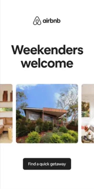
Airbnb's display advertising is attracting more and more customers to the short-term stay and weekend travel trend that is currently actively developing around the world. Target audience: People looking for quick vacation options.
Why is this ad effective?
Follow the trends and interesting directions, maybe this is a new promising direction for your business?

New York Times advertising uses a simple and transparent approach to attract new subscribers: there is a significant discount and favorable terms of use. All the conditions for a perfect sale, nothing superfluous.
Why is this ad effective?
A complete focus on the offer in a clean, concise layout is an effective combination for attracting traffic and followers.
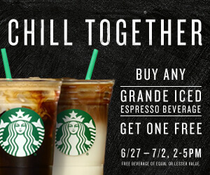
Starbucks always generates great ideas for advertising. There are many businesses that offer 1+1 products, but this brand focused not on the discount, but on the social benefits of spending time together. This is how Starbucks touches on important social needs, relationships and emotions of the audience.
Why is this ad effective?
Do you have an interesting offer? See if there are other ways to encourage customers to buy. Pay attention to the emotions and stories around the brand and try non-trivial approaches.

Logpoint decided to create a very minimalistic HTML5 banner ad with two phrases in black on a white background and a blue CTA button. It looks like a Google popup message. A bold and stylish decision!
Why is this ad effective?
Follow brands to understand what style and design is trending and how you can use it in your marketing.

Thanks to this HTML5 banner, Currys allows users to visit the main page of the online store almost immediately.
Why is this ad effective?
Got a discount or a great deal? Display it on a banner to attract the attention of potential buyers. Why wait for the client to go to the site? Show what he gets right in the ad design!

The Nexity brand is also against complications and oversaturation of advertising. This ad example conveys all the necessary information and attracts the attention of the audience, and all this — in a simple design.
Why is this ad effective?
Use images that are relevant to your brand. Let the client develop an understanding of you and your offer through clear visual images.
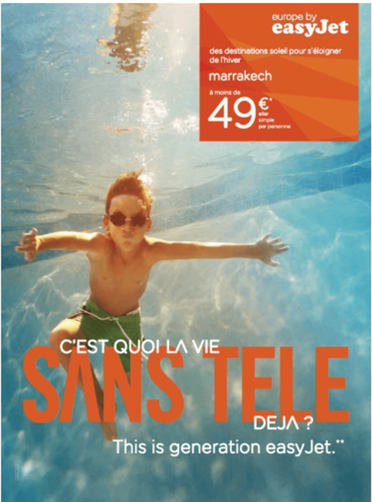
EasyJet talks about benefits and lifestyle with the brand, not just product features. This is a good idea if your goal is long-term customer relationships, not one-time sales.
Why is this ad effective?
When you design a banner, pay attention to stylish color combinations. Add emotional color and convey the whole vibe of working with your brand.

Burger King has many stylish banner ideas. Here's one: "You won't find a better burger than this," or will you want to look elsewhere? Probably not! The "Order Now" button, which is very visible, leaves no choice or doubt.
Why is this ad effective?
A horizontal banner is not a very good idea for placing a full-size photo of the product, but it is possible to beat everything very well, just experiment with the position of the object.
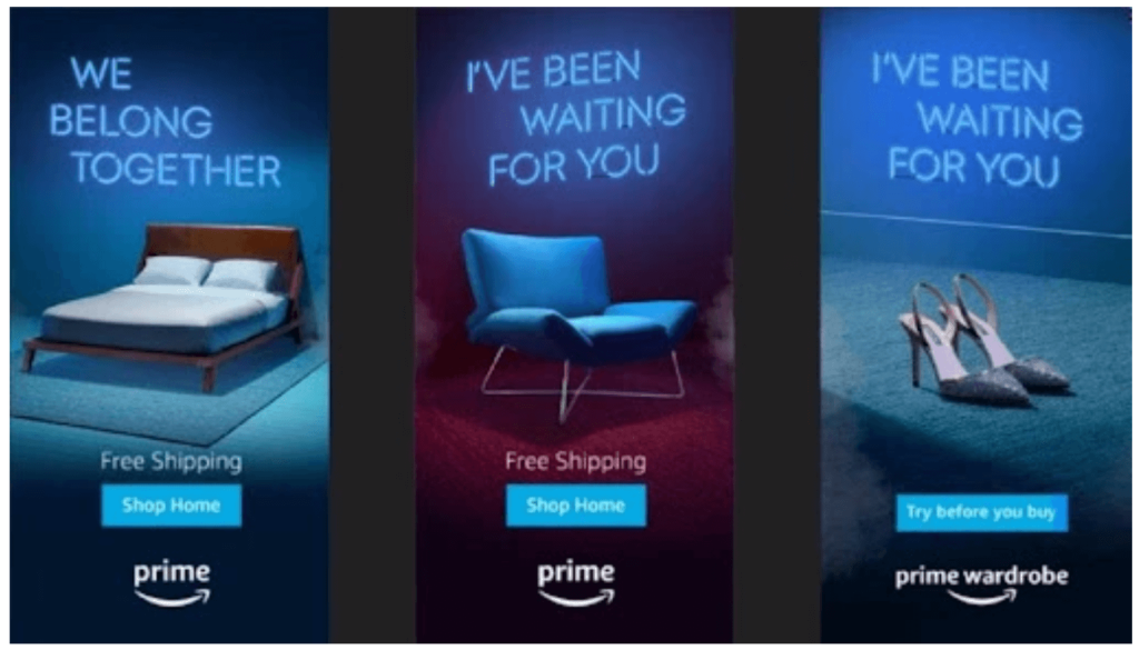
This very intriguing banner ad for Amazon's main delivery campaign uses CSS, HTML5 and Javascript to create a neon light effect that highlights the product. It may seem simple at first, but the realistic glow effect created around the product really makes it a great way to highlight the features of the product.
Why is this ad effective?
Sometimes even the first glimpse of a product is enough to intrigue viewers, and Amazon has certainly done that very well.
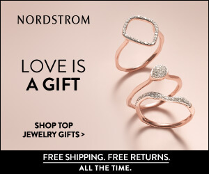
Nordstrom jewelry stands out for its design in the news feed or search. Most of all, of course, with its color palette, in pastel colors, in order to focus as much attention on the decorations as possible, and not on the background.
Why is this ad effective?
Jewelry does not need additional design, it is better to focus on the details and features of the product.
When the creative process of creating banners begins, the main task is to find inspiration and ideas to create the best HTML5 banners. Everything matters: how the visuals are placed, what design concepts are used, what format is chosen for the ad, how the file is saved, and whether it is quick and easy to upload to an ad network.
HTML5 banners open up new opportunities for advertising campaigns, because they allow you to effectively use animation, sound, video and interactivity to create advertising messages that are memorable and stand out among competitors and colleagues on the market.
When working with HTML5 banners, it is important to follow the best trends in design, but not to forget about the preferences of the target audience. Only such a combination will ensure maximum efficiency and effectiveness of advertising campaigns to achieve marketing goals.
First, they are more universal, providing greater interactivity, animation and integration for any device.
Second, HTML5 banners provide better user interaction and higher engagement rates.
HTML5 banners are digital advertisements created using HTML5, CSS3 and JavaScript technologies. They can contain interactive elements, animations, videos and other multimedia content to attract users' attention and effectively convey marketing messages.
HTML5 capabilities include:
Their versatility allows advertisers to create attractive and personalized ads for their target audience.
Yes, many ad networks and platforms have limits for HTML5 banner campaigns: usually between 150 Kb and 300 Kb. This is required for efficient operation on all devices.
We recommend optimizing the file sizes for less weight, while maintaining the quality and functionality of the finished design. So you will ensure productivity and easy interaction with the user.