Do it in detail and "aim" in your ad to clearly identify their problems. This is the basis of marketing; however, in attempts to create the most creative advertising possible, this point is often forgotten.
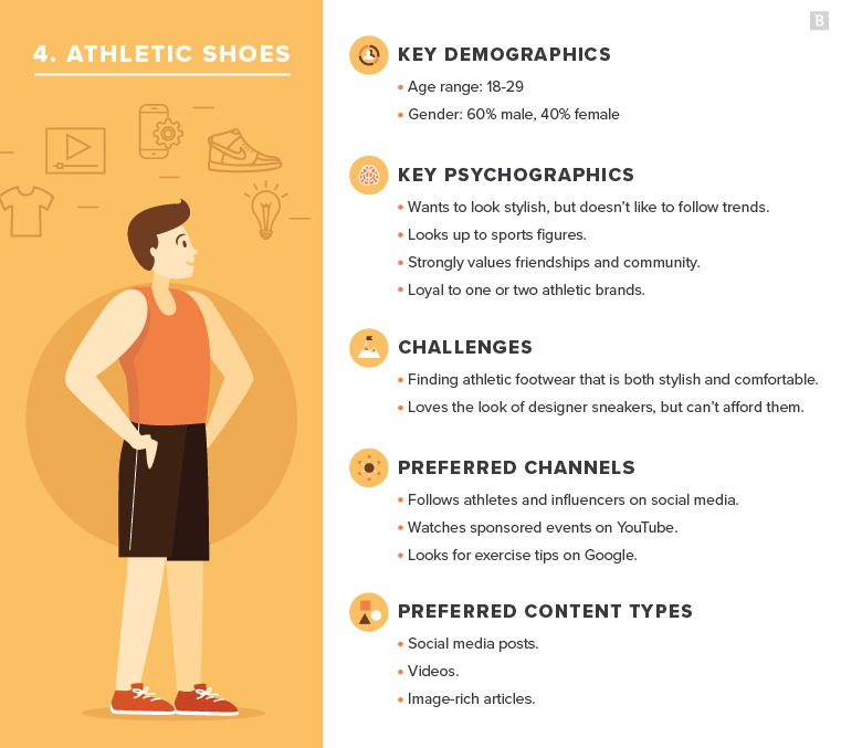
Example of the target audience by Brefton.com
You need to understand who your target audience is so that you can market to them. When you know your audience, you can create a targeted marketing campaign based on their needs, wants, and desires.
When creating a brand and marketing strategy, you need to create a detailed buyer persona. It could be someone in your target market, or it could be done based on research. This helps you understand who your customers are and what they want from your product.
The banner should reflect the solutions to the target audience's problems with the help of your product. In the event that your proposal works for a large group of people, reflect this in your advertisement with multiple images.
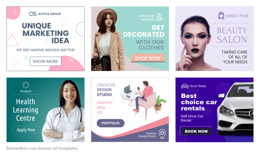 The BannerBoo templates give examples of ads for different target audiences.
According to statistics, 7 out of 10 users click on the banner if they see it as a solution to their problems and pains!
Banner with many small images, buttons, and shapes are poorly perceived by the eyes of users. This also includes frequent changes of pictures in animated banners, as well as too bright colors. This will undoubtedly attract the attention of the site visitor, but the opposite effect will happen – more than 30% of users say that flickering in banners is annoying and distracting.
If your ad design is too complex, you risk alienating your customers. Images should be simple and clear, and focus on the product or service being advertised. This means using white space to create separation between the image and text.
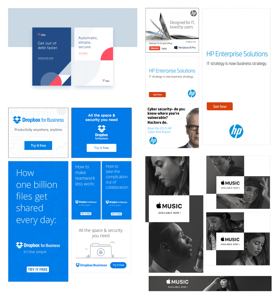
Minimalistic world brands banner ads examples
Think about the overall look of your product before you put it into production. It should reflect the brand you want to create and be as simple as possible. Nazarian says, "I'm always a fan of minimalism”.
It's important to have a strong visual identity that stands out. This can be done through the design of your ads, such as the use of photography, typography, color, and even your logo. Visual design is more than just the layout of advertising. If you don't have a great visual identity, it can be very hard to create a cohesive brand. Visual identity plays an important role in capturing the essence of your company. This helps people understand who you are and what you stand for.
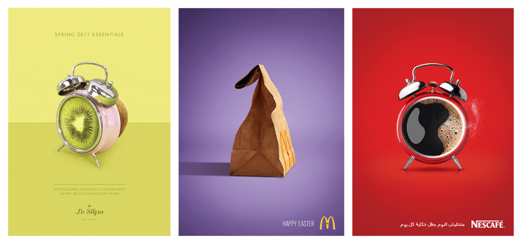 Examples of visual connections in ads
The task of the designer to create effective ads is to find a relevant, visual connection between objects that will help reflect the whole essence of the proposal. Use any familiar look. For example, advertisements often use images of art objects in conjunction with the product being offered. There is room for creativity here: a humorous presentation or, on the contrary, a reflection of some problem.
By minimizing a significant object, you will make people subconsciously accept that little things are not important. If your concept calls for it, apply the opposite effect – exaggeration. In this way, you can communicate that everything starts with little things. Depending on the purpose of advertising, you can compare objects with each other: for example, how the interest on the deposit increases depending on the term of the deposit.
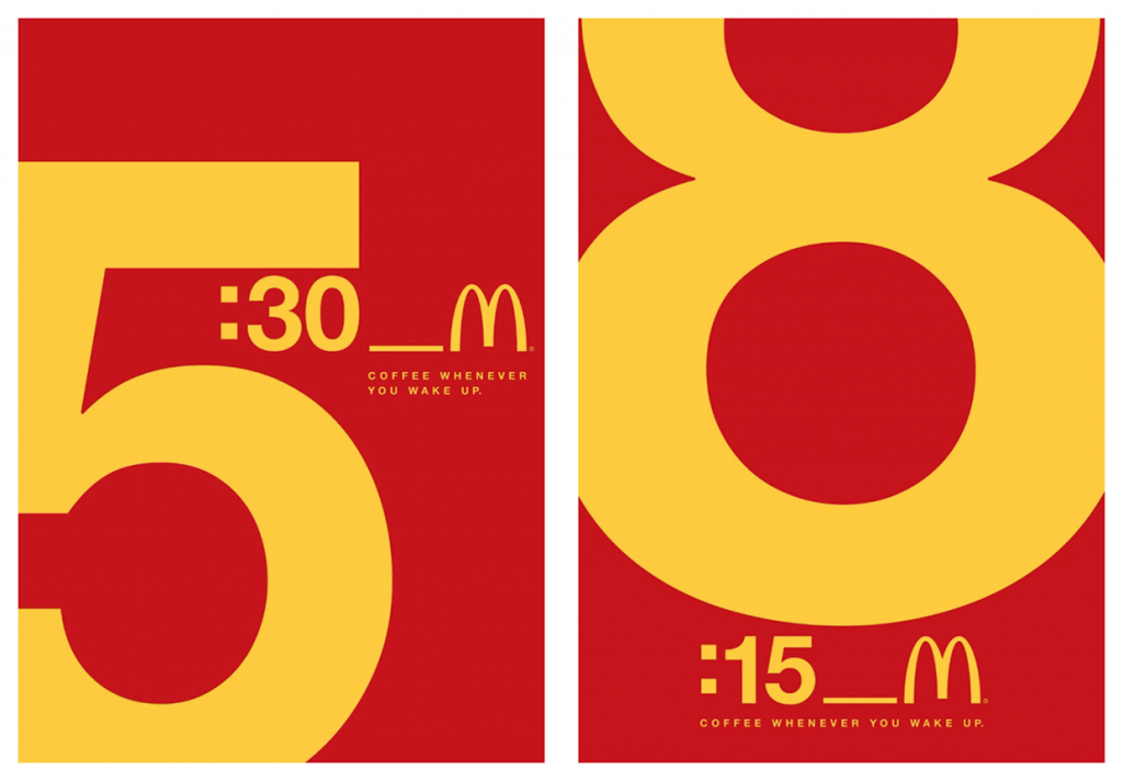 Example of scales in ads – in this McDonald’s case time is the most important element. Image via Adeevee
Sometimes the best way to tell a story is by using objects hierarchy. This is the technique of arranging objects on a layout so that they relate to each other and convey a message. When it comes to the copy or object in your ad design, the bigger it is, the more important it is. Creating an ad that looks great is important, but it's also important to think about what your audience wants. An intriguing and eye-catching ad is key to capturing an audience and gaining their trust.
For example, as in the Curtis Tea ad, where the teapot is depicted as an orange. It is clear to the consumer that orange-flavored tea is being advertised. But unlike text format, the image gives a clearer view and makes the brain smell and taste orange tea. Thus, the consumer will quickly remember the brand and the product itself, and their imagination will be "forced" to try it.
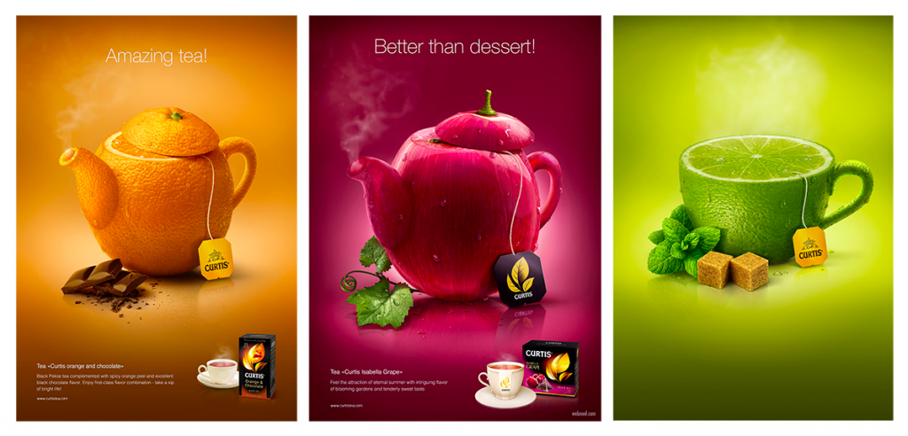
Images are crucial to the success of an advertisement. Studies show that people remember more information in images than they do in text. Therefore, when you're designing ads and images, you have to make sure they are useful and informative. "I visualize what the words can say. Those words are a visual representation of what I want people to do," said Nazarian. "If you picture that, it will come to you."
Always use images when you have a larger display ad. Using images will give your ad a more professional look and feel, especially if you are trying to get attention from customers.
Most Internet users are visual and find it much easier to perceive video and images. This is influenced by the time we live in: a high-speed lifestyle where there is simply no time to read. And the dominance of advertising, wherever it may be shown, weaned the client from the text form. Choose a bright, catchy, unexpected visual object in the advertising maker.
Bannerboo.com short text banner ads examplesTry to keep the text as short as possible, but make it so that it's easy to read and understand. You want people to want to read what you have to say. Focusing on the benefits of a product, rather than the features, will help you sell your product more effectively. The key to selling any product is making sure that customers understand why they should buy your product over the competition. The key to writing effective ad copy is to know your audience. You need to understand what their problems are and what they want from you. Write a copy that speaks directly to the reader and convinces them that your product or service will solve their marketing problems.
Color is important when it comes to promoting your brand. The color scheme you choose for your brand and logo is an important part of branding and marketing. According to research done by the Center for Creative Leadership, each color has a unique meaning in our brain.
Psychologically speaking, each color is perceived differently. For example, red is a call to action, but at the same time, it refers to danger and anxiety. White is a symbol of purity, the beginning of something new. When comparing your concepts, choose colors based on this characteristic, so you can achieve the most correct perception of your message in advertisement design and can influence the subconscious.
This is important because you want your ad design to be visually appealing. Colors can make or break a brand image. If you want to be successful, you need to make sure that your colors are appealing and match your brand.
Studies show emotion plays a much larger role in the decision-making process than rational thought. This is why it's important to get inside your customers' heads and understand what they're feeling. Emotional ads are more effective than rational ones, which means that emotional ads are better at influencing consumer decision-making.
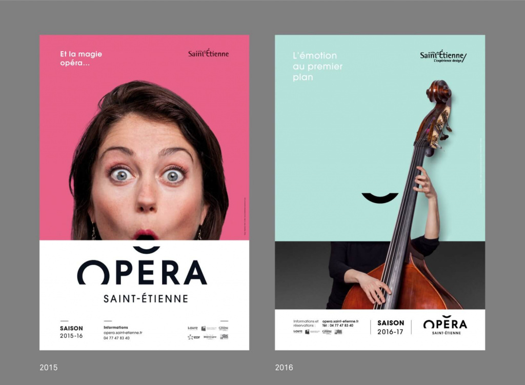
Use of emotions in Saint-Etienne Opera ads. Image via Grapheine.com
Emotional ads trigger our emotions and make us see something in an entirely different way. Ads that generate an emotional response are more likely to be shared. This will result in more exposure for your company and higher conversion rates.
Each of us experienced emotions in relation to advertising: joy, tenderness, calmness. Or negative emotions in the form of disgust or fear. Such advertising provides a 100% guarantee to remain in the memory of a person. For this technique, you can use well-known triggers: images of children for positive emotions, insects to cause fear. Sea waves, wind, and sailboats are associated with a sense of freedom. Remember that 54% of users distrust ads, while emotional attachments increase their loyalty.
When creating a banner ad, ask yourself if this object or text carries useful information. Will the meaning be lost if you remove it? If the answer to the last question is in an affirmative, feel free to delete it directly in the advertisement maker. The fashion for minimalism has left its mark in all areas, including banners. It has become more and more difficult for people to memorize bulky texts and colorful pictures. When you focus on one key message in your ad campaign, you can improve response by minimizing elements of your ad that viewers don't notice. These elements include unimportant details, irrelevant information, and confusing language.
In the book, "Minimalism: The Ultimate Guide to Living a Richer, More Fulfilling Life", Joshua Becker explains why minimalism is such an intriguing topic. Apple's brand is all about simplicity and minimalism. It is a company that put visuals at the forefront of its products and services. Apple's logo, its merchandise, and its retail stores are all minimalist in nature. The goal is to create a message that is as memorable as possible so the consumer can recall it. The more memorable your message, the more likely they are to recall it and remember you. So, be different and keep it simple stupid )
Use large fonts in graphic design when you have something important to say. Large objects attract more attention, especially when they are not surrounded by an abundance of small details. Therefore, if you want to make a loud statement, feel free to write it in a big, catchy font.
Using big fonts is a great way to boost your company's credibility. Brand names written in large font have a very good effect on conversion - 94% of users use words that they saw in banner ads in search queries.
Studies have also shown that using big fonts has a huge impact on the effectiveness of your message. It's important to use short, punchy lines in big font sizes, rather than a long body of text in small print. The average header size on a banner should be around 20-24 points.
Using large fonts in advertising design makes it easier for consumers to read and stimulates their visual sense. Large font sizes not only make the ad stand out from the rest, but they also make a bigger impression on potential buyers.
By putting these tips into practice and using BannerBoo online ad maker, you can engage your audience with your ads. This HTML5 advertisement maker will help you create a unique, clickable banner online without any programming knowledge. Marketers, designers, even beginners can master the great advertising design!