

Have you ever thought about how many ads the average user sees in an hour? In a world where every brand fights for audience attention and loyalty, simple ads are no longer enough. People are looking for more than just a product – they need emotions, trust, solutions to their problems, and motivation. This is what distinguishes an effective visual – creative approaches in advertising become crucial.
Meta Ads (Facebook, Instagram, WhatsApp) is one of the most powerful platforms for brands in the health and self-care industry. Every day, millions of users on social media search for solutions for their body, mind, nutrition, and lifestyle. The audience's needs are incredibly diverse: nutrition, fitness, emotional development, and additional support for mental well-being. But it's not all as rosy as it might seem at first glance.
Firstly, there's high competition (the number of companies is growing, they constantly generate content, and every brand strives to stand out and be remembered).
Secondly, Facebook has strict rules regarding advertising in the medical field – they cannot be ignored, as ads may not pass moderation (in the best-case scenario).
Thirdly, the audience has its own beliefs and needs, making it impossible to capture their attention with standard offers.
That's why successful Health & Wellness Ads are always based on emotion and a clear message. This creates a chance to grab attention and offer your services natively, engagingly, and at just the right moment.
Before launching ads on Meta, be sure to familiarize yourself with these factors that cannot be ignored:
We recommend following the rules and focusing on benefits rather than the audience's fears and negative emotions.
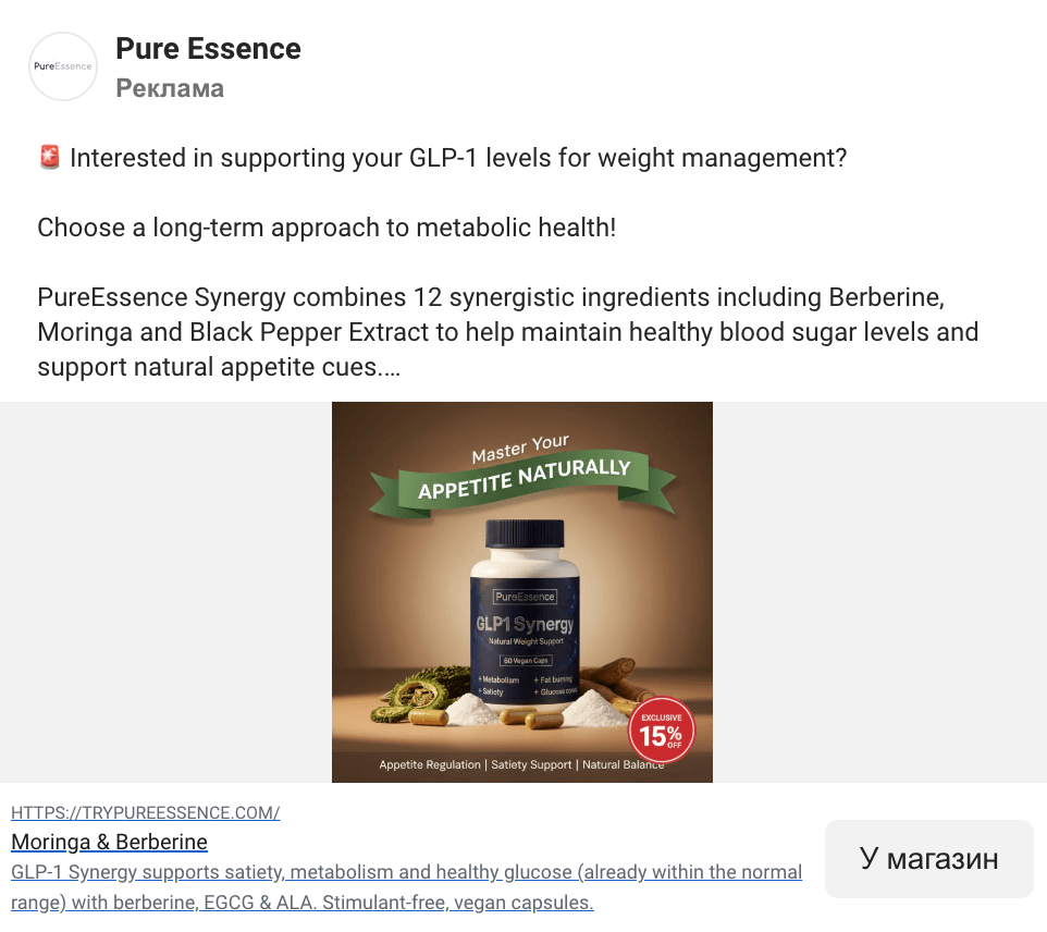
This banner is built on the principle of minimalism: a simple background, a bright product, and a short message. It doesn't overwhelm the viewer and instantly focuses on the main point.
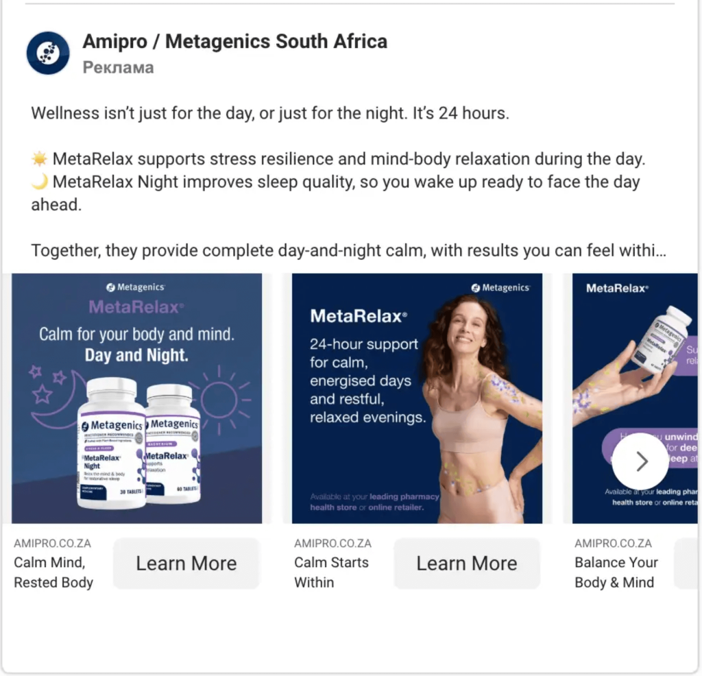
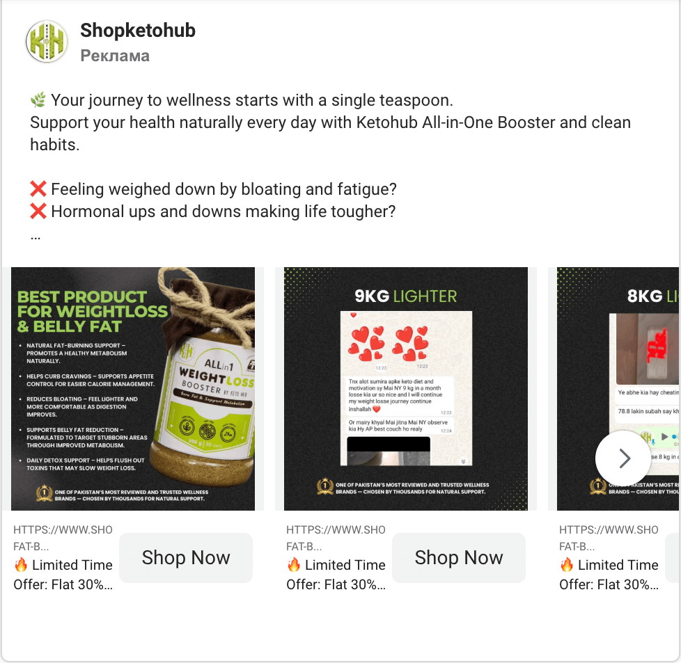
What's interesting about this format? Firstly, the carousel is a high-conversion ad type. Secondly, the brand uses its signature colors to create associations. The ad works to quickly capture attention and motivate users to click the "Learn More" button.
Key focuses: minimalism and well-thought-out visual elements.
What to pay attention to? How using small graphic elements can create a strong emotional component for the brand.

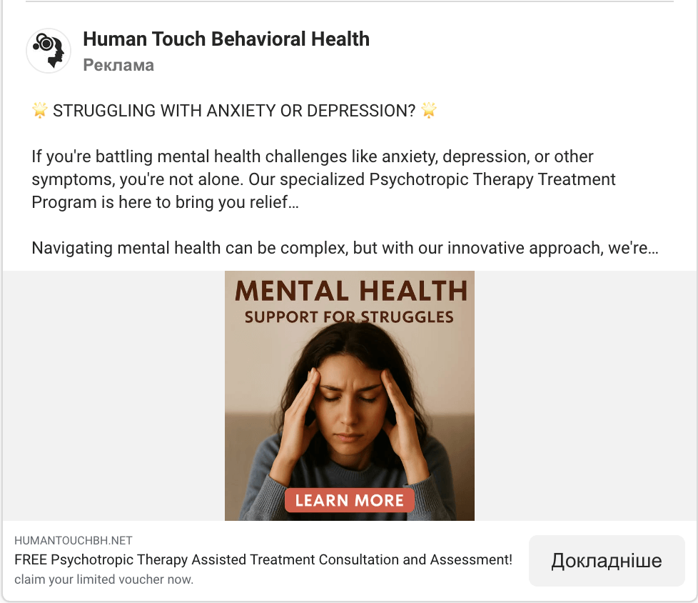
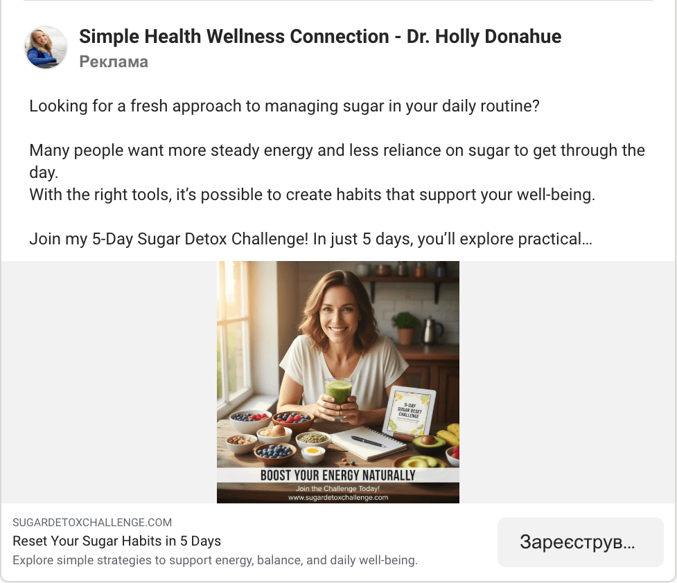
If your product or service can be represented by a photo, use this element in your advertising. This banner features a photo from the real life of the target audience (not staged shots, but genuinely real life), which builds trust and sets clear expectations.
What's interesting about this format? The ad is not intrusive; it creates a "I see myself in this situation, I need this too" effect. This approach increases trust and makes the ad feel more like content from friends rather than a classic sales banner.
Key focuses: realism and setting realistic expectations.
What to pay attention to? If the format allows, show your product or service in action (and remember that Meta's rules prohibit exaggerating symptoms too much).
A carousel format in an interesting high-contrast version: bright backgrounds alternate with calm white ones, so customers immediately notice it while scrolling through their news feed. This further enhances the feeling of energy and drive.
What's interesting about this format? Once again, color directly influences the emotional subtext. A bright palette helps associate the product with positive life changes. And the balance of calm and bright backgrounds is a great way to highlight relevant context.
Key focuses: color contrast and an energetic atmosphere.
What to pay attention to? The ability to choose colors so that the visual plays a key role.
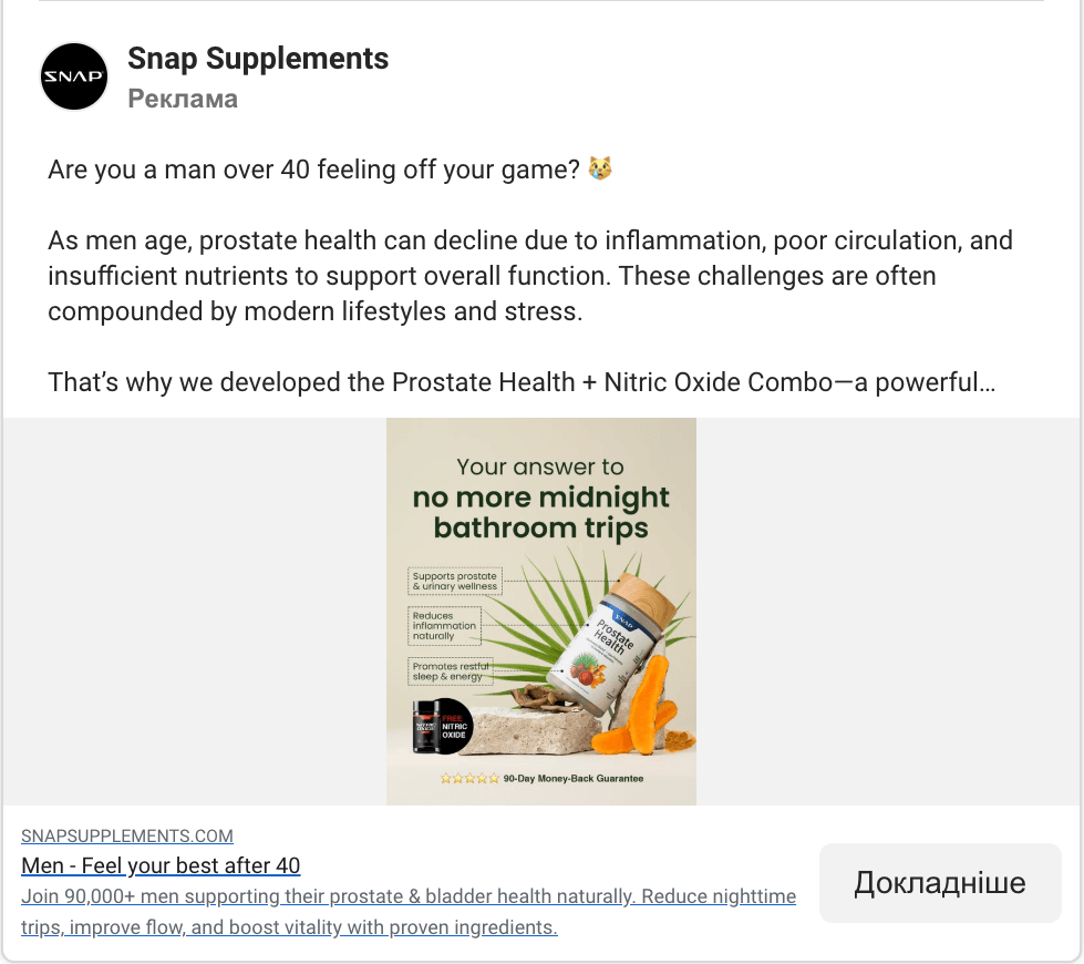
The advertising message is delivered directly on the banner – the text is a 100% extension of the visual part. This saves time – the meaning of the ad becomes clear in a second. In this specific case, everything is understood without words, and each part of the banner does an excellent job of attracting attention.
What's interesting about this format? It shows how to properly balance text and imagery. Too many words don't motivate people to read, but this format only emphasizes the key benefit.
Key focuses: text and a well-thought-out image.
What to pay attention to? Can you shorten the text as much as possible so your ad is understandable at first glance?
A classic technique of demonstrating the process and the result. The user sees not just a product, but its effect.
What's interesting about this format? This visual presentation works on a motivational level: the person immediately imagines how they will feel after the procedure. This is one of the strongest motivators in the medical field.
Key focuses: showing your product in action to guarantee a result.
What to pay attention to? How an interesting process can motivate someone to achieve the same result.
The focus is on emotion. A close-up of a face instantly shows what the person expects, and the positive mood inspires trust. Reinforced with a text message, the client is left with no questions about the necessary next steps (especially with a "Sign Up" CTA).
What's interesting about this format? Using photos and images always works better than abstract symbols. The ad feels closer to the audience.
Key focuses: the mood and emotion of the chosen image.
What to pay attention to? The quality of the content you use. Well-thought-out images can serve as a background and harmoniously complement the content.
A minimalist design where the focus is on the product. The subdued and high-contrast background only emphasizes the main motive – to try the product.
What's interesting about this format? This is an excellent example of the "less is more" principle. When a user is overloaded with information, simplicity becomes a competitive advantage.
Key focuses: banner minimalism and focus on the product.
What to pay attention to? Perhaps your product or service is already a strong focal point on its own, and there's no need to overload the banners with graphics?
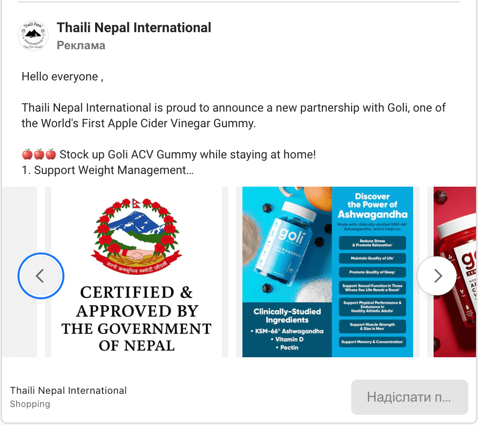
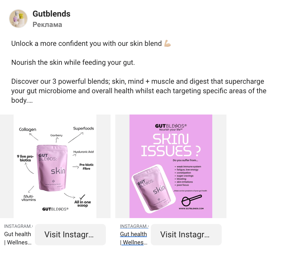
A combination of visual aesthetics and infographic elements. In this example, the banner is not only beautiful but also informative. Users appreciate simplicity in the presentation of material, highlighting the main points, and direct focuses (so they don't have to search for hidden meanings).
What's interesting about this format? An informative carousel with an informative presentation of additional product information. This creates a sense of expertise and enhances trust in the brand.
Key focuses: combination of text and infographics.
What to pay attention to? More useful information can be presented directly on the banner (of course, using modern and interactive graphic elements).
In this example, the product, its benefits, and the CTA are well-highlighted. The text and visuals are chosen to motivate the user to order. Everything in this banner works towards one goal, the images harmoniously complement the text, and each element creates strong associations.
What's interesting about this format? A static banner is one of the most popular formats, but much depends on the image. Try to make them native and unobtrusive.
Key focuses: the product and its benefits.
What to pay attention to? How important it is to correctly place CTA elements so they don't get lost in the design.
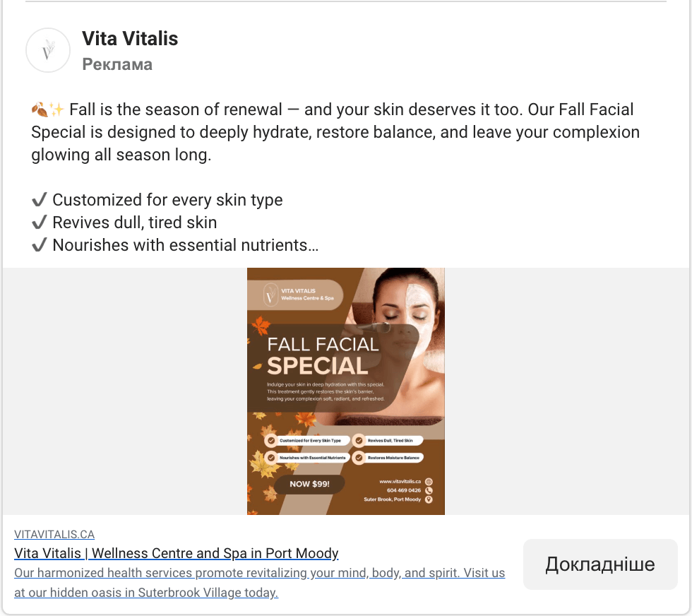
Overall, this is a classic banner, but it perfectly demonstrates how even dark backgrounds can enhance an image. The product is at the center, and a hierarchy of elements is built around it, each well-placed. The promotion is highlighted separately with a special sticker.
What's interesting about this format? A static image on a dark background that enhances the main focus and even makes it stand out.
Key focuses: the product, its benefits, and the discount.
What to pay attention to? It's not just about light backgrounds; a dark background can also be used effectively with various graphic elements.
This banner is all about relaxation and harmony. Soft colors, gentle shades, and smooth lines immediately create an association with rest and self-care.
What's interesting about this format? It's about emotions, and in the wellness industry, this is critically important: people visit SPAs not just for procedures, but for the feeling.
Key focuses: an atmosphere of relaxation and beauty.
What to pay attention to? In wellness advertising, you need to convey not just the product or service, but the emotional experience. Here, the user already "sees and feels" it before purchasing the product.
* ad design for a private dental clinic
This template has a large block for promo text that can act as a trigger for the CTA. Cute graphic elements evoke positive emotions and give the entire ad a somewhat cartoonish mood.
What's interesting about this format? The ad shows how to balance logical arguments (price, discount, first consultation) with emotional ones (health, trust, ad characters) in the medical field.
Key focuses: clear benefit and building loyalty.
What to pay attention to? The key focus is a well-thought-out text with the main offer, skillfully combined with graphic elements. It's a blend of emotional arguments and rational highlights.
* ad design for an online health platform
This banner immediately explains the essence of the service – a remote consultation with a doctor. This is visualized as simply as possible: an image of a specialist next to a gadget. Laconic colors and a clean design emphasize the modernity and technological nature of the product.
What's interesting about this format? The banner is an example of how to correctly convey a complex idea through simple visual elements. No long explanations or texts are needed – the user immediately sees and understands that medicine is available online.
Key focuses: accessibility of online medicine.
What to pay attention to? The ad is a great example of how design can simplify a complex idea. The audience immediately understands that this is online medical help and requires no further explanation.
Using ready-made banner templates is an excellent solution, as each can be personalized for a brand's specific needs. They help businesses launch campaigns quickly, save designers' time, and look very professional. Each banner is created with marketing principles in mind: correct focuses, well-thought-out typography, a harmonious balance between text and visuals, and a well-chosen CTA.
If you review all the examples, you can find common elements, the most frequent of which is a combination of emotion, simplicity, and a clear value proposition. Pay attention to:
Advertising in the health sector on Facebook is an excellent way to quickly and effectively build trust, provide useful information, and show that the brand cares about its customers.
Creative advertising examples from brands prove that truly effective banners are created at the intersection of emotions and facts:
It's important to remember: not all brands achieve the same effectiveness using the same marketing tools. Find your unique style of advertising communication with your audience that will be understandable and interesting to everyone. Your task is to get inspired by examples, experiment with formats, test different messages, and search for your perfect combination!


