

In modern pharmaceutical marketing, banner advertising remains a powerful tool for increasing awareness of products and services. At the same time, working in this field requires strict compliance with regulatory standards, clear and transparent communication of key information, and a skillful blend of creativity with ethical standards.
Let's talk about examples of banners and advertisements from the pharmaceutical industry that inspire with their simplicity, visual power, and clear call to action. By analyzing existing campaigns, we can draw conclusions about why they "work" and what techniques can be borrowed for your own advertising campaigns to make them not just visually interesting, but also effective.
Advertising in the pharmaceutical sector is characterized by high requirements for content, design, and ethics. Fortunately or unfortunately, everyone working in such a sensitive industry must be very careful about how and what they advertise to ensure the ad is acceptable and does not cross the personal boundaries of the audience.
And for a campaign to be effective and compliant, it's worth considering at least these critical aspects:
In pharmaceutical advertising, every element matters: from the wording of the slogan to the color palette. Adherence to rules, clarity of the message, and a balance between trust and creativity are the foundation of a successful campaign.
So, now let's move on to examples of pharma banners that successfully combine design, message, and call to action, and figure out why they work. This review will be useful for marketers, agencies, and anyone looking to improve the effectiveness of digital campaigns in the pharmaceutical sector.
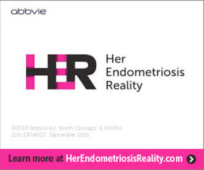
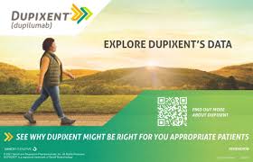
In its ad, Abbvie very clearly segments the traffic right away: the banner immediately includes a filter for the key audience's query. In this case, the target audience is healthcare professionals working with endometriosis patients. Therefore, the banner effectively establishes contact with the target audience through a clear and relevant message. The visual lightness and minimalism of the design prove that an attractive ad that works can be created even without a large budget for creative production.
The visual style of the ad: simple and elegant, with a minimum of extra elements. The bold combination of brand colors and ample white space focuses attention on the main thing – the key message and the call to action (CTA).
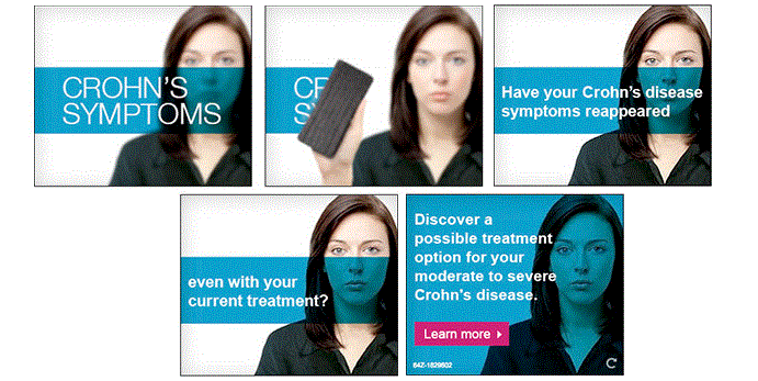
In banner advertising for the pharmaceutical industry, every pixel is important. When space is limited, the demands on the image increase, and if you can manage to convey messages both visually and through text simultaneously, it's a success!
The Humira banner demonstrates a perfect balance: simple yet powerful visual elements help convey the key message, showing that sometimes less is indeed more. The text, graphics, and clever use of animation work in sync to draw attention to an important offer ("Learn about a possible treatment option") and a clear call to action ("Learn More" with an interactive arrow).
By the way, this banner has a repeat function, allowing viewers to watch the banner again, which increases engagement and CTR. Before publishing your ad, check if the chosen platform has this feature and be sure to enable it to ensure maximum effectiveness.
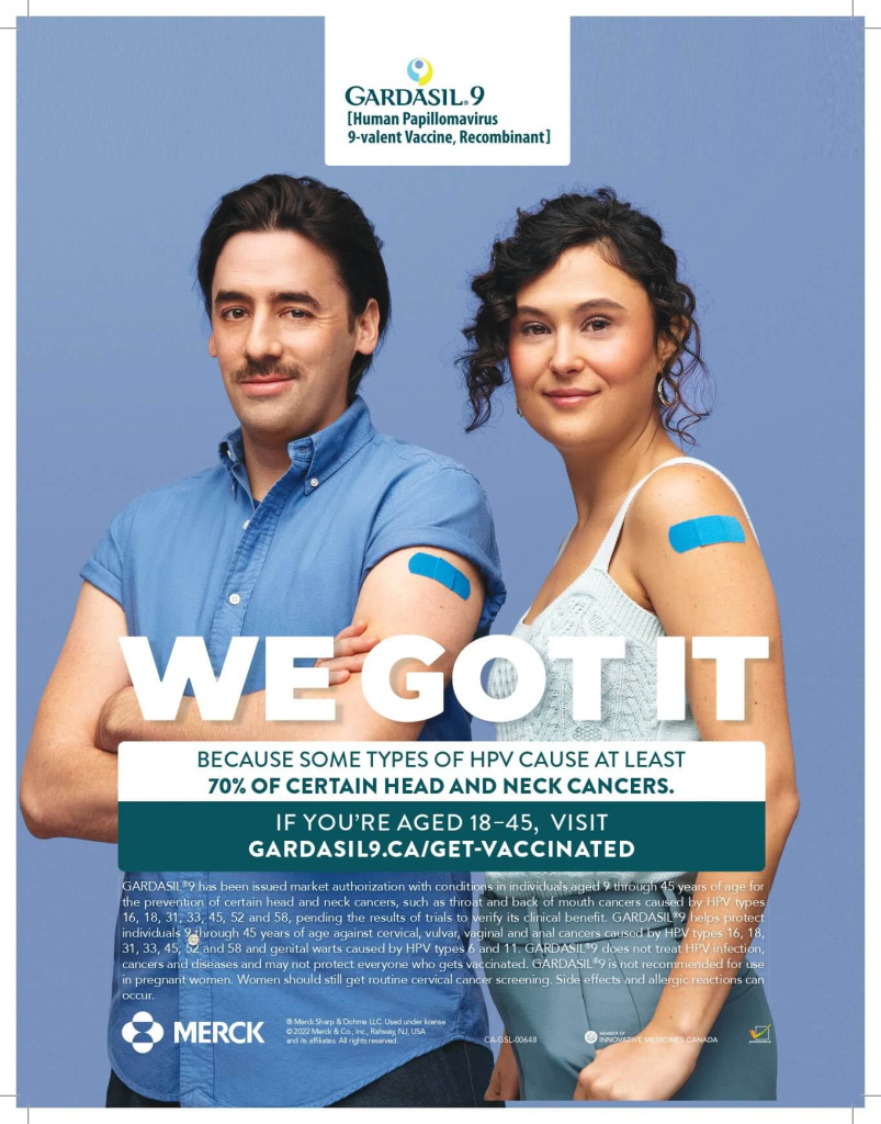
Early advertising for the Gardasil vaccine was targeted at teenagers. However, changes in the company's marketing strategy brought about changes in ads and targeting. To increase reach, Merck shifted the campaign's focus to preventing the development of HPV into cancer for the 25–45 age group.
The banner has a well-thought-out style and, through its text, fully corresponds to the key query of the audience. As always, per requirements, the banner includes information about medical research, but it is done very organically so as not to distract from the main message.
In this ad, every member of the target audience could see themselves. The focus on disease prevention and benefits for adults, combined with emotional stories (yes, I need this) and practical actions (where can I go?), yields maximum effect.
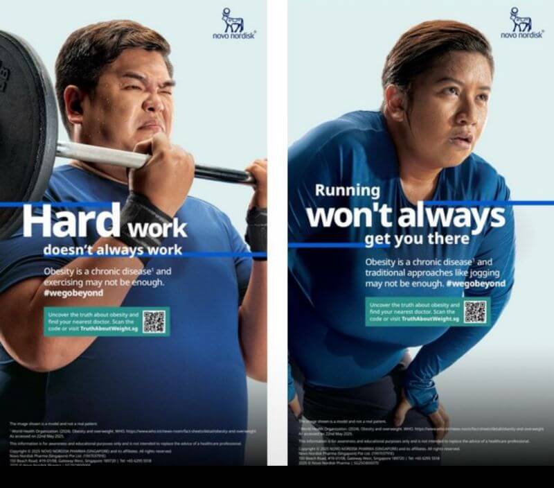
Patients often perceive obesity through a series of stereotypes. Novo decided to convey the scientific rationale and show the real benefits of treatment. For this, they use high-quality and well-thought-out images in their banner ads that show excess weight can be a problem unrelated to how many times a week you visit the gym or what you eat.
Why is this banner effective?
A high-quality image, well-crafted text, and a clear call to action. Nothing new, but sometimes you don't need to invent clever schemes to attract attention.
In fact, the brand not only created a thoughtful ad but also aimed for a kind of education: when patients understand obesity as biology, they are more open to medication therapy and prescriptions.
Next is a campaign for drugs with multiple indications. And this is a real challenge: how to show on a single banner that the drug is suitable for various needs?
Solution:
Recommendation: if you can tell a story through banners, we highly recommend doing so. Consistent and clear focuses help patients continue therapy and make the advertising more empathetic.

What if you make a banner an almost interactive platform for finding the best solution for the audience's query? Invega shows a master class in accomplishing this task. The banners invite users to "discover all the reasons for prescribing the medication." However, the click leads to a page where only two indications are available, without additional explanations or calls to action related to the banner. Only after the user makes a choice do they receive the necessary information. This is an excellent way to increase user engagement and, consequently, create positive emotions associated with the brand.
But, remember: for an ad to work effectively, the click must instantly respond to the customer's request; otherwise, the risk of losing trust and interest increases. And, of course, think through your text content!
Simply creating digital ads for pharmaceuticals is no longer enough – the audience needs to understand what to do after viewing and perform a specific action. For this, the call to action must be as clear and concise as possible. This is often where the problem with many banners in the pharmaceutical industry lies.
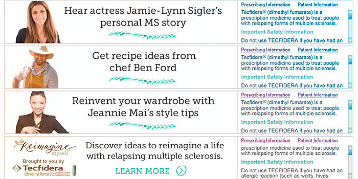
Tecfidera's ad starts brightly, with a captivating story. The final frame contains a call to action and the mandatory safety text. By the way, the banner looks very harmonious, and the large amount of text does not create a visual imbalance.
Recommendations:
A clear call to action turns views into specific actions and increases the effectiveness of the ad.
Demonstrating the consumption or use of a product is not very common in the pharmaceutical industry, but if there's an opportunity, it works very effectively. Tylenol is an excellent example of pharmaceutical advertising that uses the dramatization of symptoms to clearly demonstrate the product's benefits in a memorable way with a touch of humor and spontaneity.
Overall, the banner is light and interesting, and it makes you want to interact with it, as the design is unconventional and stands out against more restrained examples. It should be noted immediately that the style and character of the banner advertising must align with the brand and be consistent. Experiment and test various formats to find your ideal way of interacting with your target audience!
* banner design for the pharmaceutical industry
Want to create a stylish banner while adhering to the traditional color palette for the pharmaceutical industry? We recommend this template, which looks very modern, has thoughtful animation, and a well-structured text hierarchy.
Firstly, the banner meets the requirements of advertising platforms and contains all the necessary information. Secondly, the visual is chosen to communicate immediately with the correct target audience.
Thirdly, such an ad will definitely be remembered because it is clear, concise, understandable, and has no visual noise!
* banner design for the pharmaceutical industry
If your product can be easily shown visually – do it! This template for a pharmaceutical campaign is very modern, well-thought-out, and minimalistic so that nothing distracts from the main product. By the way, when working with this banner, you can completely change the color palette, but we recommend paying attention to the bold and successful combination of gray and orange colors.
Creating effective advertising in the pharmaceutical sphere is a constant balancing act between creativity and strict adherence to rules. A well-designed banner not only attracts attention but also conveys the key message, increases awareness, and stimulates the desired audience action.
Always pay attention to:
Remember: in pharmaceutical advertising, audience trust is a key asset. Use verified information, a clear design, and a relevant message, and your banners will work effectively, even in this highly complex and regulated field.

")

