

How do you decide whether to watch a video? Yes, if it's a channel subscription - that's one thing, but if it's a video unknown to you? Correct - by the preview. Why do you scroll past one banner and open another? It's about visuals, style, content, and a clear message. One of the key elements of effective video thumbnails is a properly selected font. It must be noticeable, readable, and reinforce the emotion of the content.
While scrolling through the YouTube feed, the user is constantly faced with hundreds of visual signals. Faces, emotions, colors, composition — everything is important. But the main emphasis is, of course, on the text on the preview, which often becomes the key decision-making factor. If it cannot be read quickly or looks unconvincing, the video loses its chance of being opened regardless of the content quality.
Correctly selected fonts for video previews help convey the meaning of the content in literally a second. They create a visual hierarchy, reinforce the emotion of the heading, and form associations with the brand or the author's style. For example, massive bold fonts are subconsciously perceived as energetic and decisive, while geometric or rounded shapes can convey lightness, modernity, or a friendly tone.
The font directly affects click-through rate: readable, high-contrast, and well-scaled text significantly increases the likelihood that a user will stop their gaze on exactly your preview. That is why choosing the best font is not a matter of taste, but a strategic design decision that works to increase views, recognition, and trust in the channel.
Most articles about fonts for previews repeat the same names over and over again. The problem is that these fonts are already so widely used that they no longer help a channel stand out among competitors. Non-trivial typefaces allow for maintaining readability while simultaneously forming a recognizable style and visual uniqueness specifically for your channel. Therefore, we have collected fonts that work well in previews but have not yet become cliché.
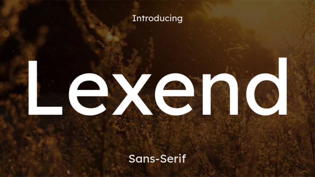
Suitable for: reviews, educational/technical content, life hacks, business videos
Not suitable for: very emotional, artistic themes or retro style
Tip: use Bold or ExtraBold for the main heading – the font was created for maximum readability and remains clear even in small sizes.
Why exactly Lexend?
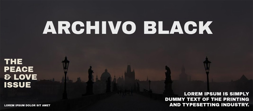
Suitable for: educational content, business videos, analytics, tool reviews
Not suitable for: children's channels, entertainment cartoon themes
Tip: add a thin outline or a light shadow on dark and busy backgrounds – this reinforces contrast and makes the text even clearer.
Why exactly Archivo Black?
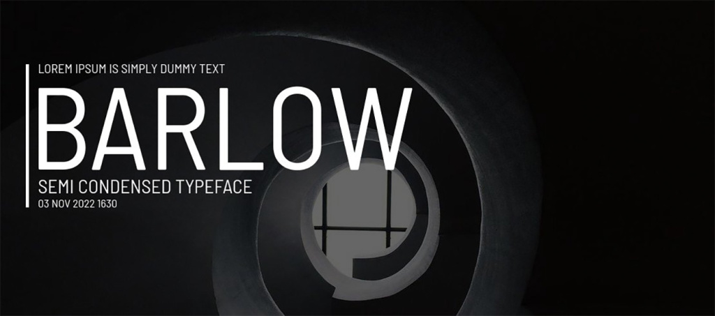
Suitable for: news, trends, compilations, event reviews
Not suitable for: emotional storytelling videos, personal stories
Tip: use Bold or SemiBold – the condensed version allows for fitting more meaning into 2–3 words without overloading the composition.
Why exactly Barlow Condensed?
Download Barlow Condensed font
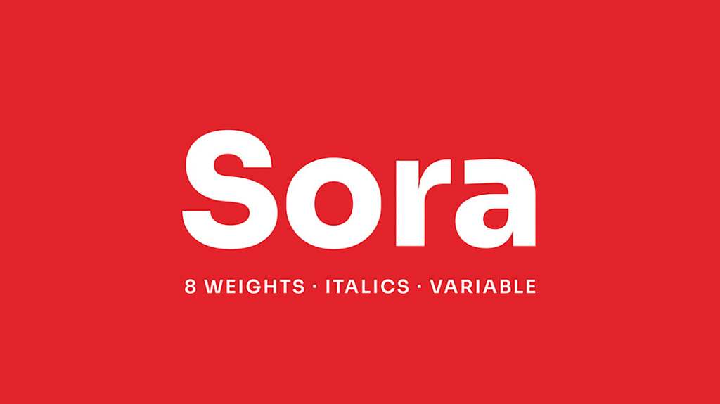
Suitable for: startups, technologies, AI content, digital reviews
Not suitable for: retro videos, artistic or experimental art projects
Tip: use Medium or SemiBold in combination with a light shadow – this adds depth and improves readability on busy backgrounds.
Why exactly Sora?
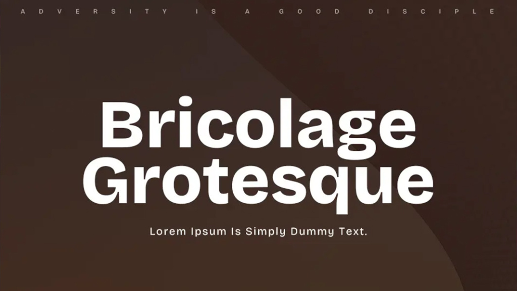
Suitable for: YouTube shows, reactions, comments, entertaining expert content
Not suitable for: strict corporate presentations, official reports
Tip: use Bold or ExtraBold in large sizes – the font has characteristic shapes that attract attention well in the feed.
Why exactly Bricolage Grotesque?
Download Bricolage Grotesque font
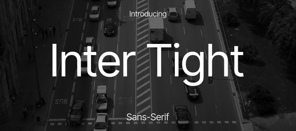
Suitable for: explainers, guides, educational videos, instructions
Not suitable for: entertaining, emotional, or creative content
Tip: choose Bold or SemiBold – the Tight version looks denser and more noticeable than the classic Inter, which is important.
Why exactly Inter Tight?
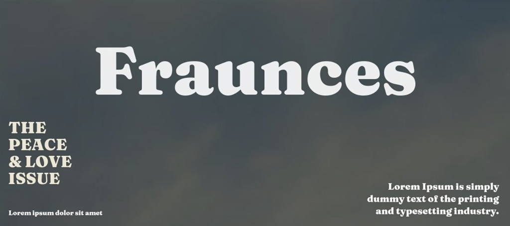
Suitable for: creative blogs, design, fashion, personal brands
Not suitable for: news, financial analytics, serious official topics
Tip: use Bold or Black for 1–2 words and combine with a simple sans-serif (for example, Inter or DM Sans) for secondary text.
Why exactly Fraunces?
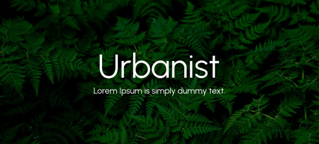
Suitable for: lifestyle content, vlogs, travel, personal stories
Not suitable for: aggressive themes, loud clickbait headings
Tip: use Bold or ExtraBold in combination with a light shadow – this adds volume and improves readability on backgrounds.
Why exactly Urbanist?
Suitable for: technologies, startups, tool reviews, digital content
Not suitable for: retro style, classic or vintage themes
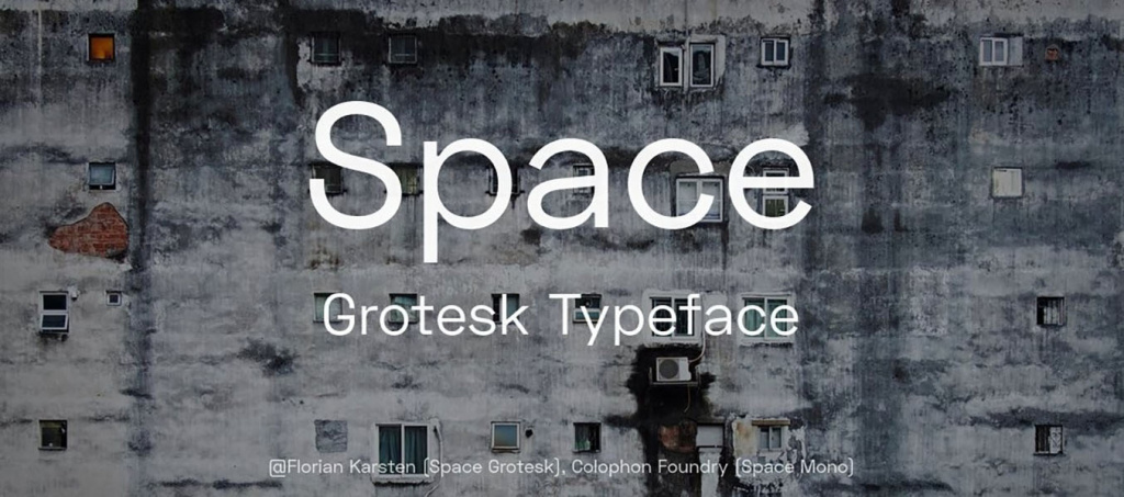
Tip: use Bold or SemiBold – the font reads well even without an outline on a clean contrasting background.
Why exactly Space Grotesk?
Suitable for: art content, creative projects, design reviews, experimental formats
Not suitable for: corporate channels, financial analytics, official presentations
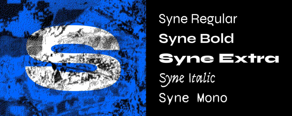
Tip: use only for 1–2 words in Bold or ExtraBold — the font has a distinct character and works best as an accent.
Why exactly Syne?
Suitable for: explanatory videos, tutorials, educational and expert content
Not suitable for: emotional or aggressive clickbait previews
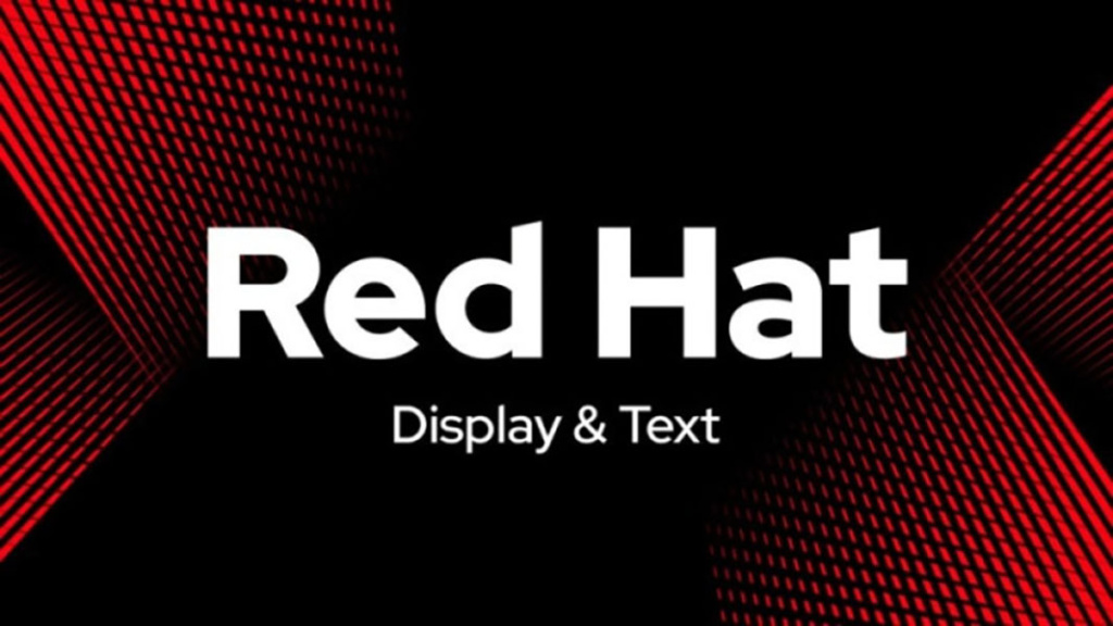
Tip: Regular weight looks too neutral – choose Bold or ExtraBold so the text doesn't get lost in the feed.
Why exactly Red Hat Display?
Suitable for: lifestyle content, personal brands, vlogs, interviews
Not suitable for: aggressive themes, loud clickbait headings
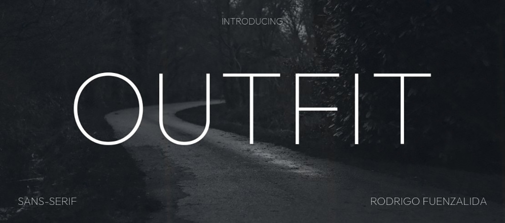
Tip: use Bold or SemiBold and slightly increase the letter spacing – this adds air and improves readability.
Why exactly Outfit?
Suitable for: business content, expert videos, analytics, interviews
Not suitable for: children's channels, cartoonish or overly emotional format
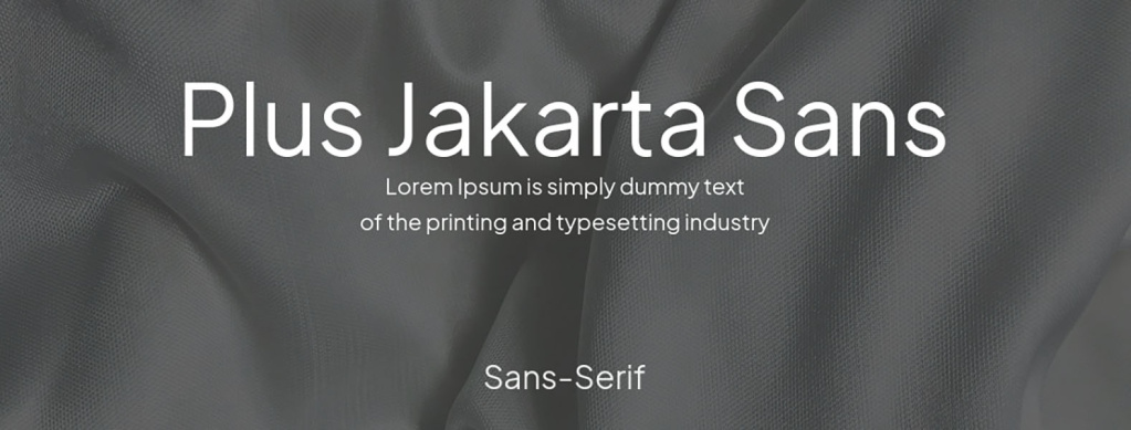
Tip: works well in caps lock in Bold or ExtraBold versions – looks confident but not aggressive.
Why exactly Plus Jakarta Sans?
Download Plus Jakarta Sans font
Suitable for: premium content, interviews, analytics, technological themes
Not suitable for: fast news, loud clickbait previews
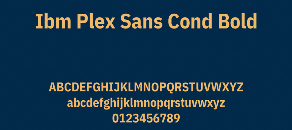
Tip: use Bold or SemiBold and add a light shadow on complex backgrounds – this reinforces volume without losing restraint.
Why exactly IBM Plex Sans?
Suitable for: a universal option for most niches — educational videos, lifestyle, reviews, interviews
Not suitable for: aggressive headings, loud clickbait previews
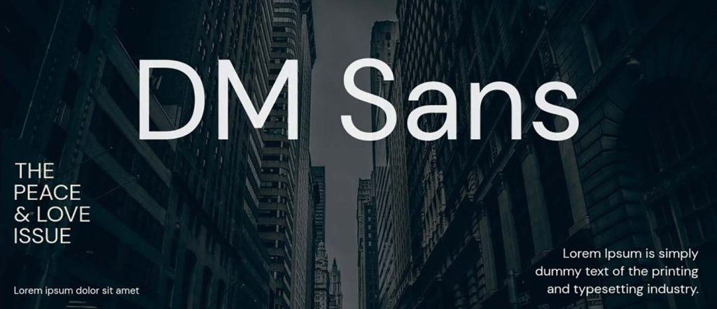
Tip: use Bold or ExtraBold in combination with a contrasting background – this will help the font look more confident in the feed.
Why exactly DM Sans?
No single font is a universal solution for all channels and formats. The exact same font may look strong in a technical review and weak in a lifestyle vlog. Therefore, the best approach: choose 2–3 fonts, test them on different previews, and see which variants give a higher CTR. Non-trivial typefaces combined with the correct weight, contrast, and scale allow for creating previews that don't just look beautiful but actually work to increase views.
Even the best font may not work effectively if basic readability principles are violated. Previews are usually seen in a reduced size, on smartphones, or during a quick scroll, so the text must be read instantly.
So, what is important?
Additional rule: scale is more important than accuracy
It's better to make the text a bit too large than too small. If words occupy more space in the frame – they will be noticed and read faster.
Even a good font can ruin a preview if it is used without considering basic principles of readability and composition. Most often the problem is not in the font itself, but in how and in what conditions it is applied. So, what mistakes regularly reduce the effectiveness of YouTube previews?
Too many words
When people try to fit half of the heading from the video description onto the preview, the text turns into a solid blob. The viewer doesn't read, but simply ignores such a preview. A short message of a few words works much better than a long sentence.
Lack of contrast between text and background
Light grey text on a white background or dark blue on black may look stylish in a layout but read poorly in the feed. If the text is not visible from the first second – the preview loses its purpose.
Complex decorative fonts
Handwritten or overly creative typefaces may look beautiful but often require more time to read. For previews this is critical, as the user doesn't stop to decipher letters.
Unjustified font combination
Combining three to four different typefaces within one preview creates chaos. The viewer doesn't understand what the essence is and skips the image.
Most mistakes occur not because of bad taste, but because of ignoring the context of preview use: small size, quick scroll, and limited time for perception. It's better to have a simple, contrasting, and bold font with short text than a complex design that is impossible to read. Minimalism and readability almost always win over decorativeness.
Before publishing a preview, it's worth spending a few seconds on a basic check. This simple checklist will help quickly evaluate whether the text will be understandable and noticeable in the feed.
If all points are fulfilled, the preview has high chances of being noticeable, understandable, and clickable. This is the minimum base that works regardless of the channel's style or video theme.
The font on a YouTube preview is part of the content strategy, not just a design element. It is what helps form the first impression of the video even before reading the heading and description. When text on the preview is read instantly, the viewer faster understands what is being discussed and is more likely to click on the video. Therefore, properly selected fonts for YouTube directly affect CTR and the growth of the channel's subscriber count.
A universal formula does not exist, but there are stable principles: minimum words, maximum contrast, and understandable letter shapes. Even a simple sans-serif in Bold weight can work better than a complex designer font if it reads well at a small size. That is why when choosing the best font for YouTube, you should focus not on trends, but on real ease of perception.
The most effective approach is to form your own set of several fonts and test them systematically. Over time, you will see which typefaces resonate better with the audience and will be able to build a recognizable visual style for the channel. In the long-term perspective, it is exactly consistency and readability that give stable results and help scale views.
A universal option does not exist. Fonts with simple shapes, high contrast, and bold weights work best. Often these are modern sans-serifs in Bold or Condensed versions. What's more important is not the specific font name, but its readability at a small size.
Yes, but it is advisable to limit yourself to a maximum of two. One – for the main word or phrase, the second – for a supporting accent. Both fonts should be simple and stylistically compatible.
Caps lock works well for short phrases and accent words, as it increases visibility. However, for long texts, it can reduce readability, so it's better to apply it selectively.
Reduce the layout to a size of approximately 10–15% of the original or look at it from a smartphone. If the text is easy to read at first glance – the preview works.
You can, but very carefully and only for individual niches where it is stylistically justified. For most channels, such fonts reduce the speed of information reading.
No. It's better to have 2–3 main fonts that form the visual identity of the channel. Consistency helps the audience recognize your content faster in the feed.


")
