

A Facebook group cover is the first thing a person sees even before they read the description, view the content, and decide whether to become a brand subscriber. That is why it is important not only to create a cool design but also to choose the right dimensions so that key elements are not cropped on mobile or desktop devices. Actually, it's simple: accurately account for the technical dimensions, know the safe zones for placing important elements, and successfully change the style or design depending on the season, promotions, or special offers. Let's look into the details below.
Everyone who works with Facebook knows that a group cover is a key element of the community's visual communication. In fact, it is a simple banner that simultaneously performs several tasks: forms the first impression, helps to quickly understand the group's theme, and enhances brand recognition. That is why the technical correctness of the cover is no less important than its design.
Facebook automatically adapts the cover for different types of devices, and this often unpredictably crops the image. You can spend several hours on development, and as a result: headings partially disappear, the CTA is not visible, and the composition loses that harmonious balance.
Knowing the current dimensions and safe zones, you will be able to create universal covers that display correctly on different screens and ensure stable readability of key elements.
For a Facebook group cover to display correctly on mobile and desktop devices, it is important to use the recommended image parameters.
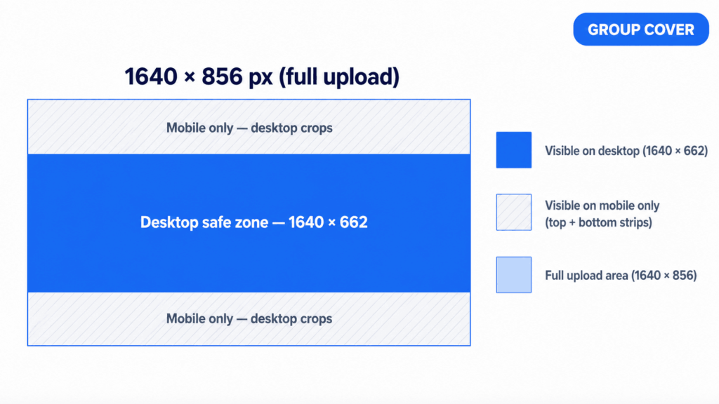
Recommended size – 1640 × 856 px
This is the optimal size for uploading group covers and provides sufficient resolution for different screens.
Aspect ratio – 1.91 : 1
This format preserves the correct proportions of the image and helps avoid unwanted cropping.
Minimum allowed size – 820 × 428 px
Facebook may accept smaller images, but they often lose quality when scaled.
File formats
Recommended file size is up to 2 MB (optimal), although Facebook supports larger files. The smaller the size without losing quality, the faster the cover loads and the less likely Facebook is to further compress the image.
If the cover contains a lot of text or small graphic elements, choose the PNG format. For photos or images with smooth gradients, high-export-quality JPG will do.
Facebook automatically scales and crops the cover depending on the screen type. The same cover can look different on desktop and mobile devices.
On desktop screens, the cover is usually displayed wider but with a smaller height.
What can be cropped:
What a designer should pay attention to:
On mobile devices, Facebook more often crops the side parts of the cover, focusing on the central area.
What can be cropped:
It is also worth noting that Facebook displays the group name, number of members, and other interface elements on top of the cover. Because of this, the lower part of the banner can be partially overlapped. That is why all important messages, logos, and buttons should be placed closer to the central part of the cover.
What a designer should pay attention to:
Therefore, when creating a cover, you should always focus on the central part of the image and leave margins at the edges so that the design remains coherent regardless of the device.
Even when using the correct cover size, part of the image can be cropped on different devices. That is why, when creating a design, it is important to focus not only on the overall size but also on the so-called safe zone.
Safe zone – is the central part of the cover that is guaranteed to remain visible on both desktop and mobile devices. All key elements are placed within this area: text, logo, heading, CTA.
For a 1640×856px cover, the central area of approximately 1640×662px is considered safe. It is in this area that the probability of cropping is minimal regardless of the device.
In practice, this means that all important content should be kept closer to the center both vertically and horizontally.
If you plan to use one template for a long time, leave additional internal padding on all sides. This will allow the cover to look correct even after possible Facebook interface changes in the future.
Place only in the safe zone:
Can be placed outside the safe zone:
This approach allows you to preserve the readability and integrity of the design regardless of which device the user uses to view the group.
An effective cover is a masterful combination of technical correctness and thoughtful design. It should quickly convey the essence of the community, not overload the user with information, and display correctly on any device.
1. Choose readable fonts
For example, with simple geometry and sufficient letter spacing. Avoid thin or handwritten typefaces for core messages. The heading must remain readable even after the image is reduced in the feed or when viewed from a phone.
Tip: before publishing, scale the layout down to the width of a smartphone – if the text can be read without straining, the size is chosen correctly.
2. Combine colors and preserve contrast
Text on a light background must be dark and vice versa. If a photo is used, you should add an overlay or a semi-transparent shape under the text. It is also advisable to adhere to the brand's corporate palette so that the cover works for brand recognition.
3. Minimum amount of text
A cover is not a banner with a detailed description. Its task is to spark interest and give a general understanding of the group's topic. One heading and, if necessary, a short subheading is usually enough.
4. A clear message or CTA
Formulate the message as specifically as possible:
A CTA does not necessarily have to be a direct call to action. Often, a clear value that motivates people to join is enough.
5. Visual hierarchy
Determine one main focus: a heading or a key phrase. It is this element that should be the largest and most contrasting. Secondary elements should support the main message, not compete with it. Proper hierarchy makes the design understandable even with a quick glance.
6. Seasonal and thematic covers
Periodically updating the cover signals group activity. These can be:
It is important to maintain a unified style so that each update remains recognizable.
7. Testing before publication
Check the layout in several scenarios: desktop, smartphone, different screen sizes. Pay attention to cropping, contrast, and overall composition.
Tip: keep a template with a marked safe zone to optimize the work for all future covers.
8. Use templates
You do not have to create a design from scratch every time. Using ready-made templates helps to adhere to the correct dimensions, safe zones, and composition. Simply replace the text, colors, or photos – and a new cover is ready in minutes.
Below are the most frequent problems that should be considered at the layout stage.
Text near the edges
Placing headings, subheadings, or CTAs close to the edges of the cover almost always leads to them being cropped on one of the device types. Even if everything looks correct on desktop, part of the text may disappear on mobile.
Solution: keep all important content within the safe zone and leave sufficient internal padding.
Small font
Text that is too small quickly loses readability, especially on smartphones. The user has to strain their eyes or zoom the screen, which reduces the likelihood of interaction.
Solution: use large headings and a minimum of small supporting text.
Overloading with elements
A large number of icons, decorative lines, images, and different fonts create visual noise. As a result, the user does not understand what to pay attention to.
Solution: choose one main focus and remove everything that does not strengthen it.
Lack of focus
If the cover tries to tell about everything at once, the user will remember nothing: there is no clear understanding of what the group is about and how it is useful.
Solution: formulate one key message and build the design around it.
The most popular cover formats suitable for most types of Facebook communities.
Such a template immediately sets the tone of the community and helps new members understand the expectations.
What goes into the concept:
All points should be as concise as possible, without lengthy wording.
Suitable for groups with regular activities, events, or rubrics.
What goes into the concept:
This format reduces uncertainty and encourages regular participation.
Focus on exactly what the member gets by joining the group: For whom + what problem we solve + result
Examples of phrasing:
Such a template is especially effective for attracting new members.
Create a cover in a few minutes!
Don't want to spend time building a layout from scratch?
At BannerBoo you will find ready-made Facebook group cover templates with already set dimensions of 1640 × 856 px and the correct safe zone. Just choose a design, edit the text, and export the ready banner.
If you need a unique design, use the AI Banner Generator – simply describe your group in a few words, and artificial intelligence will offer several ready-made options that can be edited immediately.
Before uploading a cover, it is worth doing a quick check. It takes a few minutes but helps avoid common mistakes and preserves design quality.
Size check
Safe zone check
View on smartphone
View on desktop
Using this checklist reduces the risk of technical errors and allows you to publish covers that look stable and professional regardless of the viewing format.
Correct Facebook group cover dimensions, understanding the principles of cropping, and working with safe zones are the foundation of stable and predictable design display on different devices. It is these technical details that ensure text readability, composition preservation, and visual presentation integrity.
In addition to technical parameters, design decisions also play an important role: minimal text, clear focus, contrasting color combinations, and a well-thought-out visual hierarchy. Together, this allows creating covers that not only look neat but also fulfill their communication function.
To optimize the process, it is advisable to create a universal cover template once with already marked safe zones and a basic grid. In the future, such a template can be used for various formats: rules, schedules, value propositions, or seasonal updates. This saves time, reduces the number of edits, and helps maintain a unified visual style of the community.
The recommended size is 1640 × 856 px with an aspect ratio of 1.91:1. It ensures correct display on most devices.
Yes, but it is not recommended. The minimum allowed size is 820 × 428 px, however, the image often loses quality when scaled.
The safe zone is the central part of the cover that is guaranteed to remain visible on mobile and desktop devices. All important content should be placed in it: text, logos, CTAs.
Facebook uses different cropping algorithms for different screens: on mobile, the sides are more often cropped, on desktop — the top and bottom.
For photos, JPG is suitable. For designs with text, logos, and sharp shapes, it is better to use PNG.
It depends on the activities. If the group has events or seasonal campaigns, the cover should be updated for them. In other cases, changing the design a few times a year is enough.
Yes. It is recommended to use PNG for designs with text, logos, and illustrations, as it better preserves the sharpness of small details. For photographs, JPG remains the optimal choice.
Although Facebook supports quite large files, for fast loading, it is recommended to export a cover up to 2 MB in size without noticeable loss of quality.
On mobile devices, Facebook displays the group name, member count information, and other interface elements on top of the banner. In addition, the mobile version crops the image differently. To avoid cropping, place all important content in the central safe zone.
Yes. Facebook automatically scales large images, but for the best quality, it is recommended to use the size 1640 × 856 px, as it meets the platform's official recommendations.
Most often, the reason lies in using an image that is too small, excessive JPEG compression, or repeated scaling after export. For text designs, it is better to use PNG, and to export the cover itself in the recommended size.

")
