

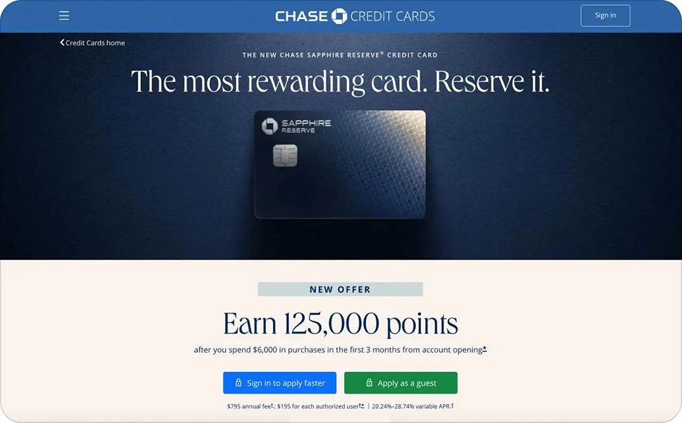
Guess which business industry conducts the fewest experiments with advertising messages? That’s right, finance. And it’s no surprise, because for decades, trust in financial institutions has been associated only with safe templates: smiling families, "reliability," "stability," blue or green colors, standard promises of favorable conditions, and a happy manager.
However, information noise has increased, client expectations are higher, and marketing tools are more powerful, so it's time for a change!
If you remove the logos from most bank banners, it will be difficult to accurately determine which brand the advertisement belongs to. Smiling and happy people, general formulations about "reliability" and "favorable conditions," a standard color palette – all of this is about safe and comfortable marketing in the banking sector.
At the same time, financial advertising became "the same" for a reason. This was influenced by several factors at once:
Banners in this area often seem identical and predictable: strict colors, numbers, cards, and dry messages about reliability. But brands are increasingly stepping outside standard approaches, using creative templates, metaphors, and emotional accents to stand out from competitors. Banners no longer just inform about a product — they tell stories, evoke emotions, and strengthen trust.
Here are 17 examples that will surely inspire you to create non-trivial and modern advertising campaigns:
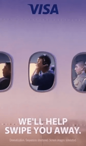
Visa focuses on the strongest emotions associated with travel and relaxation, using a visual analogy of an airplane. The banner conveys a simple but powerful message: the brand is nearby in any plans – from short trips to long journeys. Now financial services are associated not with payment, but with experience and freedom.
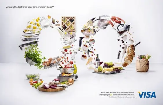
The advertisement appeals to simple everyday purchases, but at the same time conveys a much deeper message: by paying with this bank's card for mundane things, you are investing not only in needs but also in your own life. The campaign reminds us that even beyond routine, there is space for emotions, sensations, and joy. The perfect combo!
The banner emphasizes trust as the basis of financial decisions, reinforcing them with messages about security. After all, without trust, a purchase is impossible, and users want to see a reliable financial service provider. All this is in calm and comfortable colors, with highlighted text accents.
The advertisement highlights the speed and urgency of financial services through limited offers and timers. It evokes an emotion of instant satisfaction and motivation to act now. This emotional trigger works well in PPC advertising and email campaigns, especially in combination with personalized banking marketing.
The banner demonstrates a financial product as a tool for improving lifestyle, focusing primarily on a younger audience. Finance here is not a limitation, but an opportunity to earn more, live brighter, and feel status.
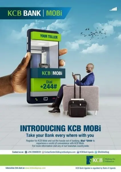
The banner is very simple, but it carries the most important thing: loyalty. Just one phrase, but it shows that the bank is not just a financial institution, but a service that improves life. The banner combines technology and humanity, showing digital tools alongside personal stories. Modern clients value convenience and emotional support at the same time.
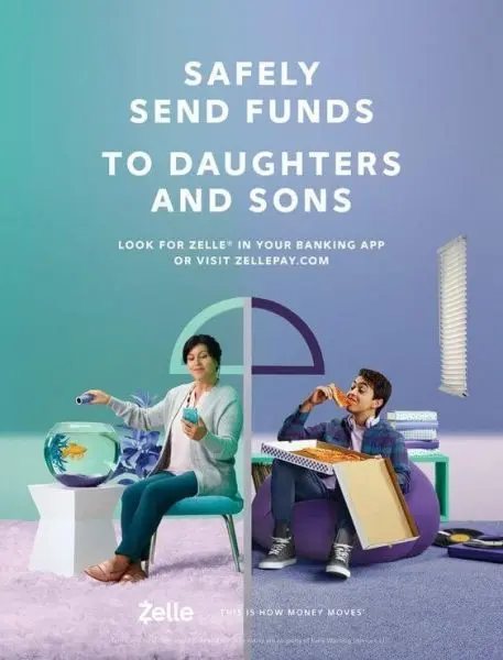
The story of the banner depicts a situation typical for most families: a mother who quickly and safely sends money to children through the app. The core of the advertisement is the importance of simplicity and reliability for family finances. Focus on the most important: trust and simplicity, reinforced by bright colors and clear visuals.
The creative demonstrates the security of finances during travel anywhere. The main message is reinforced by the standard green color, which symbolizes money. Every bank user wants peace of mind and confidence in access to their funds, and the financial institution guarantees this with every visual element.
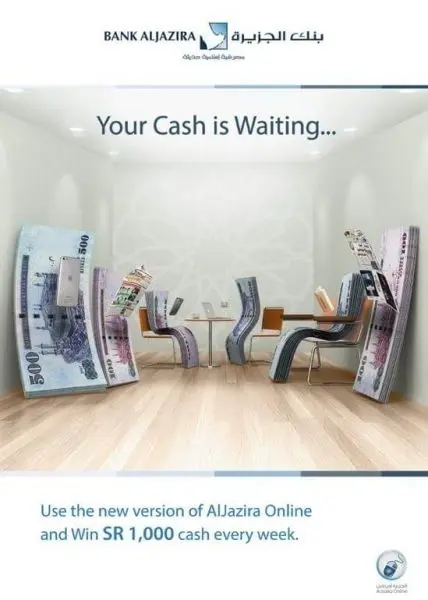
The banner shows banknotes in an unusual context (waiting room), breaking the stereotypes of financial advertising. Of course, the audience values creativity and non-standard presentation of familiar things, which means this creative metaphor quickly attracts attention and leaves an impression.
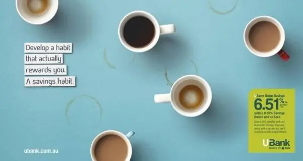
This creative promotes the idea of healthy financial habits through a concise but visually strong message. The advertisement does not overload with details, but shows: controlling savings can be simple and clear. Most people want financial stability but avoid complex tools, and this banner contains a direct call to act now.
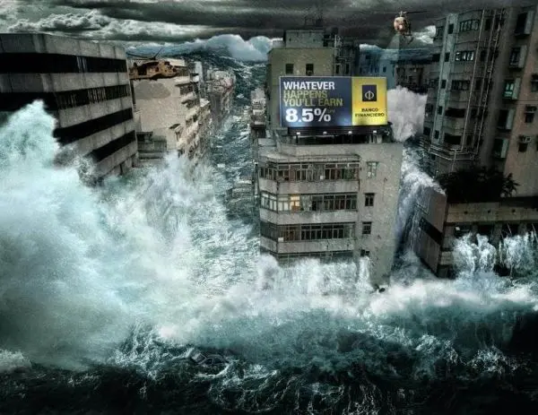
The creative boldly plays with the theme of the apocalypse, demonstrating that even in the event of global catastrophes, the client's financial stability remains protected. This approach evokes an emotion of surprise and is easily remembered due to the absurdity of the plot. Sometimes non-standard scenarios help to better convey a complex message about reliability.
This banner is one of a series of advertising campaigns with real stories of businesses and communities that received support from the bank. It appeals to the rational thinking of a professional audience that wants to see real results rather than promises. B2B clients need to understand exactly how a brand creates value in real life. For this, the brand used cases and storytelling, which strengthens trust and brand reputation.
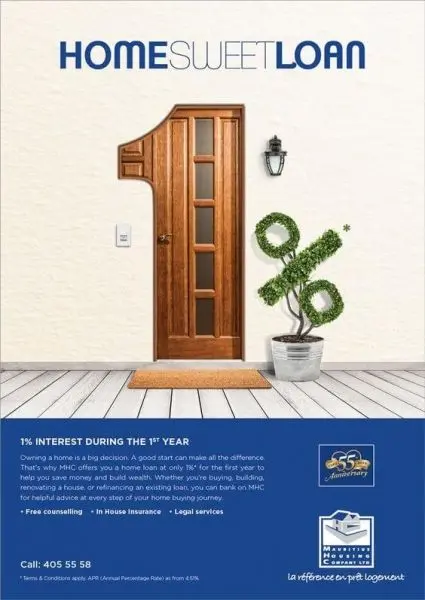
The mortgage loan advertisement uses the familiar phrase "home, sweet home," transforming it into a financial context. The visual accent in the form of a percentage sign made of greenery adds an association with growth, naturalness, and stability. People are not looking for a credit, but for a sense of home and security. And the banner provides all the necessary emotions.
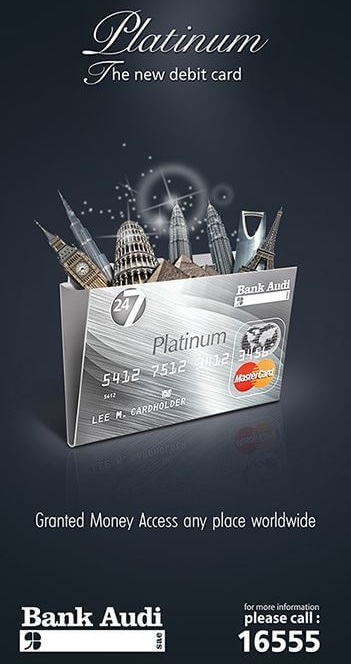
This creative is built on a visual metaphor that simplifies the perception of a financial service without a direct explanation. The advertisement works at the level of the first impression, forcing the viewer to stop and "read" the meaning. Often visuals say more than any text, and metaphors and minimalism increase memorability.
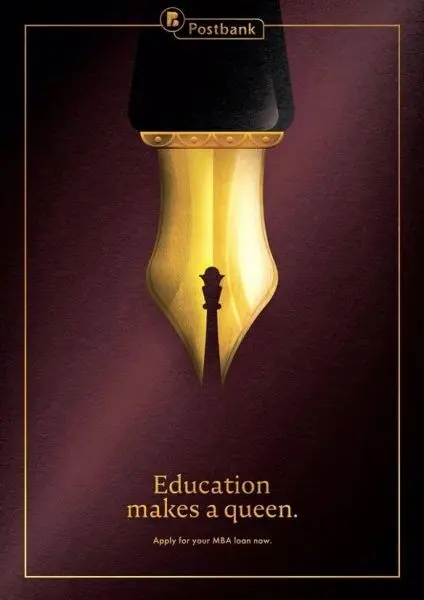
The banner clearly addresses a specific audience – women who invest in their own education and development. The image of a pen with a tip in the shape of a chess queen symbolizes control, strategic thinking, and the power of choice. The banner's effectiveness formula: metaphor + clear segmentation, which makes the advertisement as relevant as possible.
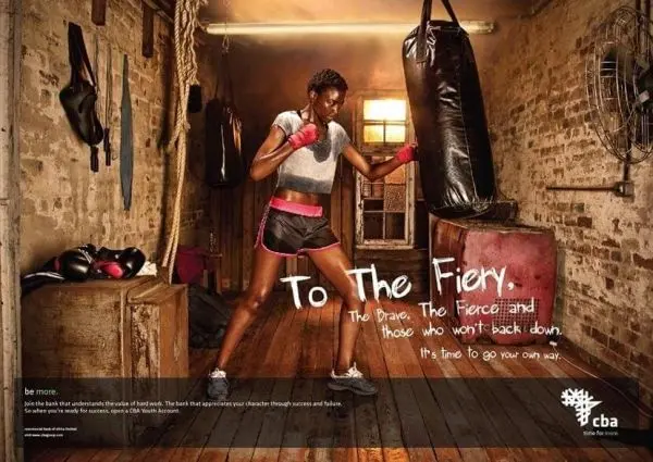
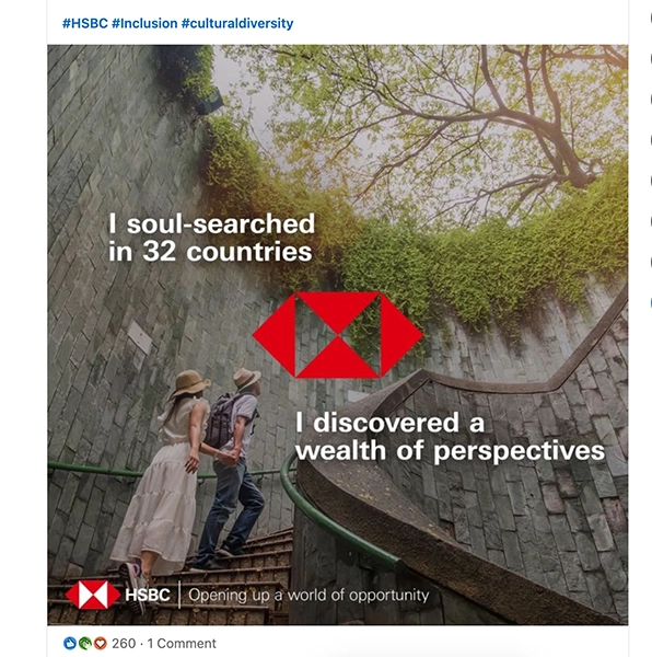
This advertisement moves away from traditional financial symbols and focuses on people, their dreams, and hopes. This approach creates a strong emotional connection and shows the bank as a partner. In the world of finance, humanity becomes a competitive advantage, and personalization builds trust.
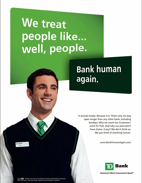
The creative demonstrates a real bank employee, emphasizing care and a personal approach to each client. Simple text and a warm smile create a feeling of openness and accessibility.
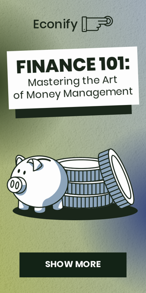
18. Finance 101 – Mastering the Art of Money Management
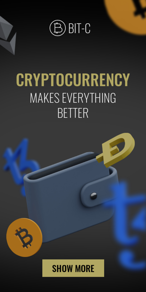
19. Cryptocurrency – Makes Everything Better
20. You Can Count On Us – Financial Services
Developing banners is not an easy task in itself, and for banks, it is a task with an asterisk. Of course, only when your strategy is not to blindly copy competitors, but to truly create creatives that captivate from the first seconds! Below are practical recommendations that can be applied right now during work on the next banner campaign for a bank.
Remember: one message + one visual accent = the right interaction experience for the client. Do not force them to look for hidden meanings; the audience already finds it difficult to make decisions in money matters.
Banks that speak a simple and clear language are perceived as more reliable and accessible. It is important not to emphasize the complexity of financial products or the client's incompetence, but rather to create a sense of support and understanding.
When working on a banner, you should ask yourself: can complex terms be replaced with clear examples or everyday formulations without losing accuracy?
The most successful financial campaigns appeal not only to "the joy of benefit." They also take into account less obvious but much stronger emotions: uncertainty, fear of mistake, the need for control, the desire for stability and security.
A banner that reflects the real experiences of the client is automatically perceived as more relevant and honest.
Clients react to situations, not abstract ideas. One well-shown scenario works better than ten generalized advantages. In banner advertising, this means a focus on a clear case in which the client can recognize themselves.
The most successful banking ads are part of a systematic and consistent marketing strategy. Investments in recognition, consistency, and brand character always yield better results than separate, unrelated advertising activities.
Financial advertising must change along with changes in the market and client requirements. When the audience sees dozens of similar banners every day, trust is formed not by standard formulations, but by the brand's ability to be clear, consistent, and human.
In 2026, banking advertising is not competing for the right to "look reliable," because that is already a basic level. It competes for attention, for instant understanding of the value proposition, and for the emotional contact that arises even before a rational analysis of the conditions.
Advertising campaigns are becoming effective if they:
Money will always be a serious area, but seriousness can be different: with a clear character, a recognizable tone, and honest communication. These are the new markers of reliability and responsibility.
Effective banking advertising today is not a compromise between creativity and trust. It is their combination, which allows the brand to stand out from competitors without breaking the rules of the game, but moving them to a different level.

")
