

Planning to actively promote your brand on LinkedIn? Remember that in addition to high-quality content, correct image sizes also significantly affect the quality of interaction and user engagement. The wrong format, cropped pictures, or low quality can alienate the audience (especially new users) and ruin the professional appearance of your profile or company page. Therefore, we have gathered all the relevant data on LinkedIn image sizes, safe zones, and file formats so that you can create perfect visuals for posts, banners, carousels, and ad creatives – and fully leverage LinkedIn's capabilities.
LinkedIn is the most popular platform for professionals and businesses to find career and business opportunities. It brings together experts, recruiters, and companies from all over the world, while the right visual assets and advertising tools help create effective creatives that accurately convey key messages. It is crucial for visual materials to be properly optimized to meet the platform's standards.
Monthly, according to LinkedIn, over 930 million active users and 63 million companies from more than 200 countries use the platform. It is the perfect place to search for jobs, recruit, promote business, and establish new business relations.
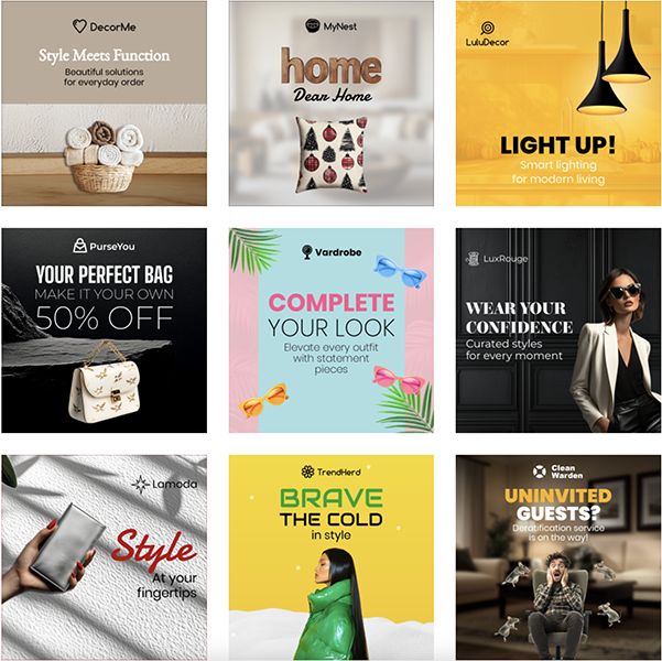
* examples of LinkedIn Ads templates on BannerBo
LinkedIn is a platform where every visual element affects the perception of you or your brand. Images that get cropped or blurred can create an impression of unprofessionalism and reduce audience trust. Posts with well-selected images get more engagement, and ads with professional banners and carousels demonstrate expertise and attention to detail.
What should you consider?
Most popular LinkedIn image sizes (2025–2026)
| Format | Size |
|---|---|
| Profile Photo | 400 × 400 px |
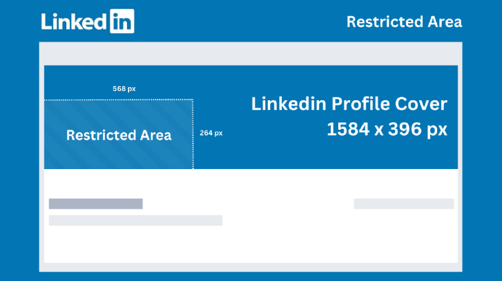
| Personal Cover | 1584 × 396 px |
| Company Cover | 1128 × 191 px |
| Shared Image (Landscape) | 1200 × 627 px |
| Square Post | 1200 × 1200 px |
| Portrait Post | 1080 × 1350 px |
| Carousel | 1080 × 1080 px |
| Document Cover | 1200 × 627 px |
| Video Thumbnail | 1280 × 720 px |
| Single Image Ad | 1200 × 627 px |
| Carousel Ad | 1080 × 1080 px |
| Conversation Ad Banner | 300 × 250 px |
| Slideshow Ads (Premium) | 1080 × 1080 px |
Tip: if you work with advertising, create separate templates for each format – this significantly speeds up the launch of new campaigns. You can create a LinkedIn Banner using ready-to-use BannerBoo templates.
Like all social networks, LinkedIn is actively optimizing visual formats for more interactive and dynamic content. Users are affected by constant visual noise, so it is important for brand content to be professional and not undermine trust in the platform itself. This is handled by algorithms that more actively promote banners meeting the requirements and reduce the reach of those where visuals need improvement.
What you need to know:
What changed in LinkedIn in 2025–2026?
In recent years, LinkedIn has continued to develop advertising capabilities and focused on mobile viewing. The main changes are:
New LinkedIn advertising formats in 2025–2026
LinkedIn continues to actively expand advertising capabilities for brands. In addition to classic Single Image Ads and Carousel Ads, the following are gaining more and more popularity:
Such formats make it possible to reach users at different stages of decision-making and increase the effectiveness of B2B communication.
Correct image sizes are important not only for aesthetics: they affect post visibility, ad efficiency, audience engagement, and the professional perception of the brand. Cropped or blurry images can reduce trust and decrease click-through rates, while sharp, optimized images look professional on all devices and increase content reach.
| Content | Format Description | Size and Technical Recommendations | Safe Zone |
|---|---|---|---|
| Profile Photo (Personal Account) | Avatar for personal profile |
- 400 × 400 px (minimum) - aspect ratio: 1:1 - PNG/JPG format - up to 8 MB |
The face must be in the center of the frame, margins on the edges are not critical, but keep the focus in the center, as the avatar will later be cropped into a circle |
| Profile / Cover Banner | Profile cover for a company or personal brand |
- 1584 × 396 px - aspect ratio: 4:1 - PNG/JPG format - up to 8 MB |
Central 60–70% of the banner is for logos/text, it is better to avoid placing important elements near the edges |
| Company Logo | Logo displayed in search, on the company page, and in results |
- 300 × 300 px - aspect ratio: 1:1 - PNG/JPG format - up to 8 MB |
Center is the logo, it is necessary to maintain a minimum margin from the edges to avoid cropping |
| Company Cover Image | Large banner for the company page |
- 1128 × 191 px - aspect ratio: 6:1 - PNG/JPG format - up to 8 MB |
Central 70% of the area is for logo and text, do not place important information near the edges |
| Shared/Link Post Image | Image for posts or links in the feed |
Standard horizontal image (Landscape) - 1200 × 627 px - aspect ratio: 1.91:1 Mobile format (Square) - 1200 × 1200 px - aspect ratio: 1:1 Portrait - 1080 × 1350 px / 627 × 1200 px For each banner: Format: - PNG/JPG format - up to 5–8 MB |
Place text, key elements, and logos in the center (about 70–80% of the frame), leaving the edges free |
| Carousel Images | Set of 2–10 slides in one post |
Each slide: - 1080 × 1080 px or 1200 × 1200 px - aspect ratio: 1:1 - PNG/JPG format - up to 5–8 MB |
Allocate the central 80% of the banner for text and key elements, each slide must be visually balanced so that the meaning is not lost when flipping through the carousel |
| LinkedIn Stories Image | Vertical images for Stories in the mobile app |
- 1080 × 1920 px - aspect ratio: 9:16 - PNG/JPG format - up to 8 MB |
Do not place important information in the top 10% and bottom 15% of the banner area, as these areas are most often covered by the platform's UI elements |
| Video Thumbnail | Static photo representing a video in the feed |
- 1280 × 720 px - aspect ratio: 16:9 - PNG/JPG format - up to 8 MB |
All the main information should be in the center, and it is better to extend the background to the edges |
| Article/Newsletter Header | Header image for LinkedIn articles or direct newsletters |
- 1200 × 627 px or 1200 × 644 px - PNG/JPG format - up to 8 MB |
Keep text/logos in the center, avoid small text near the edges |
| Document/Slides Thumbnail | Preview of the first page of a document in a post |
- 1200 × 627 px or 1080 × 1080 px - PNG/JPG format - up to 5–8 MB |
The main heading, text, and photo are best placed in the center; do not place small elements close to the edge |
| Sponsored Content & Ads | Formats for paid advertising: sponsored posts, InMail, and other |
Sponsored Content / Single Image: - 1200 × 627 px - aspect ratio: 1.91:1 - PNG/JPG format - up to 5–8 MB InMail Banner: - 300 × 250 px - PNG/JPG format - up to 2 MB Text Ad Logo: - 100 × 100 px (1:1) - PNG/JPG format Carousel Ads - 1080 × 1080 px - PNG/JPG format - up to 5-8 MB |
Place the logo and key CTA in the central 70–80% of the frame; you can boldly use more text, as it is readable even in the preview |
Practical tips for setting safe zones and text placement for all image formats:

* infographic
Creating banners from scratch every time is not necessary. If you regularly publish content or run advertisements, ready-to-use templates help significantly reduce design time.
In BannerBoo, dozens of professional templates are already available for:
If you need to quickly get a finished design, you can use AI Banner Generator. Simply describe the future banner in plain language – the artificial intelligence will offer a ready-made layout with the correct proportions for LinkedIn. After that, you can change colors, texts, logos, or brand elements without involving a designer.
This approach is particularly useful for marketers, agencies, and companies that regularly create dozens of ad creatives.
To make your content look professional, it is important not only to know the sizes but also to properly prepare images before publication. This will help avoid cropping, quality loss, and ensure maximum efficiency of your visuals.
Tip: create a template for yourself for posts, carousels, or advertisements, taking into account safe zones and proportions, and save time on creating a new advertising campaign.
Approaches to the design of images and content for a personal profile and a company page have differences, and understanding these nuances helps create publications that look professional and effective.
Differences in banners, logos, ad creatives, and carousels:
| Element | Personal Profile | Company Page |
|---|---|---|
| Banner | Professional photo or personal brand, central focus on the person | Corporate banner with logo, slogan, or product, highlighting company values |
| Logo / Avatar | Avatar – a clear face in a circle | Company logo in a square, use branded colors |
| Ad Creatives | Posts with personal comment or content | Sponsored posts about products, case studies, events, promotions |
| Carousel | Case studies, personal stories, educational materials | Company portfolio, successful case studies, product series |
A personal profile has a more "lively" style, while a company page is, naturally, more corporate and structured.
What tone and visual style is best to choose?
Personal brand:
Company page:
To make your images look professional and not lose effectiveness on LinkedIn, check the following key points before publishing:
Visual content on LinkedIn often plays a critical role in shaping a professional image and communication effectiveness. Incorrect sizes, cropping, or low image quality can reduce engagement, make the message irrelevant, and ruin the first impression.
Knowing and practicing current sizes and banner formats for LinkedIn promotion helps:
Most importantly, brands should avoid technical errors and create visuals that stand out in the feed, build trust, and increase the effectiveness of personal or corporate content. Proper sizing and proper preparation of images are the foundation of professional, recognizable, and attractive content on LinkedIn.
LinkedIn automatically rescales and crops images depending on format, device, and aspect ratio. To avoid this:
For most posts and banners, PNG is suitable, for photos – JPG.
PNG: optimal for graphics, logos, and text, keeping clarity and transparency.
JPG: suitable for photos and images with a large number of colors.
Of course, keep key elements in the central part of the frame (~70–80%) to avoid cropping. Do not place small text near the edges – it may become blurry on mobile devices.
Formats and sizes of main images are identical, the main difference lies only in the content topics.
We recommend additionally exporting the file with maximum quality:
And, of course, test on different devices before publishing.
Yes. Modern AI tools allow you to generate banners from a text description. For example, in BannerBoo AI Generator, it is enough to describe the desired design, after which the system will automatically create a banner of the required size for LinkedIn. This helps to quickly prepare creatives for posts, ads, or carousels without professional design skills.


